Jordan Roland is a staff designer/illustrator for the Shutterstock blog. This post was originally published on the Shutterstock blog and has been adapted with permission.
In the last five years, there’s been a bubbling resurgence of high-art versions of movie posters. It can be attributed to a few different companies and art galleries, but there’s one that has been at the forefront: Austin, Texas-based Mondo.
One thing that’s unique about Mondo prints is that they’re all silkscreened, meaning that the artists have to use a limited color palette in constructing their designs. This results in a high degree of attention to color as well as detail.
Below are 10 of our favorite Mondo posters from the past few years, spanning from old classics to contemporary juggernauts, along with a look at why they’re so effective as both advertisements for their respective films and gorgeous pieces of art.
Halloween by Phantom City Creative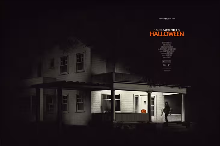
The best horror films never show us everything horrible; they let our minds fill in the gaps. Halloween is one of those films where if you talk about seeing it to your friends, you’ll talk about how violent and scary it was. The thing is, the film’s not really that violent, and it’s surely not very gory. That’s why this poster is so great at capturing one single moment, tone, style, mood, and setting, all in a very limited color palette. Mood is everything when it comes to this film — if you’ve seen it, you’ll know the scene this depicts. If you haven’t, you can still piece together very quickly (even without the title) what day of the year this is by the only spot of color in the whole composition: the orange jack-o-lantern. Celebrating one of the most iconic horror films in history, this piece plays off that iconography and helps the myth of Michael Myers live on.
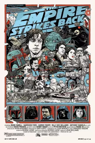
The Empire Strikes Back by Tyler Stout
Tyler Stout has perfected the art of image composites, packing a poster with as many characters and references to the films he pays tribute to as possible. The Empire Strikes Back has so many moments that helped define the Star Wars mega-franchise that it’s a lot to digest visually. Stout takes every iconic moment and builds off of them all, layering and creating a sense of battle and chaos, all while keeping the main focus on Luke Skywalker training with Yoda to make sure the energy of the imagery communicates the heart of the story it’s trying to tell.
The Evil Dead by Olly Moss
Equal parts campy and horror, The Evil Dead deals with friends vacationing in a cabin who release evil spirits that possess them one by one, along with the woods around them. This poster pays tribute to a moment in the film involving a hand erupting form the ground (which is also given a nod in the final frame of the more recent horror movie The Cabin in the Woods), but also plays on the woods being alive in a very detailed but minimalistic manner. Instead of showing our hero front and center, Olly Moss subtly silhouettes Bruce Campbell’s Ash as a small element of the poster, rather than its focus.
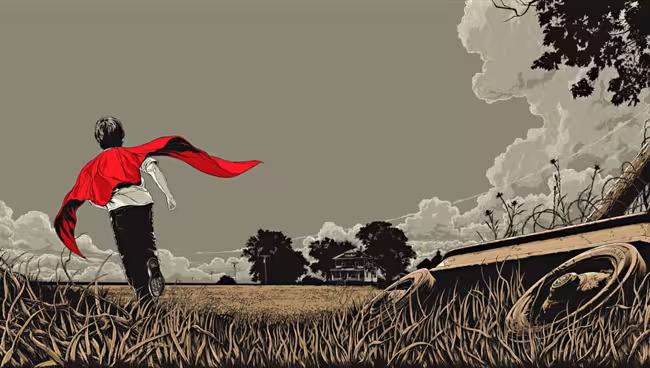
Man of Steel by Ken Taylor
This poster captures a great sense of wonder and imagination, playing off our childhood nostalgia about running around and pretending to be a superhero. Superman has always been a symbol for people to aspire to, a person who always did what was right and tried to help other people before himself. To take those ideals and convey them through the innocence of childhood, Ken Taylor not only a makes a reference to a scene in the movie itself, but also makes us all believe we can fly.
Taxi Driver by Martin Ansin
Mood is everything in selling a movie, and this poster captures ’70s New York in an amazing way. The smoke from the subways, the dark color palette — it all plays up the dirty horrible underbelly of New York through the eyes of the infamous Travis Bickle. Though the poster is mostly covered in smoke and grime, Robert De Niro’s character is the only in-focus part of the image, making sure the viewer doesn’t lose sight of the perspective of the Taxi Driver.
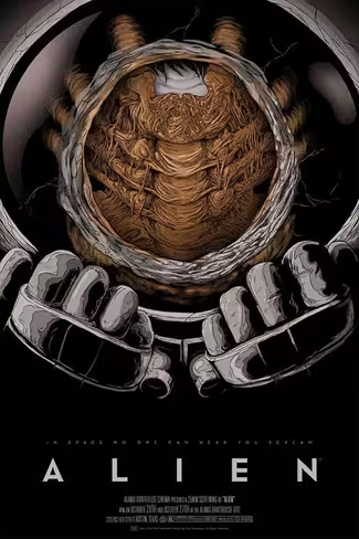
Alien by Randy Ortiz
Alien will go down as having one of the best creature designs ever in film, and you barely ever even see it. The biggest thing about the movie is its ever-growing sense of claustrophobia and isolation (because in space, no one can hear you scream), as well as the idea of being violated by an alien species. This poster conveys those ideas and feelings by showing the alien facehugger (but not the full grown xenomorph), while also creating a sense of panic and dread with the tight confines of the helmet/mask.
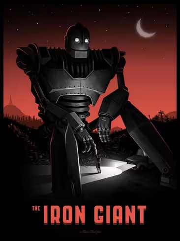
The Iron Giant by Mike Mitchell
“I am not a gun,” one of the more famous quotes from this film, represents the friendship the titular Giant has with Hogarth — and the crux of his decision to fight his programming as a weapon. Mike Mitchell decides to take this friendship and make it the focal point of his poster. With noir undertones in the color palette and an art deco style for the giant and the car, Mitchell helps play up the era this film takes place in (1950s). What makes this so effective is that, with a very limited focal point and palette, Mitchell helps establish the main characters, their relationship, the evolution the giant goes through, and the era.
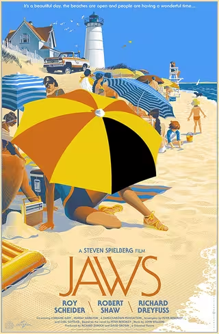
Jaws by Laurent Durieux
This is one of the only posters for this film to ever not show the shark. To use the idea of promoting the New England beach the movie takes place at, it comes across more as a tourism ad than a movie poster. A snapshot in time moments before the first shark attack, it uses a bright color palette to really sell the idea of a warm summer day. However, if you look closely, you can see how it still hints at the danger that awaits in the water with the only spot of black (on the umbrella) used in the entire piece.
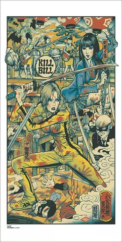
Kill Bill by Rockin’ Jelly Bean
Long scenes of witty dialogue might be a staple of Tarantino films, but one thing that’s always abundantly clear is his unrelenting love of cinema. Every one of the director’s productions is a tribute to the styles and films that came before him. This poster does the same visually, as it captures the climax of Kill Bill Vol. 1 in the traditional Japanese woodblock printing style. The exaggerated proportions and the flat perspective help really tie this piece together stylistically as a homage to the style, which mirrors how Tarantino pays homage to the samurai films that preceded him.
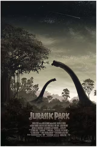
Jurassic Park by JC Richards
There’s this moment the first time you see a dinosaur in Jurassic Park where you take a second and really question what you’re seeing. In a darkly lit theater, with the huge screen in front of you, for a split second Steven Spielberg has you believing that dinosaurs are real. It’s that sense of wonder and awe that JC Richards captures in his poster for the film. Taking not just one of the few calm scenes after the park loses power, but also the same dinosaurs we’re first introduced to at the start of the film, Richards brings you back to that sense of wonder. The muted color palette helps add a sense of calm; the shooting star sets the tone for a tranquil night; and the scale of how big these creatures are embodies what makes this film so powerful. Instead of placing focus on the fear instilled by the dinosaurs, it enables us to reflect on how wonderfully this film envisions what these animals could have really been like.
Alexander Huls contributed to this story.
Which poster is your favorite? Are there any other Mondo posters you’d love to hang on your wall? Tell us in the comments.
Get the TNW newsletter
Get the most important tech news in your inbox each week.
