Gal Shvebish is the VP Products at MOBurst, a global mobile marketing agency helping first tier startups and brands grow their mobile business.
Let’s be honest – we are all, to an extent, addicted to mobile device. The smartphone is one of those conveniences of modern life we’ve gotten accustomed to and quite dependent on – no different from indoor sewage or regular power supply.
The average user peeks at their smartphone about 110 times a day, and according to mobile analytics provider Flurry, more than 176 million users world-wide access apps on their device more than 60 times a day.
It makes sense that we’d be addicted to this magical device at the tips of our fingers. The smartphone doesn’t only provide us with various means of communication with the world, but also serves as a guide when making buying decisions, a source of information about the world around us, a tool to document our lives and get entertainment when we want it, no matter where we are.
According to data published by comScore, more than half of all digital media time spent by users in the US is dedicated to mobile apps. However, according to Nielsen, the upper limit to the total number of apps users access in any given month is 30.
What this means for mobile app developers and marketers is that the challenge is keeping users engaged and coming back to the app or in other words – make their app as addictive as possible.
Obviously not all apps can be equally addictive. You can’t really compare the length of time spent using social apps (like Facebook or Twitter), games and media apps to that spent using apps geared for a specific need (like a shopping list or price comparison app) or brand apps. Yet, it is possible (and recommended) to make any mobile app an experience users will want to repeat and spend time engaging with.
Some of the tips here discuss the addictive properties relevant mostly to mobile games. The games category is one of the app store categories with the highest rates of addiction and is the most profitable category by a large margin. Even if you are not developing a game but an app, these tips will help you design your app to be stickier and more engaging.
In addition, the way we become addicted to games and mobile gaming apps has led to the popularity of gamification in the design and planning on mobile apps.
KISS – Simplicity Rules
“Keep it simple, stupid” is very good advice when it comes to designing the user interface and engine of a mobile app. Don’t scare your users with a flood of menu items, buttons and content on their very first experience with the product.
Regardless of the age of your target audience is, your app should be simple enough for a nine-year-old to figure out. The more a person has to “work” in order to get what they want or need, the more likely it is that they’ll avoid repeating the action (in our case – using the app again). So don’t make your user “work.”
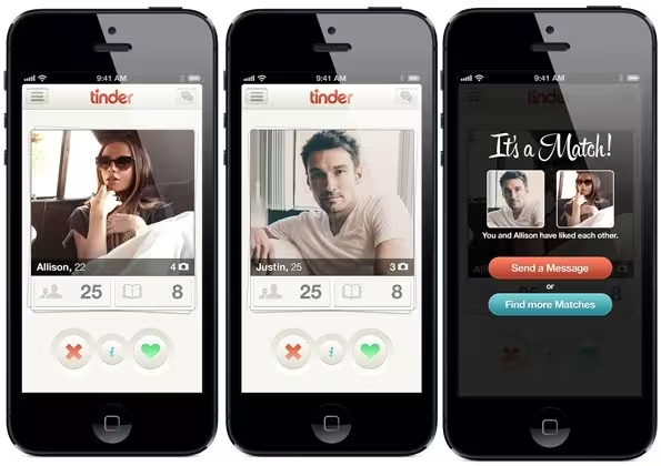
A good example is the wildly popular dating app Tinder. One of the reasons it’s so popular is the ease of use it offers, compared to other dating apps. All a user needs to do is swipe left and right according to their interest in the date offered to them by the app – something an average person can do (but probably shouldn’t) even while fairly drunk.
Multitasking and division of attention
When planning your app, it’s important to think about the time and place your users are likely to use your app. Generally speaking, mobile users are an impatient crowd and if the app requires more attention than they’re willing to invest or if it’s too slow to respond to their commands – they’re likely to abandon it for another.
Casual games like Candy Crush and Angry Birds can usually be operated with a single hand, do not include a time limit (for the most part) and do not require constant attention to the game. This dramatically increases the range of opportunities for the user to access these apps, even while doing something else completely.
Any delay, even the tiniest one, on the user’s way to satisfying the need that caused them to run the app in the first place, may cause them to leave the app, never to return. A truly sticky and addictive app should not only have a polished and bug-free interface, but also needs to deliver the most value in the shortest time.
Sure, we want the user to spend more time using our app, but the way to achieve this is by offering more value rather than “traps” that will waste the user’s time and annoy him.
The illusion of control and loss aversion
In a research conducted by psychologists in 2011 it was discovered that one of the strongest indicators of the level of happiness people feel in their lives is their perception of the level of free choice and autonomy they possess. According to the researchers, autonomy and freedom have a greater influence on the level of happiness than other variables such as wealth.
We like to be in control. We also like to choose what, when and how we control things. Our need of control combined with the freedom to choose is one of the main drivers of the popularity of computerized role-playing games (especially open world “sandbox” games) and various simulation games like The Sims and even the old Tamagotchi devices from the 90s.
Our mind works in such a way that we feel some satisfaction when interacting with a game that gives us a measure of self-expression and control over different aspects of the experience – be it the hair color of the character we choose to represent ourselves or the types of vegetables we grow on our virtual farm.
Loss aversion is a psychological effect that encourages repeated use and addiction by making us believe we can re-gain what we’ve lost if we keep investing more.
For example, look at gamblers who’ve lost a sum of money on a bet and are then requested to stop betting. In most cases, they will resist and ask to continue because human nature causes them to believe they can win back the money they lost if they keep betting.
In the mobile app and gaming world you can see this principle used in games like FarmVille. In FarmVille, if you miss the time frame in which you can harvest your crops they will die and you will not gain the points you would have had you harvested them in time.
The human brain will demand the user returns to attend to the crops, even if at the time he’s doing something far more important than playing a farm simulation game.
Innovate and excite with care
In order to create an addictive effect the usage experience has to leave a positive impact and create a weak positive emotional response in the user.
Why a weak emotional response? Because a strong and overwhelming emotional response it not only hard to achieve, but can also exhaust the users over time, causing them to avoid using the app when they don’t have the leisure to engage in a full-on emotional involvement.
Moreover, in order to preserve the users’ interest in the app you will need to gradually provide more excitement to keep them coming back, while at the same time trying to avoid creating an emotional overload.
When designing the user experience with an app it’s also important to include an effect of constant innovation, growth and improvement. Every time the user accesses the app, his experience should be slightly different than the one he had the previous time.
For example, a brand app should show new and up to date discounts, news and product suggestions to the user as soon as they launch it. At the same time, create a sense of expectation you can meet. The aforementioned brand app can announce an upcoming sale or product launch, offering users to set a reminder to check the app on a specific date, for one.
It’s important to note that the constant innovation and positive expectation effects are not suitable for all apps. For instance, an e-hailing app that is used to simply hail a cab and pay for the fare doesn’t need to innovate or excite much – it simply needs to deliver the service quickly, effectively and at a competitive price.
You should also be careful not to overdo it with innovation and application of changes in order to retain your users. Don’t go around re-designing the app look and feel every other day and don’t start moving around buttons or functions the users have grown accustomed to – people aren’t huge fans of change, especially when it comes to things they’re used to over time.
If the user accesses a familiar app only to receive an unfamiliar interface, odds are he’ll get confused, frustrated and then close the app, never to open it again.
Next: Engaging subconsciously
Engaging the conscious and subconscious minds
In order to create an addictive experience (one a user will want to repeat) we must message and engage the user on both the conscious and subconscious levels. The conscious is the part of our psyche that makes logical and intelligent decisions.
For example: “I need another 10 points in the game in order to move to the next level, so I should invest about 10 minutes in playing in order to do so.” The subconscious makes faster and more emotional decisions, sometimes without us being aware of it at all.
Another instance: the subconscious creates a connection between the sweets in Candy Crush (or the fruit on a slots machine) and the positive experience of the sweet taste. The subconscious is also much easier to influence using simple tools like colors.
Experiments have shown, for example, that people will find a portrait more attractive if the model is photographed against a red background. They will also eat less if food is served on a blue plate rather than a white one.
When designing the interface of your app, try testing different colors and user flows with your test groups to see which colors, design elements and interactions increase app stickiness and time spent in the app.
If you can create a positive subconscious experience (by connecting app components or processes to positive experiences or evoking a positive emotional response) along with a conscious thought-provoking process of progress and increasing challenge, you can cause a certain level of addiction in the users of your app.
The compulsion loop: Do it again!
Many games are based on a simple repetitive action followed by positive feedback. This positive feedback causes our brain to release dopamine – a neurochemical that affects learning processes and the sensation of pleasure. Our brain, wanting another surge of dopamine, encourages us to repeat the action we performed to get it. This is the compulsion loop.
The compulsion loop in fortune games and most casual games is usually quite similar. The user is offered a challenge that requires action. The user performs this action and is given positive encouragement or some kind of reward (such as points in a game) which in turn triggers the dopamine emission in the brain.
At this point, a new challenge is presented to the user. And so on.
For example, in Farmville, the user chooses the crop he wishes to plant. When the crop is ripe and ready to be collected, the user clicks to collect it and receives virtual currency in return that allows him to buy additional seeds to plant.
In Candy Crush Saga the compulsion loops are brilliantly tight and effective: move the candy, create the line, get the score and positive encouragement and again, until you finish the level or fail. The levels themselves are a kind of compulsion loop – your get the positive reinforcement and proceed to a more challenging level.
The tighter and smoother the compulsion loop, and the more effective is the positive reinforcement, the harder it is for the user to stop and get out of the loop.
Just one more round, yes? This is one of the reasons people play so many hours a day playing Candy Crush or Flappy Bird.
Organizing patterns
The human brain likes to organize things. At a young age we begin to play with completing shapes and patterns, solving jigsaw puzzles and similar games. We derive automatic pleasure from bringing order to chaos.
Our psychological need to complete patterns has led to the production of organizational games from the very dawn of the gaming industry. Among the many examples you’ll find classic games like Tetris, Sokoban and Solitaire.
“Look at me!” – Something to be proud of
Whether we’re aware of it or not, we all want to be somehow better than others. This isn’t only because it makes us feel better about ourselves, but also because it gives us something that allows us to present ourselves in a positive light to others, supposedly earning higher popularity and acceptance with other people.
According to studies, people invest vast amounts of time, resources and energy in order to appear better to others. Even if it sometimes comes on the expense of other personal needs.
“Free to play” gaming apps that base their revenue model on IAPs (in-app purchases) often rely on this type of human behavior when offering in-game content that has no effect on the gameplay itself, but only on the appearance of the player avatar. Some users will invest real-world money in purchasing in-game decorations for their character because in their perception, this makes them appear to others as invested and financially capable of such investments.
Score-boards in apps create a measure of competition between the users and it’s obvious that any player is striving to have their name featured in the list, presenting to other app users their accomplishments in this specific app. Social media integration further increases the ability to “show off” accomplishments by displaying them not only to friends who use the same app, but to all social media followers of the user.
For the user, this answers the need to “show off.” For the app developers, it’s basically free advertising aimed at the friends of an existing app user.
Activity tracking apps like RunKeeper and Endomondo encourage people to “show off” their accomplishments.
Over-the-top feedback to success
Have you ever wondered why slot machines make so much noise when you win, even if it’s a small sum? It’s not only aimed at attracting the attention of people around the machine to the possibility of winning, but also in order to create an exaggerated response to success, even if it’s just luck.
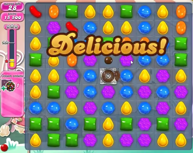
In the app world, this works in the same way. In Candy Crush, your move will be described in colorful letters as “Tasty!” or “Unbelievable!” even if the cause is just lucky placement of the candy on the board rather than your skill in the game.
Obviously, this sounds silly when put in perspective, but this effect works, especially in games, and amplifies the positive reinforcement that encourages the user to stay in the compulsion loop previously mentioned.
Hedonic adaptation
“Good things come to those to wait” is a well-known old saying. The truth is, that it’s mostly an illusion based on something called hedonic adaptation.
In essence, it’s a psychological effect that means that the longer you wait for something (within certain boundaries, of course) the more you will enjoy it when it comes and the more you will want to experience it again.
This effect is the cause of many human behaviors. For example, the concept of “playing hard to get” in a relationship as a means of increasing the other side’s interest.
It’s also the concept behind the limitation on number of rounds or games one can play before they have to wait for another chance. For example, in Candy Crush, you run out of “lives” while in Clash of Clans you need to wait a while before you can enter another build or upgrade order
Of course, the more addicted the user is to the app, the harder the wait will be for him, and this is where app developers make their profit, offering the players a way to avoid the wait by paying a small sum of money.
Conclusion
If you go over the list of apps you use on your mobile, odds are you will find evidence of at least two or three of the of the addictive app properties we’ve discussed.
In the highly competitive app market of today, app developers who want to succeed in the long run understand that success is not only about creating an awesome app and acquiring users, but also about creating a user experience that is fun to repeat.
Even if the goal of your app is curing the addiction to mobile (and of course “there’s an app for that” already), it needs to be at least somewhat addictive in order to retain users over time.
Read next: The psychological addiction behind Facebook’s success
Get the TNW newsletter
Get the most important tech news in your inbox each week.


