Yesterday the FedEx Santa Claus dropped off a new Toshiba laptop at my door. It’s a capable machine, with a Core i5 processor and 6 GB of RAM. It’s on loan to me for testing purposes, and I thought I’d see how it will do with Windows 8, as anyone who buys the machine today would have the ability to upgrade on the cheap.
So I snagged a copy of Redmond’s upcoming touch-friendly, hybrid OS and loaded it up sans problems. Upgrading from Windows 7 was a breeze, and offered plenty of options to keep my existing files, keep only some of them or to start anew. The on-boarding process was even done very well, eschewing the worthless scroll of tips and facts that we’ve seen in previous versions.
But then the first boot happened. That’s when all of the fun things stopped. Mind you, I’m an OS X user on a daily basis, but I came from 20 years of using Windows. I’m not at all unfamiliar with the OS, nor do I shy away from change. I just think that change should be done well, and in this case, it’s like Steve Ballmer is sitting in Washington state, chuckling and sweating as we all try to figure out how to operate this beast.
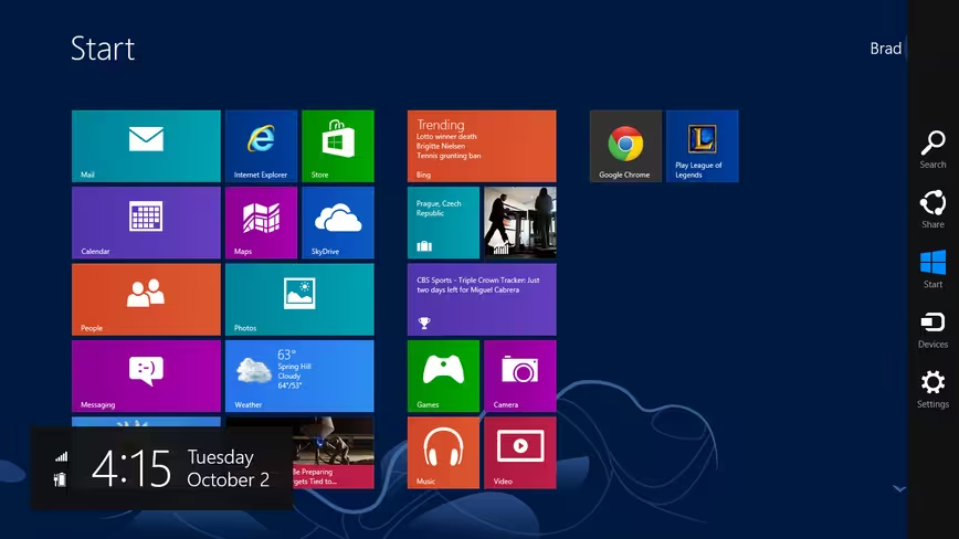
Let’s start with the Met…err…”Modern” interface It’s tiles. They look nice. But if you are just looking at the screen (which you will be, because that is what you’re going to boot to every single time, even on a desktop) it appears that your options are pretty limited. Yes, you’re instructed to mouse to a corner of the screen to see more, but even those options don’t reveal much:
Looking at this screen, it appears that you’re only allowed to click on the tiles that are there. I did manage to install a couple of apps, as you can see, but even that was frustrating. Using Chrome, for instance, you’re able to sign in and sync your installation. But if you switch to Desktop mode, you’ll have to sign in again. It’s as if there are two separate versions of the same OS running, and neither of them are talking to each other.
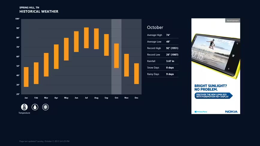
I dug around, looking through the tiles. As with Windows Phone, I’m a fan of the Live Tile idea, and it works pretty well for a start screen. It provides a wealth of information, such as incoming mail, news headlines and weather. Deciding to look at weather, imagine my surprise when I noticed an advertisement in the app. Mind you, this is a bone stock installation of Windows 8, that you will have to pay for. This is not a pre-loaded version with crapware from an OEM.
Microsoft…why are there ads inside my OS? Didn’t I just pay you money to use it? Should I have to pay more to get rid of the ads? Or is it even possible?
Ahem. Moving on.
I wanted a screenshot of the ad, so I did what most users would — I used the Print Screen button and then went to paste it into Paint. But wait…where is Paint? It’s not in the tiles. So let’s go to Desktop mode and press the Start button to get the menu. Oh look…it’s tiles again. Maybe if I browse the computer via Windows Explorer? Nope. No dice. At least without fully navigating the app’s path. A search returned nothing, even for mspaint.exe
What. The. Crap?
So off to the Twitters I go, to rant and ask questions. Come to find out, if I press the Windows button and start typing, “The Ocho” will start finding things for me. But there’s no visual clue of that. There’s no box. There’s no magnifying glass. There’s not even Clippy, chiding me for wanting to search. I’m just expected to know that, on this screen with a bunch of tiles, displaying information that I don’t really want to see, I can type and things will happen.
@bradmccarty hit the windows key and type paint, is that so hard?
— Tom Warren (@tomwarren) October 2, 2012
Now back to the Modern vs Desktop thing. I like Modern. I dislike scrolling down to scroll sideways when on a laptop, but I like the rest of the idea. It would make a great second-screen interface, for at-a-glance information. But you can’t do that. It’s one or the other. Always.
In Modern, Windows 8 makes quite a bit of sense. I get the feeling that, on a touch screen, it would be great. I’m honestly pretty excited for the Surface tablets, because I want to use the OS in the way that it feels like it’s designed to be used.
But then there’s Desktop. While most of your daily operations will be the same, you’re almost forced back to Modern at seemingly odd intervals. Want to launch an app that isn’t on your desktop or the quick launch? Back to tiles. Feel like accessing the Control Panel or Management options? Tiles.
It’s not that tiles are bad, it’s that the experience of being jerked back into them when you’re working on the Desktop is jarring. There’s nothing elegant about it. Your entire UI changes. Your whole screen is suddenly different. It’s like you’ve literally stood up, moved to a different computer and now have to use it to accomplish what you need.
I titled this as being from a Mac user, but really I don’t think that it matters. These are UX problems. It doesn’t matter what you’re used to, Windows 8 isn’t it. Microsoft has taken that adage of “the UI should disappear” and gone entirely too far with it. If I have to stop and think about the steps necessary to open a program, something’s wrong.
There’s a big difference between ushering in a new era of computing and body-slamming someone into it. If Microsoft wants us all on tablets as a primary computer, Windows 8 will be a great way to do it. But forcing us out of the familiar Desktop, into something that simply doesn’t work well on a standard computer? That’s confusing at best. How it feels, and most of all how it works? It’s all a bit Frankenstein right now, leaving you feeling like you’re walking on a bolted-together structure that might fall apart at any given moment.
You’re close, Microsoft. What you have are two really good operating systems. Win 8 Modern is fantastic, and will be great on a tablet. Win 8 Desktop is capable and familiar. But, akin to introducing your wife to your girlfriend, it’s just a really bad idea to put these two together. Find a way to make them dance, or you’re going to have a bad time.
Get the TNW newsletter
Get the most important tech news in your inbox each week.


