
Whether you think the future is HTML5 or native, Android or iOS, one thing we probably all agree on is that mobile is edging increasingly towards the center of the media-consumption realm.
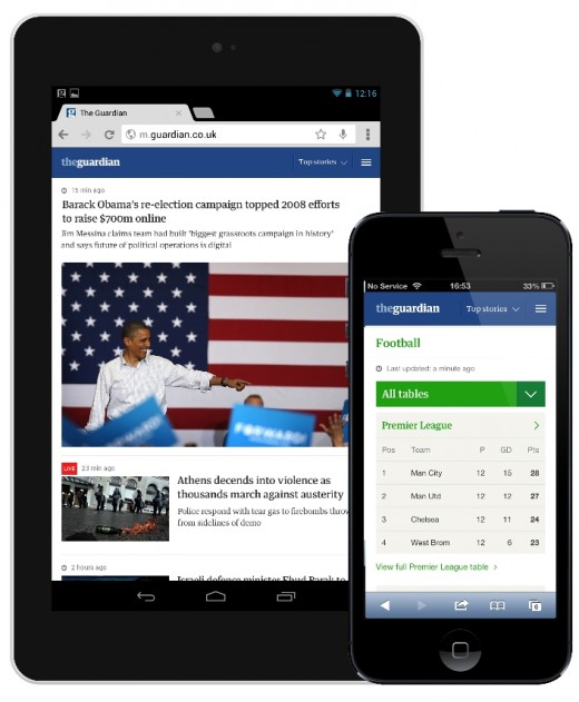
With that in mind, Guardian News & Media has launched its new mobile website after a successful one-month beta trial, underpinned by ‘responsive’ design principles to adapt to any mobile form factor. The site is available at m.guardian.co.uk – or m.guardiannews.com in the US – and was built entirely in-house.
‘Responsive’ is very much the cool kid in school, and follows the BBC’s recent roll-out of its own responsive mobile site. Ultimately, it helps cater for ‘all the other’ mobile platforms that don’t have native apps, with the Guardian currently only catering for Android, iPhone, iPad and Kindle in this regard.
The new site will also appeal to those who simply prefer to access the main online portal, even where there is a native app offering.
The Guardian’s first mobile site went live initially way back in March 2009, and was given a makeover almost two years later in 2010. The mobile site draws in almost 13 million unique visitors per month, with 680,000 average daily unique users.
“As the use of mobiles and tablets continues to grow rapidly, so does the range of devices and screen sizes on which people are reading us,” explains Tanya Cordrey, Chief Digital Officer, Guardian News & Media. “Our own mobile traffic has grown an incredible 63% year on year and, in line with our digital first strategy, we want to ensure our readers have the best possible experience when looking at the Guardian website on any type of small tablet or mobile.
“Smartphones and tablets are an important part of our digital growth strategy,” she continues. “At the start of 2011, mobile devices accounted for just over 10% of visits to core Guardian products, but less than two years later, that’s now closer to 30%. And there are already times in the week when the volume of mobile traffic is greater than on desktop such as 6am and 7am in the morning Monday to Friday and on Saturday afternoons.”
It’s also worth noting that traffic from all smartphones and tablets (including apps) accounts for almost a third of the Guardian’s online traffic. Compared to the corresponding figure of 10% at the beginning of 2011, it’s clear to see the impact mobile is having on its business, a trend we’re seeing across the digital media realm.
➤ Guardian Mobile Site – UK | US
Feature Image Credit – Thinkstock
Get the TNW newsletter
Get the most important tech news in your inbox each week.