2016 is going to be a big year for The Next Web.
TNW Conference Europe will be the biggest so far, with more than twice the number of attendees. We’ll also have a new HQ and the team is growing exponentially.
The TNW brand is also evolving, and you’ll see that reflected in a new logo and a website design refresh soon.
We asked our Head of Design, Alexander Griffioen, to explain what inspired him on the redesign.
First of all, why change the logo?
When I joined TNW in 2012, it was quite a different company.
Our “I have no idea what I’m doing” merchandize strapline wasn’t far from the truth. We didn’t have a clear why.
Fast-forward four years and it turns out we did quite alright. We’ve multiplied our readership, expanded into the US and tripled in size with people that know exactly what they’re doing.
We’ve matured – except on Fridays – and we’re taking our brand more seriously than ever. In doing so, we’ve learned that our trusty logo failed to meet some requirements for evolving our visual identity:
- In today’s flat design zeitgeist, our quintessentially Web 2.0 logo looks dated. This is not to say a logo should submit to the design trend du jour, but it should avoid trends altogether in order to age well. The gradients also added headaches and expense to screen printing on merchandise.
- Attempts to simplify our logotype by removing the gradients resulted in an unpleasant blob where the N meets the W. It simply doesn’t work in one color, which is a shame considering a lot of the startups we endorse put our logo on their websites – often in a single color. A logo that goes places should be absolutely fool-proof.
- The safe and friendly TNW logo no longer reflects our company culture. Visit our Conference and the parties we host around it, and you’ll quickly discover we don’t play anything that safe. More importantly: it doesn’t reflect tech.

How long did it take to come up with a final version?
Not that long yet very long. It was among the first of 10 proposals, but it wasn’t love at first sight for our CEO Boris – whereas I was ready to have its babies.
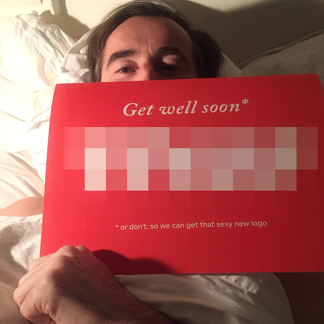
More proposals followed, the site redesign was launched and two conferences came and went, all without a new logo. It took a “get well soon” card after a skiing accident that shattered his collarbone earlier this year for Boris to cave.
That, and some persistent nudging from TNW’s finest (you know who you are, drinks on me).
What were the inspirations for the new design?
The process started by putting into words what The Next Web represents, and subsequently putting those words into something visual.
The answer turned out to be our middle name: Next. We’re obsessed with how tech will shape our future. If the new logo had to communicate one thing visually, it’s “future technology”.
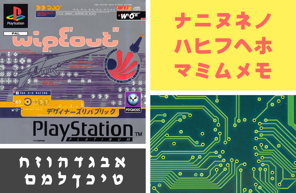
Top left: The futuristic type design in the WipEout PlayStation franchise by The Designers Republic™ was a great source of inspiration. It was designed in the late 90’s, but in such a way that it will still look futuristic decades from now.
Bottom right: The 45º angles of the copper tracks on a circuit board informed the shape of the characters to represent tech.
Other: We pride ourselves in covering global tech news, so I wanted the characters to look somewhat nationality agnostic. Hebrew and Katakana alphabets offered some inspiration there.
Despite the fact that the new logo doesn’t look out of place in the team lineup for Wipeout – a game that much of the team grew up on – it has a sense of being perpetually futuristic.
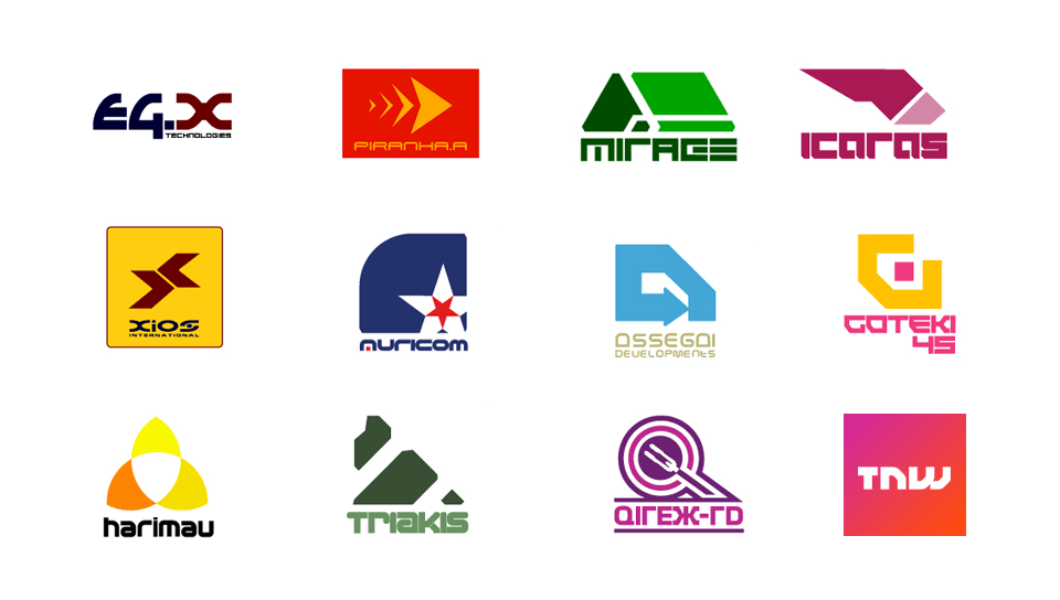
That video game is now more than 20 years old, but the style of font still embodies a future that we’re yet to pass through or reach.
What are the advantages of the new logo?
For starters, I will wear this one proudly on a t-shirt, but that might be the IKEA effect at play.
Seriously though, the main advantage is that it solves the problems I mentioned earlier – it’s fool-proof, versatile and audacious. We believe it’s better to raise eyebrows (have you seen our CEO’s Twitter avatar?) than to play things safe, and our new logo will definitely raise a few.
What about the colours?
It’s still red! The gradient we had on the original logo was great, but it harks back to a time when you didn’t need the versatility that is demanded by today’s vast range of screen sizes and platforms.
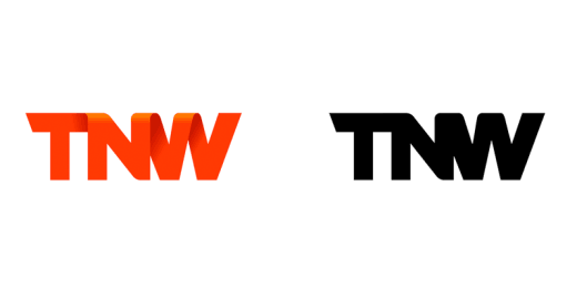
This was most apparent when the logo was small and in black and white, as it is above. The subtle distinctions are completely lost. So we wanted to create something that didn’t rely on such typographic trickery and still stood out.
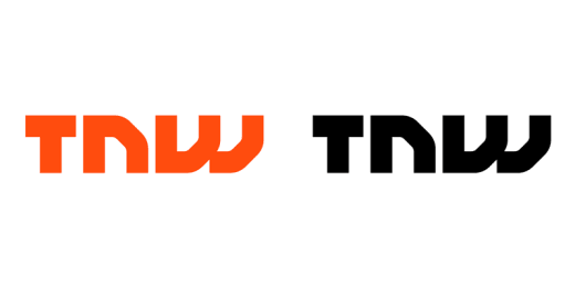
What do you think? Send us your feedback through the usual channels.
Get the TNW newsletter
Get the most important tech news in your inbox each week.

