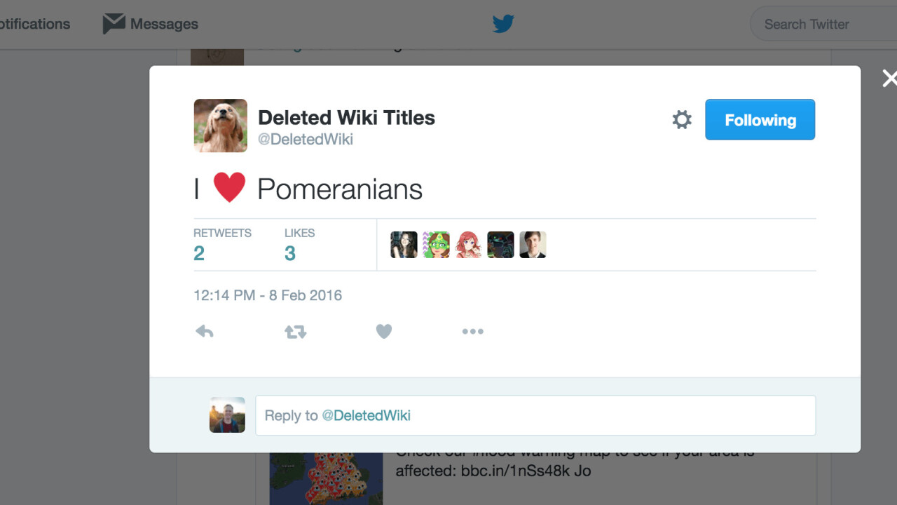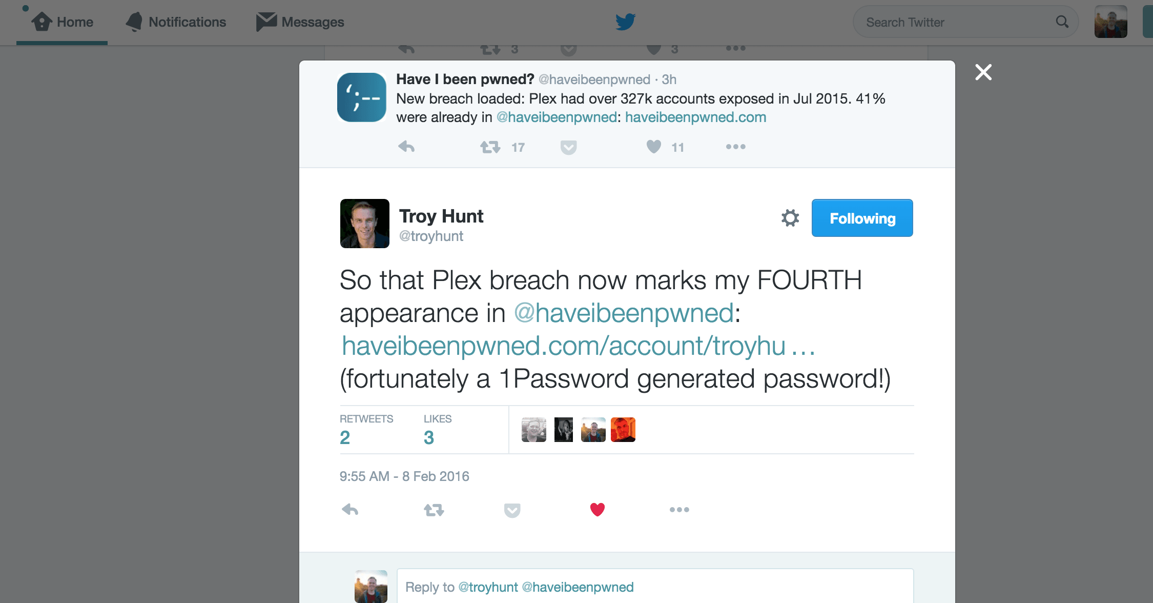
While everyone was mourning the death of the realtime Twitter feed on #RIPTwitter, the company changed the way its Web interface works last week. Now every tweet you click in your timeline is a popup modal — and people aren’t happy about it.
Twitter needs to revert this pop up thing. It takes too long to view replies >_>
— Ainsworth (@AinsworthA) February 8, 2016
Wow that new @twitter POP UP box sure makes threaded tweets/stories hard to read, huh. What a piece of shit. Why do you do this, Twitter?
— Angie Manfredi (@misskubelik) February 7, 2016
Before, when you clicked it would just slide out to display inline but now the company has changed the way it works to pop open an entirely separate modal to show you a single tweet.

I use Twitter Web most of the time I’m on a computer and the change is perplexing — the old way was much more elegant, though it’s clear the company is trying to encourage people to read the full conversation in context rather than just parts it.
Remember when popups and frames were huge in design and you'd popup a small window for things? Like the twitter modals remind me of that
— Guillotine Grrrl (@lindseybieda) February 6, 2016
https://twitter.com/NotHipsterToast/status/695848240332275713
It’s just one simple change, but it has a jarring effect on the way Twitter Web works — the inline slide-in tweet format was that way for years and the popups can be disorienting when trying to read tweets in context.
I really hate the popup when I just want to read a thread on twitter…
— Lene (@sparkilene) February 6, 2016
As of February 7th, Twitter web's modal popup is 2016's worst thing ever
— sikander // 시서방 (@sikander) February 7, 2016
https://twitter.com/SEKAlYEOL/status/696393001052975104
twitter why on earth have you introduced a modal pop-up when i click on an individual tweet? I don't want it in a pop-up, feck off
— Vicky (@NinjaPotts) February 7, 2016
Supposedly the change was made because it’s difficult to keep track of conversations, but it’s not really clear if this is any better at all.
What do you think? Hate it or love it? Let us know in the comments!
Get the TNW newsletter
Get the most important tech news in your inbox each week.


