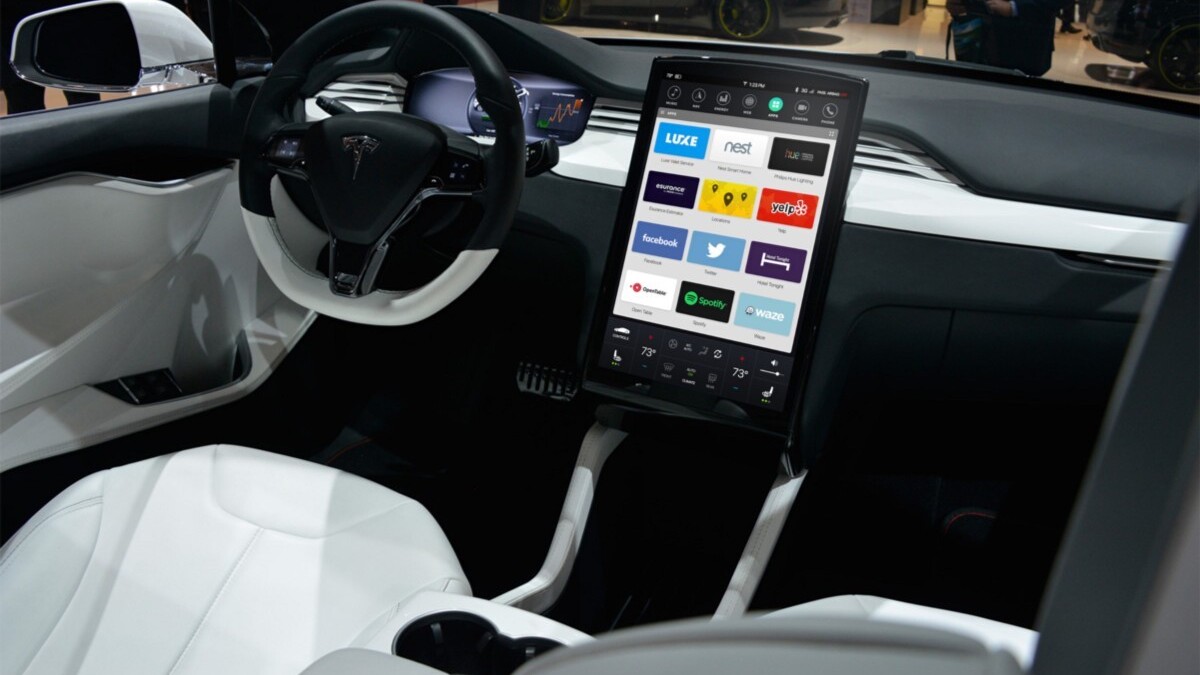
There’s been plenty of talk about Tesla’s upcoming dashboard redesign, but rather than waiting I thought I’d take a stab at a visual overhaul of their current dashboard. The current dashboard UI was quite revolutionary when it first came out, but it’s definitely showing its age with its skeuomorphic visual cues. Buttons looks like physical buttons, while icons are given embossed 3D treatments.
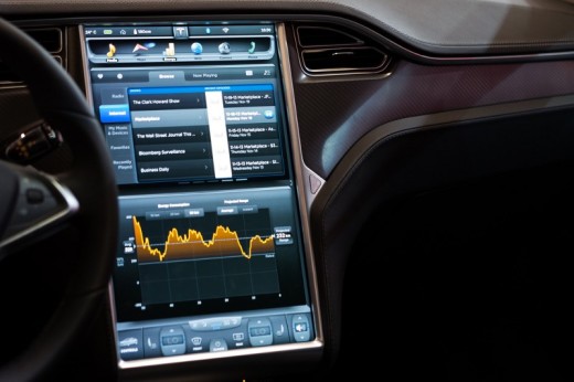
When approaching the redesign, I wanted to keep the UX more or less the same, and focused on reducing the UI chrome and visual noise. I wanted the dashboard to have a clean, minimal UI that was easy to use and scan. Keeping in mind that the point is not to distract the user while they’re driving, I tried to keep things as simple as possible while reducing visual clutter.
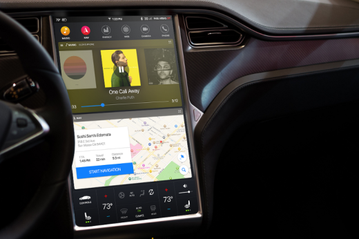
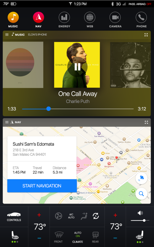
Here’s a close-up look at the redesigned dashboard.
Connected Apps
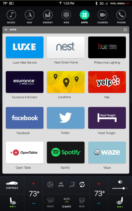
Another concept I wanted to explore is connected third party apps and how they could integrate with the Tesla dashboard. Here’s a concept of a homescreen that essentially functions as a hub for apps.
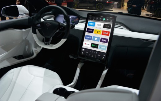
Here’s a close-up view of the app dashboard.
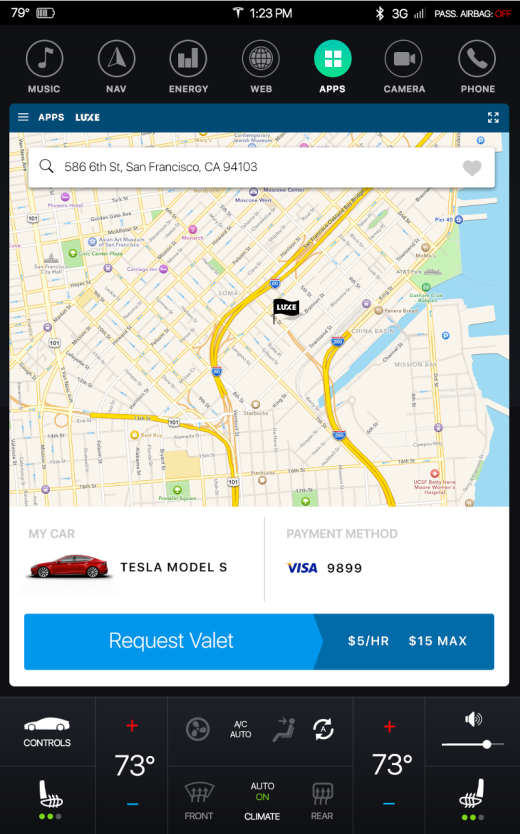
One feature I would love to see is the ability to request a valet service from anywhere. Here’s an example of a user using Luxe, an on-demand valet service app, through their Tesla dashboard.
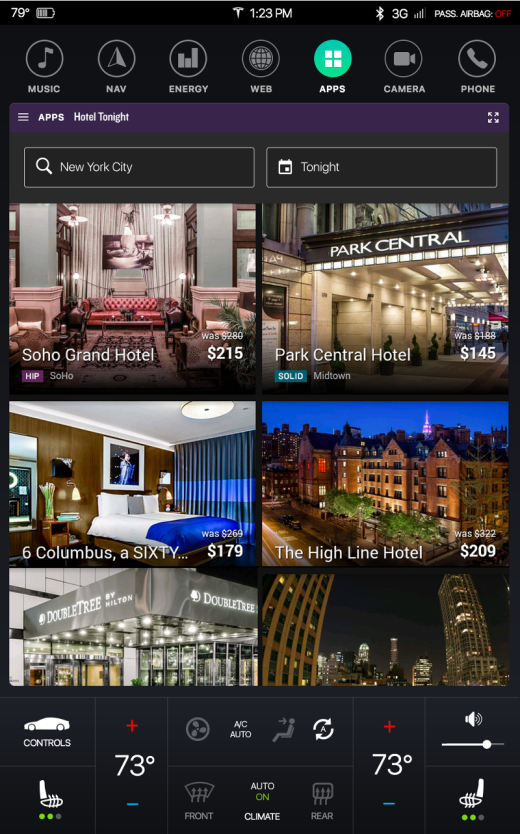
Another awesome feature would be the ability to book hotels on-the-go without having to take out your phone. Here’s a look at the Hotel Tonight app integrated with the Tesla dashboard interface.
Some other examples of apps could be food ordering, shopping, gas delivery, an insurance estimator based on your driving habits, just to name a few. The possibilities for connected Tesla apps are limitless.
This was a fun exercise on how to take existing UI elements and extrapolate them into their simplest form. The hardest part was actually the climate controls at the bottom of the screen. I didn’t want to drastically change the placement of things as users are probably used to where they are, but I did want to simplify each element and give it a minimalist makeover. As to what the actual Tesla redesign will look like, we can only wait and see.
Read Next: Look ma, no hands: Watch a Tesla in Autopilot mode tackling NYC traffic
This post first appeared on Medium.
Get the TNW newsletter
Get the most important tech news in your inbox each week.

