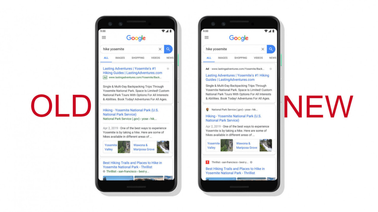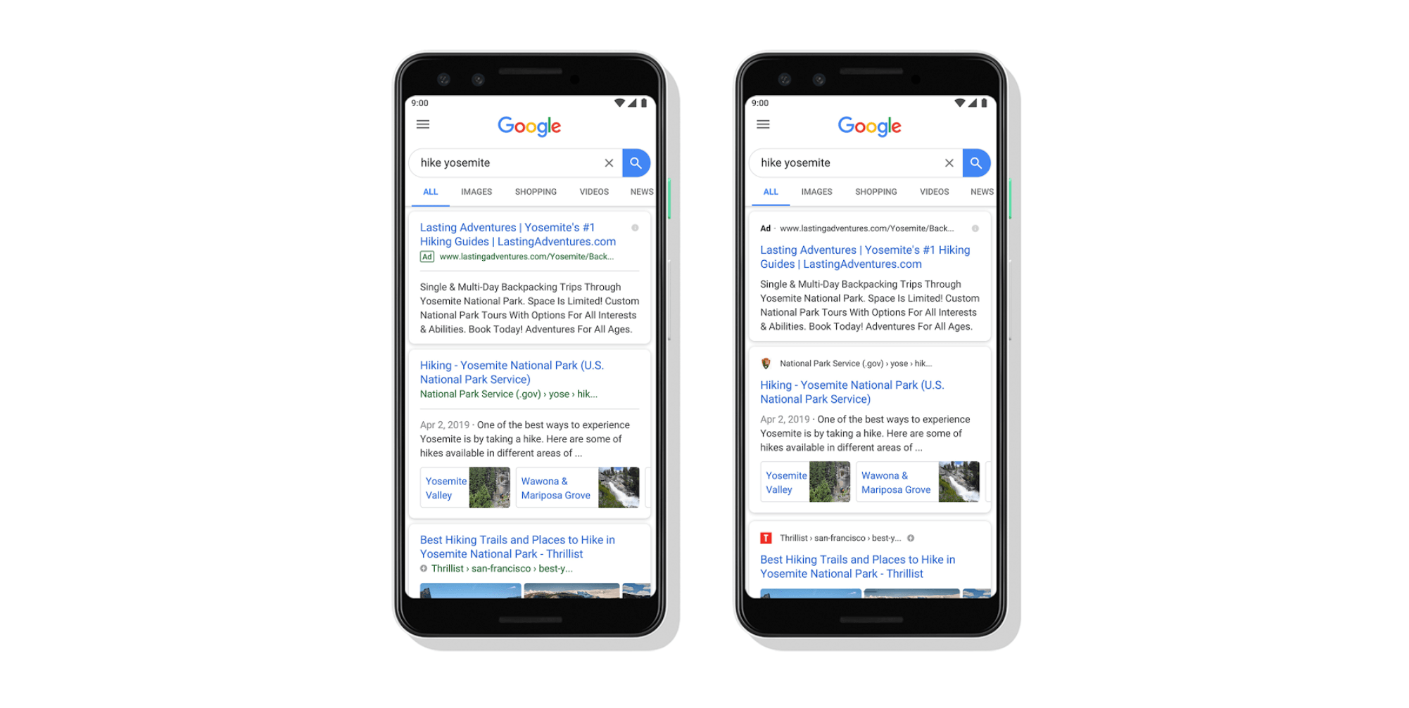
Google today announced it’s making a visual change to Search on mobile devices. Behold:

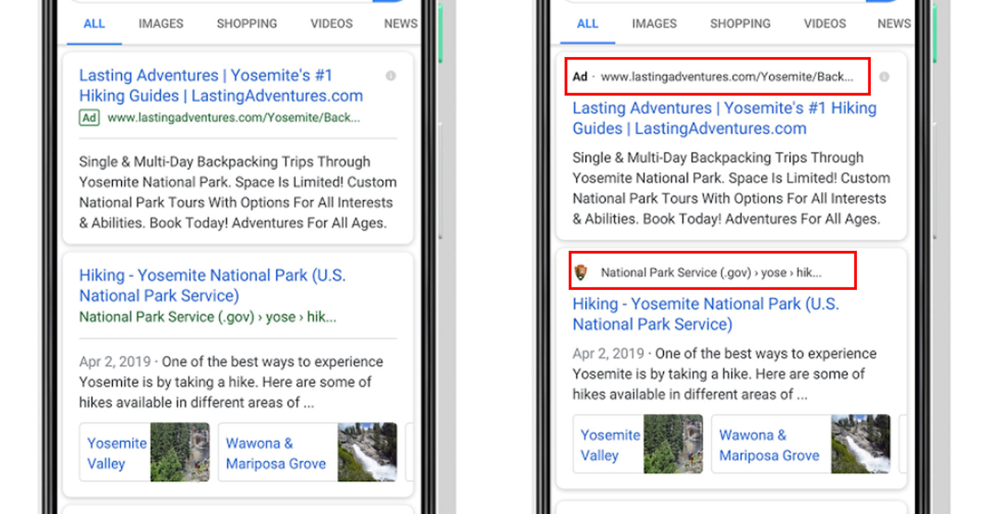
Can you spot the difference?

The “visual refresh,” as Google calls it, is a small one. But it’s also an important one: It makes sure the first thing you see in a search result is where information is coming from, including the site’s favicon/logo. In Google’s own words:
With this new design, a website’s branding can be front and center, helping you better understand where the information is coming from and what pages have what you’re looking for.
It’s sometimes easy to forget that Google itself doesn’t actually provide much information via Search; almost everything you see is sourced from other web pages. But often, simply reading through the wall of blue links and short blurbs nets you the information you’re looking for, without ever having to click through to a site. It may seem like trite, but it’s something Google’s been sued over.
Today’s change is minor, but not inconsequential. It simplifies picking out reputable sources from a crowd of links, it makes it clearer when links are ads, and it makes it easier to acknowledge and remember where the information you see is coming from. You’d be more likely to trust an answer about the distance to the sun from NASA than, say, theearthisflat.com.
Mostly, it’s an important reminder that generally speaking, Google doesn’t create or record information – it just aggregates it. Google says more changes are on the way, but in the meantime, the new design is rolling out to mobile first “over the next few days.” Presumably, it’ll roll out to desktops soon as well.
Get the TNW newsletter
Get the most important tech news in your inbox each week.


