In case you haven’t heard, Gmail got a big redesign recently that’s in the process of rolling out. Now Google Drive is getting a look to match.
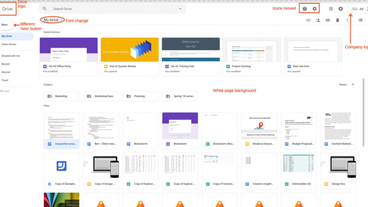
The company today made a small announcement on its G Suite blog detailing the update. Here’s Google’s descriptions of the changes:
- The logo in the top left has been changed to the Google Drive logo.
- If you’ve added a custom company logo, it is now in the top right.
- The Settings icon has been moved in line with the search bar.
- The Help Center icon has been moved in line with the search bar.
- The page background is now white, not gray.
- The “New” button has been updated.
- The font used for headers has been changed.
Or just take a look at this GIF:
Google Drive has used the company’s Material Design aesthetic for quite some time, so the change isn’t quite as dramatic as Gmail’s – but hey, it’s something. I like the colorful ‘New’ button, but not everyone will take kindly to the update, I’m sure.
Either way, you’ll have to get used to it, as the lighter, bubblier Material Design will permeate all of Google’s apps sooner or later. The update is still rolling out, so don’t be surprised if it takes a while to hit you.
Get the TNW newsletter
Get the most important tech news in your inbox each week.


