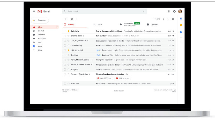
Update (April 25): Google is rolling out the Gmail update to its desktop web interface starting today; to try it, click on the settings button with the gear icon in the top right corner of your inbox, and then click ‘Try the new Gmail.’ To switch back, go to the same menu and select ‘Go back to classic Gmail.’
At the time of writing, the new Gmail option wasn’t available to us, so it’s possible that this is a gradual rollout that will slowly reach all users.
Our original story follows.
Yesterday, Google confirmed a major redesign for Gmail was on the way. We’d seen drafts of a redesign dating back nearly a year ago and heard some descriptions of the new look, but after yesterday’s news, several sources shared images of the new design itself – including some new features.
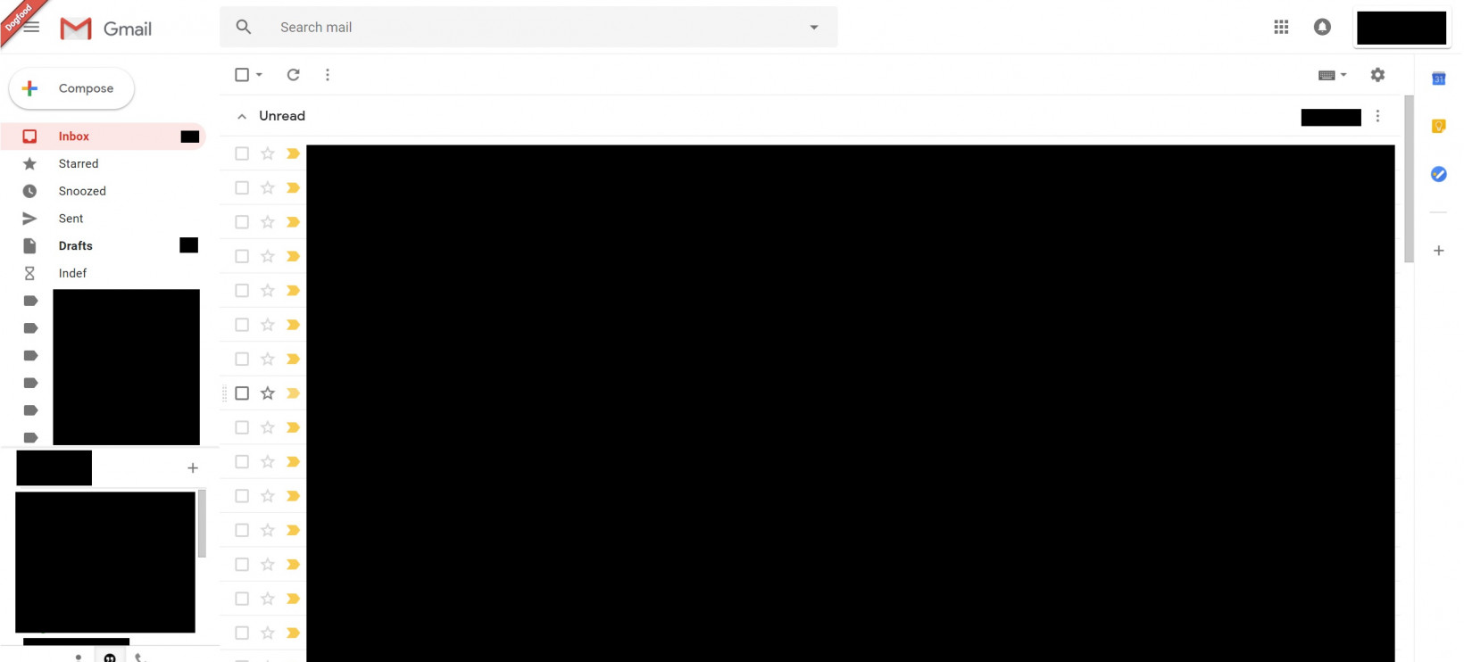
Other than the addition of snoozing and smart replies – which we already knew were coming – the key feature of the new design is a modular sidebar that allows it to integrate with other Google apps.
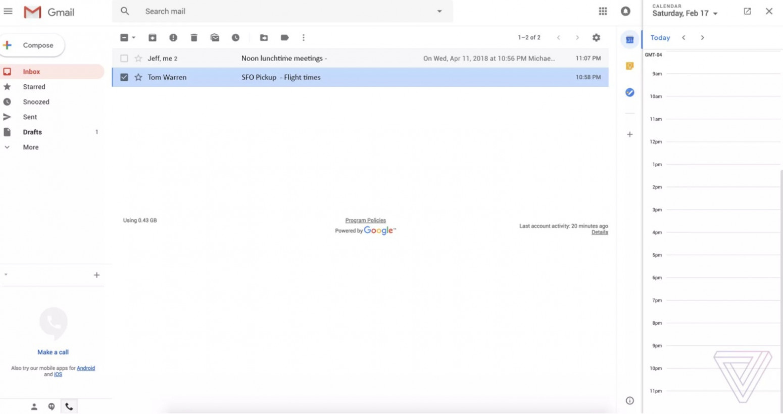
As shown by The Verge, there’s a new sidebar that lets you use Calendar, Keep, or Tasks right next to your email. That means you never have to leave your inbox to create a to-do list or reschedule a meeting. It’s also not a stretch to imagine other apps will be able to integrate with this section, and TechCrunch reports that’s indeed the case.
Google Tasks, by the way, has also long been ready for a revamp. Android Authority shared some images of showing off a new Tasks icon that suggests a new design is also imminent.
For reference, this is what Google Tasks looks like right now… in 2018:
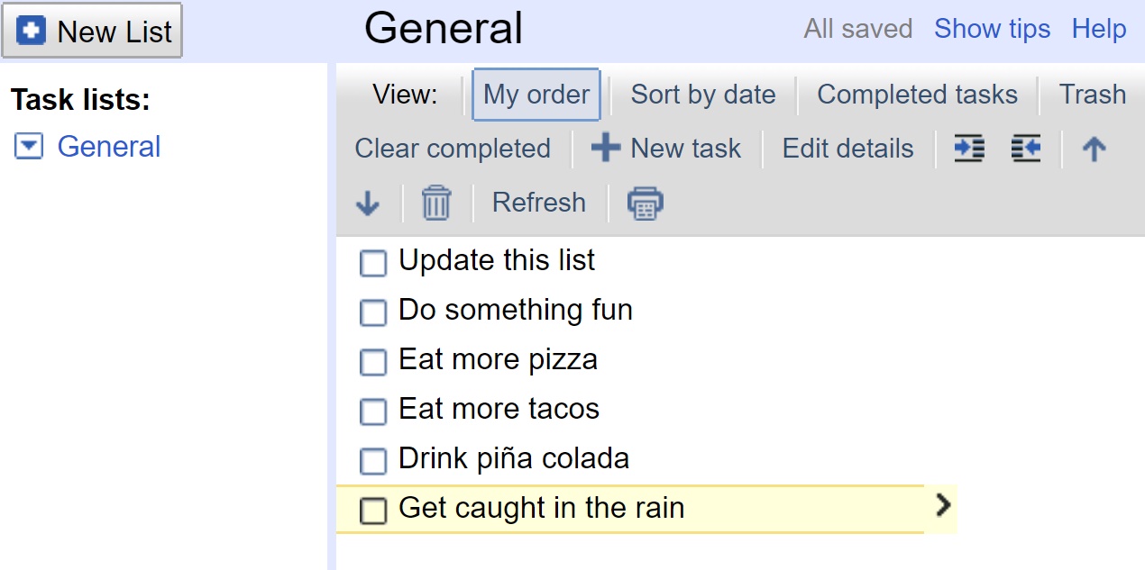
Yeah, I’d say it needs an update. If you access it from your email, it’s mostly a simple check list with due dates. Considering Keep can already pull double duty as a barebones to-do list, I’m hoping Google has some new features in tow.
The new look isn’t a radical departure from the gmail of old, but it does bring Gmail more in line with Google’s current brand of Material Design – note the bubble ‘Compose’ button. That said, it’s not clear if you’ll be able to apply themes the way you can with the current version. I’d miss my ninja backdrop.
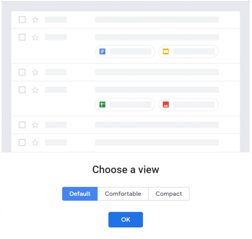
The new Gmail also lets you choose between a few different display modes. The current version of Gmail lets you choose between compact, cozy, and comfortable sizes, but it only really affects spacing between emails.
The new gmail replaces the cozy setting with a new mode simply labeled ‘default’ which highlights attachments within your messages.
Lastly, there appears to be a new loading animation, which is neat, I guess.
Update (April 25): For folks who need to send sensitive information, Gmail is also getting a new confidential mode, which will let remove the option to forward, copy, download or print messages. Plus, you can also make a message expire after a set period of time to help you stay in control of your information.
Get the TNW newsletter
Get the most important tech news in your inbox each week.
