Google today announced it’s bringing a new look to Maps. The new experience has brighter colors, clearer icons and an overall improved user experience.
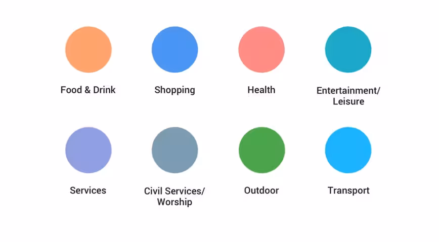
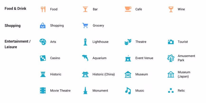
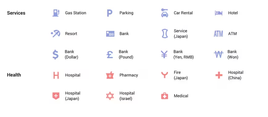
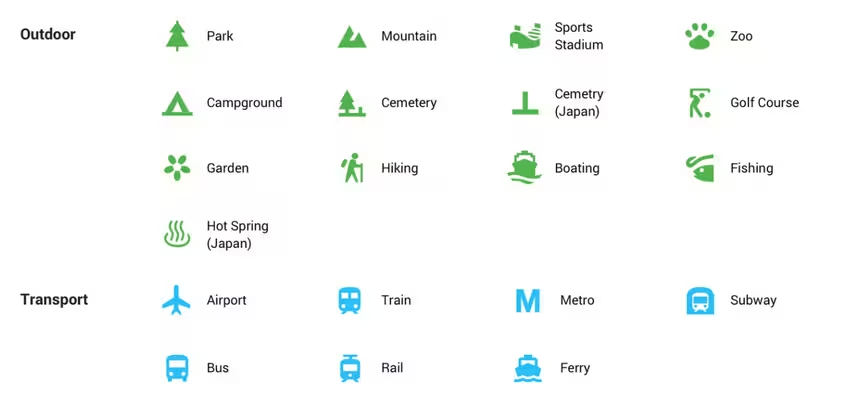
Over the next few weeks users will be introduced to new color keys and icons depending on the category, such as orange for food and drink and pink for health. This comes as an upgrade to the old design, where it was easy to mix things up as icons were small and similar in color.
The idea is that now users can easily spot what they’re looking for. For example, if you’re out of town and have an accident, you can quickly spot a pink icon on the map and get to hospital.
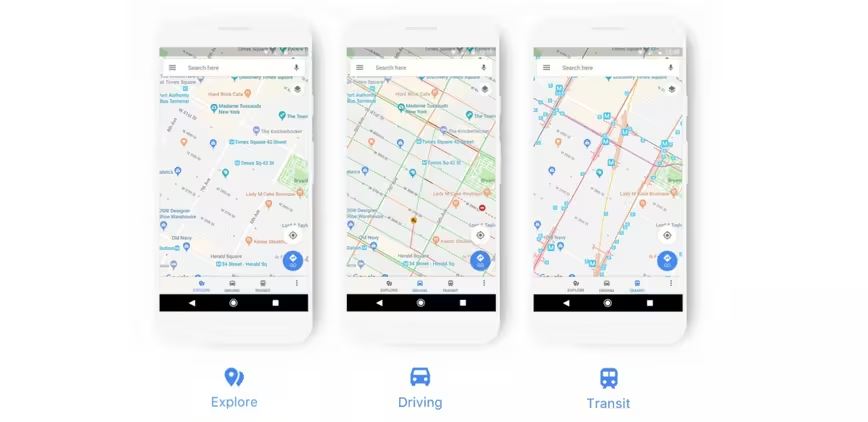
In addition, Google will provide specific maps for different functions, depending if you’re driving, using public transport or simply exploring. If you’re driving, the map will be able to direct you to the nearest gas stations. In the case that you’re using public transport, the nearest train station or bus stop.

The 💜 of EU tech
The latest rumblings from the EU tech scene, a story from our wise ol' founder Boris, and some questionable AI art. It's free, every week, in your inbox. Sign up now!
The update will first be available in all Google products that incorporate Google Maps: the Assistant, Search, Earth, and Android Auto, and eventually apps and websites that use the Google Maps API.
Google’s aim is to keep its maps updated and useful for its users, and hopes to achieve this with its newest updates.
I personally think this was much needed, as the icons previously used were easy to mix up — with a clear color scheme and icons it’s much easier to navigate.
Get the TNW newsletter
Get the most important tech news in your inbox each week.