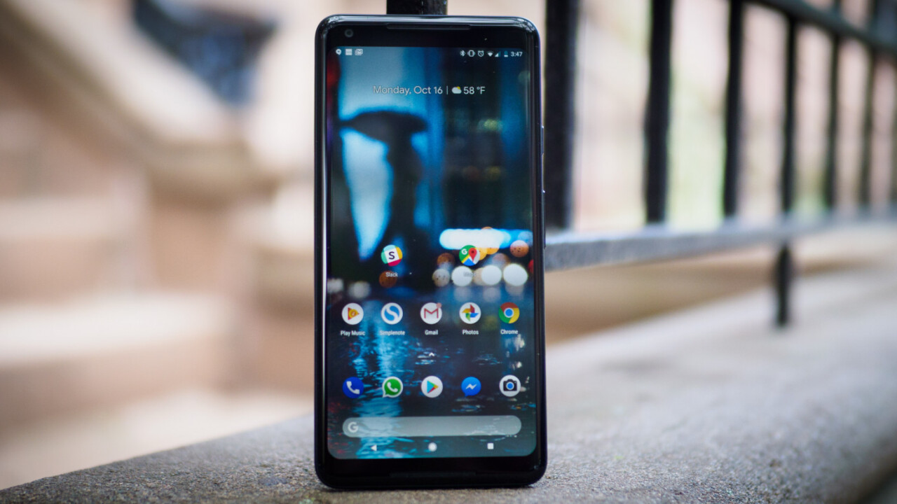
The Google Pixel 2 series was met with near-universal acclaim upon launch, but even from then it was clear the displays would be, umm, divisive.
In particular, the XL’s LG-made display has been a point of frustration, arguments, and overall frumpiness due to a combination of Google’s software and hardware choices. I called it my favorite phone of the year in my review, but have been disheartened by some of the drama surrounding the display. So now I’m here to break down the severity of the issues.
The TL;DR: Much of the furor over the display is hyperbolic, but Google also made some poor design choices regarding color management. Instances of early onset burn-in and/or image retention, however, are serious issues Google needs to remedy. Thankfully, the company is taking at least some steps to ameliorate these problems.
The Pixel 2 XL’s display isn’t the best in a flagship, but it’s also not the worst, and for most people, will likely not be a dealbreaker. This post is not meant to turn around anyone who is disappointed with their Pixel 2 XL’s display, but I do hope to provide some perspective for prospective buyers so they can decide for themselves whether the Pixel 2 XL is worth their money.
Color accuracy over spectacle
The first thing I noticed about the Pixel 2 XL’s display is that the colors are less vibrant than what I’m used to on virtually every other OLED panel – and even many LCDs. This is also somewhat the case on the smaller Pixel 2, but to a lesser degree (more on this later).
However, Google says it’s a design choice, as it decided to promote color accuracy over spectacle – even if it means colors appear a bit dull compared to what you’re used to on other devices. According to the company, the displays are tuned to closely match the sRGB color space – the traditional color gamut used on the Web and a myriad of devices – despite supporting a much wider range of colors (93 and 100 percent of DCI-P3 on the Pixel 2 and XL, respectively).

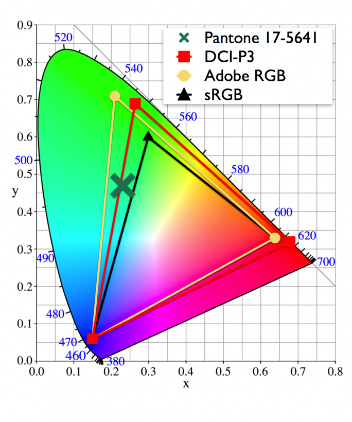
Let’s use YouTube’s new logo to illustrate how this could be a problem. The logo consists primarily of a pure red (plug in #FF0000, or 255, 0, 0 in Photoshop). Problem is, ‘pure’ red has a different meaning depending on the color gamut you’re working with. A device that displays 100 percent of DCI-P3 will be able to create a redder red than one that ‘only’ shows 100 percent of sRGB (or less).
Check out how the reddest point compares for sRGB and DCI-P3 in the graph below. It shouldn’t be a surprise that the red of the YouTube logo looks much more saturated on a device using a color gamut beyond sRGB than the Pixel 2. To people coming from wide gamut displays – almost any other Android flagship released in the past few years – sRGB will appear comparatively muted.
So why stick to sRGB if both of the Pixel 2 models can go beyond? Well, sRGB has long been the color space standard, and its ubiquity helps ensure some accuracy across devices. sRGB is pretty much the only color space used in the Web, for instance, and it has been the default color space on most display devices for ages. When designers are creating apps and websites, sRGB is the assumption.
Furthermore, for most of the computing era, sRGB was more than enough. It wasn’t until the last few years that common display technology in our phones and screens could exceed it, so Google didn’t bother to worry about how to deal with wider color spaces on Android.
That’s led to those super saturated colors we now see on so many Android OLEDs. Pretty as they may be, the colors are not exactly accurate, and can vary significantly from device to device. Without a way for Android to deal with wide color gamuts at an OS level, manufacturers are free to remap colors intended for sRGB however they choose. You can imagine some engineer at Samsung being like “okay, so this shade of red was technically designed for sRGB, but I have all these extra colors – why not use them?”
This isn’t necessarily a bad thing, and with tasteful tuning and some customization options, manufacturers like Samsung have figured out a good balance in lieu of proper color handling in Android. Still, everyone who’s used an Android flagship in the past few years is now used to these vibrant, inconsistent colors.
Then came Oreo and the Pixel 2.
But it’s not sRGB’s fault
To get over Androids reputation for inaccuracy, Google designed the Pixel 2 such that it only displays sRGB unless an app explicitly calls on a wider color gamut (generally defined as any color space more expansive than sRGB). This is a form of color management, and it helps maintain consistent colors even across displays with varying quality. In theory, other manufacturers will eventually follow suit, and we’ll one day live in a word where the red YouTube logo looks relatively similar across various devices.
But there are two problems with Google’s approach.
As Android Police points out, Google went through all the trouble of implementing color management in Oreo, but then didn’t follow through by actually enabling wide color gamut in almost any of its apps. Not in Photos, not in the Pixel Launcher, not in Chrome, etc. Most app developers havent had enough time to catch up. Pretty much the only place you’ll see more vibrant colors is in some games, because OpenGL and Vulkan have native support for wide color spaces.

In other words, Google built this awesome new feature into Oreo, but did little to show it off. This, one hopes, will change over time.
Here’s the thing though: sRGB doesn’t deserve all the hate it’s been geting.
All this talk about Google not leveraging wider color gamuts makes it seem like the color space is some antiquated dull mess, but there are plenty of truly excellent displays calibrated to display 100 percent of sRGB accurately. The new MacBook and MacBook Pros, all the Surface PCs of the past few years, the iPhone 7 and 8, etc.
The real story seems to be that the Pixel 2 XL is just not as perfectly tuned for sRGB as Google wants you to believe.
The most obvious evidence is that the Pixel 2 XL’s colors look slightly different (read: worse) than its smaller sibling, despite ostensibly being similarly color managed for sRGB. Greens and especially reds are a little bit brighter on the smaller model, and closer to what I’ve seen from other displays calibrated for sRGB. Again, the Surface Pro is calibrated for sRGB, but I don’t see anyone complaining its colors are dull.
Measurements I’ve seen seem to back this up. Both Phone Arena and Erica Griffin show the XL has particularly with the XL’s reds showing up a bit darker and less saturated than they’d ideally be, even with the Vivid Colors settings. As developer and display expert François Simond tells me, humans are particularly sensitive to reds because of skin tones. A relatively high gamma point also points to some colors being darker than they should.
Here’s Phone arena’s result for the smaller Pixel 2:
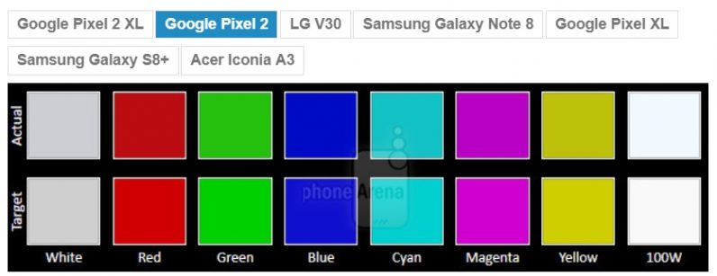
And here’s the larger one. Note the darker red, green and yellow.
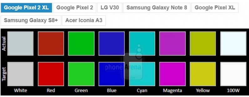
It doesn’t seem to be a problem inherent to the pOLED technology either, as LG’s V30 does not suffer from this issue. Somewhere down the line, Google appears to have simply screwed up the out-of-box calibration.
So no, the Pixel 2 and XL in particular won’t look as vibrant as you might be used to, but despite a rough start, I’m still convinced it’s a good thing for Android in the long run.
I also very much doubt the average, non-techie user will care much. No one I’ve shown the phone to has commented on the colors, even when specifically asked about them. I am a techie user, but found my eyes largely adjusted within a couple of days. I still am using the Note 8 as my secondary device, but now that a few have passed, it’s hard not to feel like its colors are exaggerated.
Still, I do think Google erred too much on the side of caution, and the “Vivid Colors” option in settings – which is enabled by default – hardly makes a difference.
Thankfully, the company recently responded to complaints, saying it plans to introduce a ‘saturated mode’ that will put the Pixel 2’s colors in an unmanaged state – like every other Android device before it. That will allow the devices to show off their full range of colors without being beckoned to do so.
It’s a step forward for people who just miss those ‘OLED colors’, but it kind of defeats the purpose of introducing color management. I’d rather Google simply focus on getting the XL’s tuning closer to the smaller model, fixing reds in particular. I think very few people would have complaints about color then.
The other problems
If the Pixel 2 XL only had somewhat dull colors – essentially a software fix – there might’ve been less drama. But it’s also been plagued by some concerns that are plainly connected to hardware. How serious these issues are will depend on how picky you are.
A prime complaint is that the Pixel 2 XL exhibits a a noticeable amount of blue-ish tinting when viewed from an angle. More importantly, it happens with a considerably smaller tilt than most competing OLEDs.
Since the V30 has a similar pOLED panel, it’s surprising it doesn’t exhibit the same tinting issues as the XL. The prevailing theory is that it has something to do with the circular polarizer – which allows you to view the screen even through polarized sunglasses – on the Pixel 2 XL’s display.
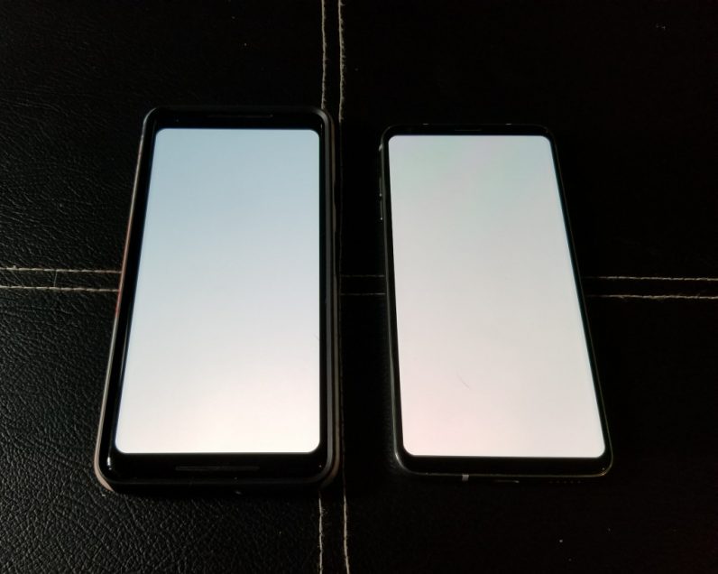
The other issue, which does affect the V30, is graininess on solid colors. It’s there if you’re looking for it, especially at the lowest end of the brightness slider, but it’s hardly irksome.
I feel the complaints of tinting and graininess on the whole have been pretty hyperbolistic for the average buyer. Do I wish the issues didn’t exist on an $850 device? Definitely. But they don’t significantly detract from my experience.
I look at my phone head on most of the time, so the tinting rarely bothers me, and the graininess is also something I only notice when I’m really looking for it. Nearly a month after I first received my review unit, I’ve practically forgotten about the issues, even though I always carry a Note 8 with me.
It’s also worth noting that for a lot of people (like me) OLED is simply a categorically superior technology to LCD, even with the issues on the XL. I wouldn’t take any of the best LCDs of the year – the HTC U11, iPhone 8, or LG G6 – over the OLED in the XL. And in my experience non-techie consumers generally appreciate the immediately tangible benefits of OLED over LCD.
For example, I find the tinting on the XL to be way less distracting than the drop in brightness and contrast on LCDs viewed from an angle, which can often appear as a sort of shimmer. I’ve also rarely used an LCD display of any kind that didn’t exhibit some degree of light leakage or mottled blacks after a month or two – sometimes right out of the box. You can’t use Daydream VR on OLED panels. Most importantly, you never get pure black with LCDs
And hey, some people might actually appreciate having a circular polarizer.
The one issue that is a bigger concern are reports of burn in/image retention. My first Pixel 2 XL was symptomatic after just a week, but Google says its hardware exhibits a similar amount of burn in to the competition. It’s just those have better ways to get around it via software; both the V30 and S8 periodically move around the navigation bar buttons slightly, for example.
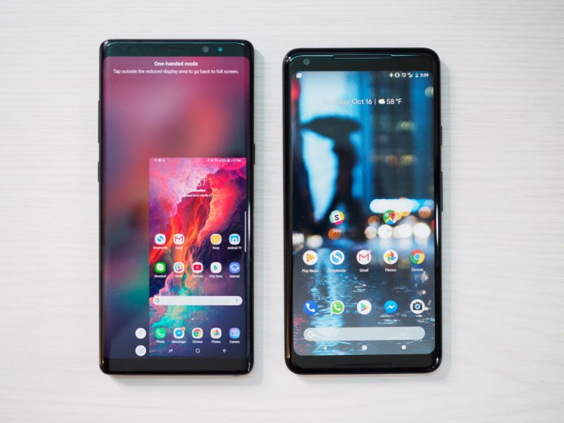
Thankfully, Google already started working on a solution in Android 8.1 arriving next month, by dimming the navigation bar when not in use. I wish Google let us hide the navigation bar altogether, like Samsung and LG, but as long as it stops burn in, I’m happy. Moreover, Google has increased the warranty to two years, which should help assuage concerns of long-term burn-in.
It’s understandable that people are upset over the Pixel 2 XL’s display, considering the display is the main aspect of the phone you interact with. But for everyday use, none of the XL’s problems are serious enough to stop me from making it my main recommendation for most people looking for a new phone. The camera, software, and battery experience are too good otherwise.
While Google should be held accountable for some dubious software and hardware choices, it’s up to you to decide whether those flaws are actually deal breakers. I suspect for most people, they won’t be, but I hope Google addresses issues it can remedy via software sooner rather than later.
Get the TNW newsletter
Get the most important tech news in your inbox each week.


