Hate them or love them, Google is ditching its infamous blob emoji and redesigning them entirely for the upcoming release of Android O.
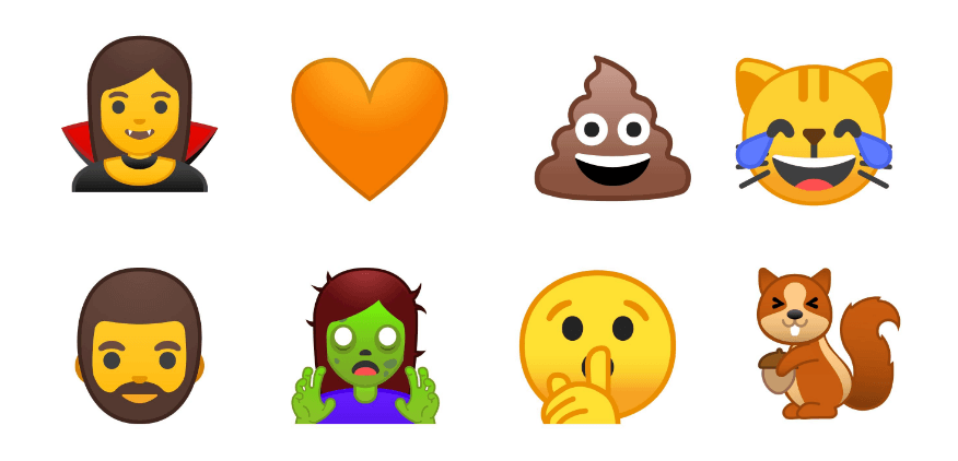
In addition to the redesign, the Big G has become the first major company to announce full compatibility with Emoji 5.0, Emojipedia wrote in a blog post. This means you can expect a slew of awesome new icons like the vomit face and the dinosaur.
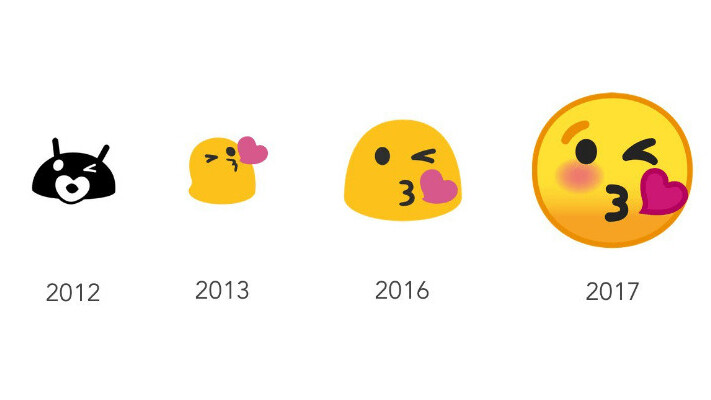
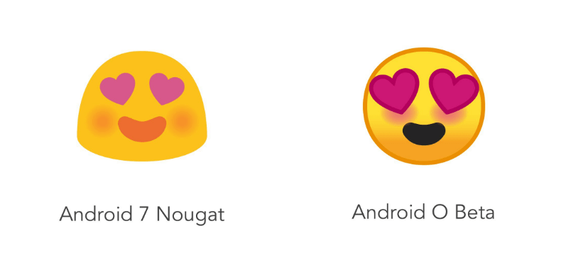
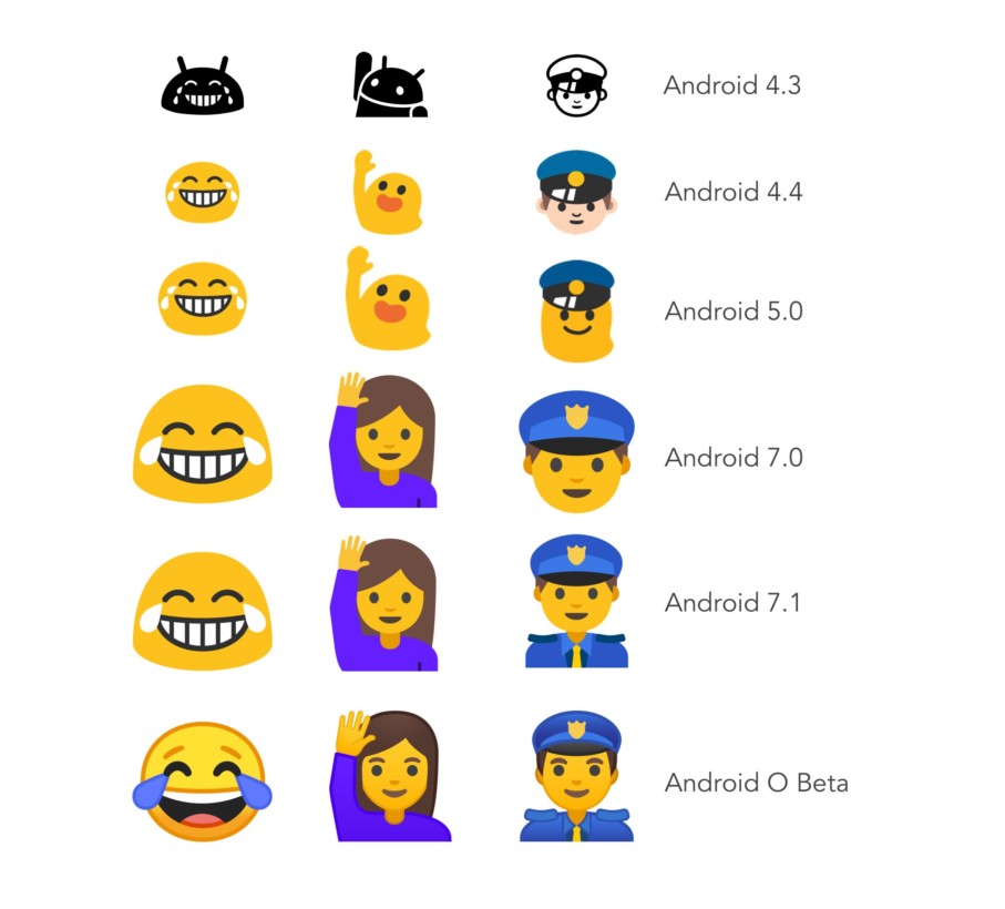
The “blob” shape – which has gradually morphed into more of a “gumdrop” over the years – will soon become fully circular with the arrival of Android O.
Here’s what the new emoji will look like:
The move marks the end of an era after Google first introduced the rather amorphous emoji with Android 4.4 back in 2013.

The 💜 of EU tech
The latest rumblings from the EU tech scene, a story from our wise ol' founder Boris, and some questionable AI art. It's free, every week, in your inbox. Sign up now!
The company will also abandon some of its older Android conventions like refraining from using pink or red in emoji, in addition to bringing tonal strokes around the edges of all emoji as well as a variety of gradients.
Having said that, not every single emoji will undergo drastic changes in design – so you’re bound to see some familiar icons.
While Google is yet to announce a launch date for the new emoji, Android O is expected to roll out in the latter half of this year – though you can download a developer beta version right now.
To bring the redesigned set to all Android users, the search engine giant has also promised to release a feature that would let users install the new emoji on older reiterations of its mobile operating system.
Get the TNW newsletter
Get the most important tech news in your inbox each week.