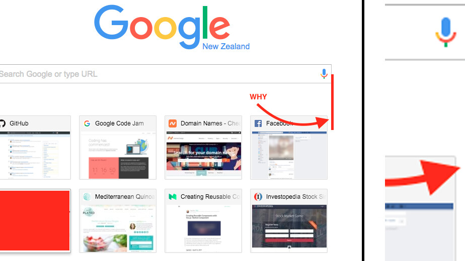
Once you see it, you can never unsee it. It turns out Google has somehow failed to make the ‘new tab’ page in Chrome fully symmetrical.
As you can notice in the image above, while the left side of the search box aligns perfectly with the thumbnails for your most visited websites directly underneath, it leaves out a few extra pixels of space on the right side.
The appalling asymmetry was spotted by a user going by the nickname ‘iamzacharyrs’ who took to Reddit to point out the inconsistency – and irreversibly ruin Chrome for thousands of obsessive-compulsive pedants.
While we’re not entirely sure what’s causing the asymmetry, it most likely has to do with improper use of CSS.
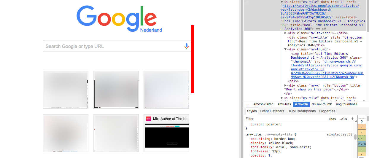
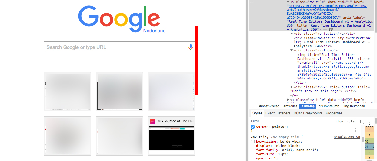
Redditors are speculating the misalignment stems from using wrong box-sizing properties.
We tested this hypothesis and it indeed appears that removing the box-sizing: border-box property fixes the issue.
Here’s the proof of concept:
For context, companies sometimes deliberately opt for asymmetrical designs – like Nintendo and the logo for its Switch console – but it is highly unlikely this is the case here.
Chances are Google will rectify the misalignment in one of its upcoming Chrome reiterations.
In case the asymmetry is hurting your eyes too much, you can easily resort to one of the numerous third-party ‘new tab’ extensions on the Chrome Store.
Blank New Tab Page is a pretty decent alternative if you want something clean and simple.
Get the TNW newsletter
Get the most important tech news in your inbox each week.


