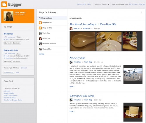
Google’s Blogger is one of the grand old daddies of blog platforms and while remaining widely used, there’s no doubt that the interface itself is looking a bit tired these days. It looks like that’s set to change this year as Google has today teased us with a glimpse at a radical overhaul.
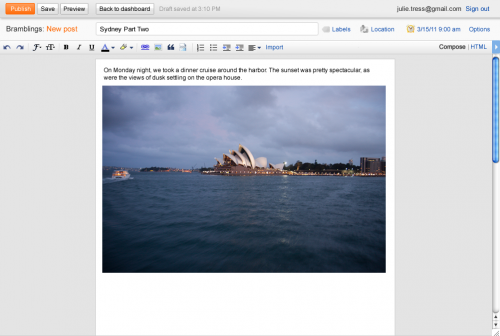
At first look, we’d say WordPress has been an influence on the design of the new dashboard. Google says it’s been built using its Web Toolkit for creating high performance Ajax-based UIs. That ‘Wordpress-y’ look seems a little less obvious in the new post composing window, which seems to hold on to a little more of that old-school Blogger look, while not making us feel like it’s still 2005.
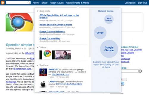
Google is also offering a first look at a content discovery tool that it says “lets you uncover interesting and related content based on the topics of the blog you’re currently reading”. The video below offers glimpses of it all, along with a look at some very sexy mobile themes that it appears will enlivening phone screens at some point this year.
There’s no word on exactly when these new designs will be rolled out other than a vague “2011”, but if you’re a staunch supporter of Blogger I’m sure you’ll be watching keenly.
Get the TNW newsletter
Get the most important tech news in your inbox each week.


