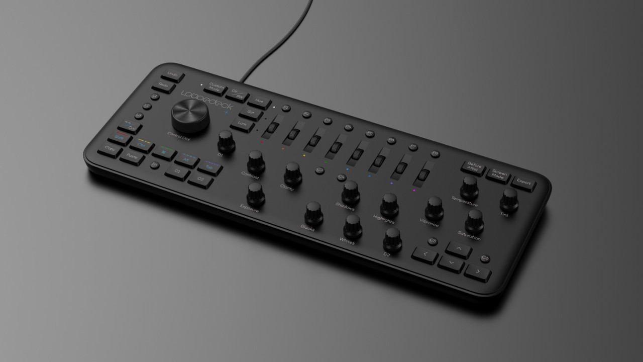
When I reviewed the Loupedeck earlier this year, I was surprised to find it cut down my photo editing time nearly in half – I actually timed it. A chunky slab full of knobs and buttons, it adds an intuitive tactile element to the normally grueling process of editing hundreds of photos.
Problem was, it felt cheap. Even though it was effective, it didn’t feel great to use, particular due to flimsy buttons.
That’s no longer an issue. The new Loupedeck+ addresses all of my big complaints with the original hardware. Though I’ve only had a couple of hours to play with it, it’s already infinitely more satisfying to use.
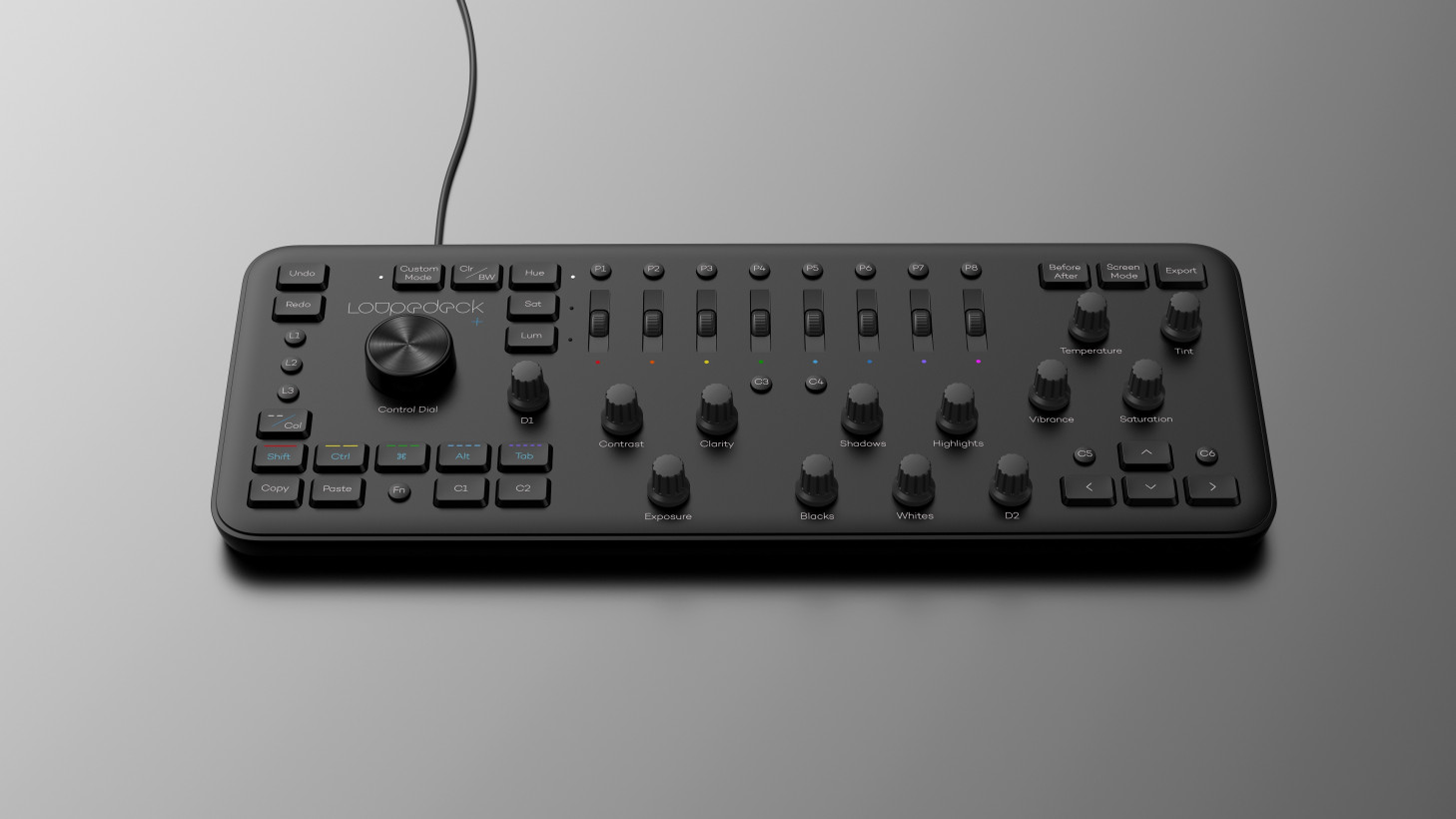
All the physical elements are refined. Though the body is still made of plastic, it feels sturdier, and now comes in all black instead of a chintzy faux-silver. The knobs and scroll wheels have more defined notches. But most importantly, the buttons feel so good. They use real mechanical switches now, and feel like they were ripped off a good keyboard.
But those are just tactile improvement. One of the other issues with the original model was that I still felt I had to reach for my keyboard and mouse more often than I’d like.

To help speed up your workflow further, Loupedeck has added several more customizable buttons, an extra knob, and modifier keys.
What’s more, a new “custom mode” lets you adjust every dial to your liking; I’ve found myself reaching for my mouse less often. Loupedeck says its sped up its software as well, and is integrating support for Lightroom alternatives like Skylum Luminar and Capture One.
At $229, the Loupedeck remains an expensive niche tool, but its small target audience is obvious. As they say, time is money; if you’re a pro photographer, it could pay for itself just on the hours saved.
Get the TNW newsletter
Get the most important tech news in your inbox each week.


