
Social media managers, aspiring influencers, and individual users are all seeking that winning combination of composition, lighting, color, and subject matter that will drive up likes, followers, and click-through rates on Instagram.
But what is it that gets the perpetual scroller to stop in their digital tracks?
We spoke with a neuroscientist, a top designer, and a visual psychologist to find out.
What’s science got to do with it?
In 2017 Dr. Tedi Asher became the first ‘neuroscientist in residence’ at the Peabody Essex Museum. She was hired by PEM to enhance the visitor experience by conducting research into influencers on visual attention and perception in the museum.
In Daniel Kahneman’s award-winning book Thinking, Fast and Slow, he explains that we have two systems of thinking.
System one is all about shortcuts, allowing us to quickly process the vast amounts of information we come across daily, without tiring ourselves out. It’s fast and unconscious and exactly the type of thinking we’re using when we’re mindlessly scrolling through our Instagram feeds.
System two is when things slow down and we start to focus our conscious mind, employing our use of logic and reason. This would be the kind of thinking we use when our brain suddenly registers something interesting and stops to admire an image more thoughtfully.
According to Dr. Asher, there are two types of influences that can impact this shift in attention:
- Bottom-up influences are focused on sensory perception and stimulated by things we see, hear, smell, taste, and touch.
- Top-down influences are cognitive in nature and stimulated by goals, memories, and/or emotions.
These two can work hand in hand to draw in and keep a viewer’s attention.
To put it into perspective, when you look at this photo your focus may immediately be attracted to the bright yellow and red canopy in the top left of the photo, but you’ll continue looking for the emotional satisfaction you get from finding Waldo.
(Now that I’m sure you’ve found that sneaky bastard… )
Let’s dive into the clues these two influences can give us in creating great Insta snaps.
Design meets psychology
As Lead Product Designer at Combin, a company that creates Instagram marketing solutions to attract and grow followers, Sergey Kruglov knows all too well the fierce competition Instagrammers face on the social battlefield.
“The most valuable thing that almost all brands and products on Instagram are currently fighting for is attention. It’s become a new currency in the modern digital space and, to understand how to get it, you need to know how the psychology of the viewer works,” he explained.
The problem is, if you want to capture a viewer’s attention, you have to do it fast: a study by MIT found it only takes 13 milliseconds to process and identify images.
So how can we combine psychology and design to get attention and grow followers?
When used in collaboration, design elements like color, lighting, and composition can act as bottom-up influences that attract attention and help enhance top-down influences like emotion, memories, and goals. Let’s take a look at color as an example.
Impact of color on memory and attention
In 2013 a study reported that blue-colored photos received 24% more likes than predominately red and orange photos on Instagram. Variations on the headline ‘Want more likes on Instagram? Use blue’ started popping up. Bad news for Coca Cola, McDonald’s, and Santa.
But studies also showed that red was better at getting people’s attention on Facebook ads.
“Color is a very powerful tool for attracting the user’s attention and perception at the deepest unconscious level. There’s a large amount of research on this subject in advertising and psychology but the context and color environment of the space in which the content will be displayed are equally important. As Derek Jarman said: Color glows in its surroundings,” Kruglov explained.
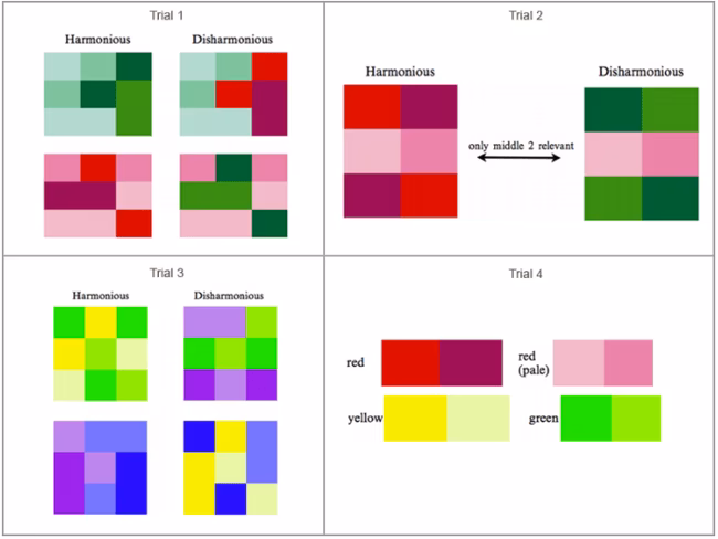
A study by psychology professors Thomas Sanocki and Noah Sulman found that the way we harmonize colors in our images can actually have a significant impact on our memory and focus. By showing test subjects groupings of harmonious and disharmonious colors they were able to conclude that harmonious colors are rated as more pleasant and more memorable.
But, the researchers also found that using disharmonious colors to contrast the background with the focal point in the can actually grab and focus your attention.
“Breaking visual patterns and speculating with familiar images works well, making it quite easy to attract attention and make you stop and think about the content,” Kruglov said.
So, in the end, the battle between blue and red is irrelevant.
According to Kruglov, “From a practical point of view, no matter what colors you choose, it’s important that their combination is unique and the frequency of repetition allows you to give charisma and recognition to the content.”
But after getting our viewers’ attention, how do we keep it?
“There are so many visual images that each new technique stops working almost as soon as it appears and becomes popular. New filters, masks, effects, all this is quickly picked up and replicated with incredible speed. Therefore, the best thing is to be sincere and convey meaning through stories that cause the right emotions,” Kruglov explained.
Emotions stimulate memory
Professor John Suler of Ryder University is an expert in photographic psychology. He co-authored a book with Professor Richard Zakia called Perception and Imaging: Photography as a Way of Seeing which applies psychological principles to help photographers predict and control emotional reactions to their images.
“While the visual design and composition of an image might catch a person’s eye, its impact will not last unless it conveys or stimulates emotion in the viewer. Research has well demonstrated that we are more likely to remember something that generated a feeling in us, and sometimes that impact occurs on a subconscious level,” he explained
One day he greeted his undergraduate psychology classes with a peculiar experiment. He presented a slideshow of 200 random photographs, including landscapes, architecture, abstracts, and portraits. Each was shown for only five seconds. The students were prompted to simply watch the slideshow and write down the numbers of any photo that stood out to them, regardless if they had a positive or negative reaction.
He then asked them to recall one image from the slideshow and answer a series of questions including: What thoughts, feelings, or memories come to mind about this image? What message might this photo be giving you?
When discussing the results, he said, “In my own research I’ve found that if people view a long series of images, the pictures they tend to remember afterward are not the ones that ‘pop’ in terms of design features, but rather the ones that struck a personal and emotional chord in them.”
“So if someone spends half an hour scrolling through their Instagram feed, they might ‘like’ photos that pop with color and clever composition, but the images that will linger in their minds are the ones that stirred up a feeling of anger, fear, disgust, happiness, sadness, surprise, contempt, or love,” Suler told TNW. “And it might even be an image that they didn’t give a ‘like’ to because people might not ‘like’ a particular image that nevertheless stimulated an important emotion within them.”
Indeed, back to what we consider a ‘good’ Instagram photo, you really have to consider what your goal is. If you want to generate likes and shares you might want to focus on positive emotions like humor or tranquility. But if you want to raise awareness of a social issue, other emotions will be more effective. Consider this anti-smoking ad:

Visual priming and storytelling
If a picture is worth a thousand words, what are yours saying?
A study by Professors Naomi Mandel and Eric J. Johnson found that visual priming can influence consumers’ perceptions and preferences for a product.
In one experiment, subjects were shown two different websites for a couch. One had a blue background with clouds to prime the perception of comfort. The other featured a green background with pennies, priming subjects to consider the price.
They found that respondents perceived the first couch as being more comfortable and more expensive and the second couch as being cheaper but also less comfortable. Interestingly, the subjects that were primed for comfort later favored the more comfortable sofa in a second experiment, while those that were primed for price chose the cheaper option.
Visual priming allows you to bring different design elements together to tell a story. Consider what your values or key features are and the emotions you want to show. Use priming that communicates those aspects.
When asked for some examples of companies doing a great job of attracting followers with their Instagram photos, Kruglov pointed out Casper for the “combination of aesthetics, sincerity and emotions that the product evokes using dogs, cats, real people, and beautiful photos.”

Indeed, the company’s use of soft colors, curved lines, fluffy sheets, and puppies takes us to a lazy Sunday morning when nothing but a pancake run will take us out of the comfort of our bed.
So how DO you take a ‘good’ Instagram photo?
For Kruglov it’s about considering your audience, “I think the most important thing is to ask yourself the right questions: who do we make content for? And what does the audience care about seeing?”
Asher agreed, “It might be helpful to bear in mind that part of how we interact with and respond to visual images has to do with the way that the visual system in our brain responds to physical characteristics of those images: colors used, contrast in brightness, kinds of shapes included, etc. Other aspects of how we engage with images stem from factors that vary across individuals and can change over time: e.g. past experiences, focuses on education, mood, environmental context, etc. These two sets of influences interact to create our very diverse visual perceptions.”
Asher continues: “In thinking about how to impact your viewers, you could spend some time learning about how the brain processes different kinds of visual features. You can also do some research about your target audience: What are their interests? What are they already looking for or primed to notice? What would catch them by surprise?”
Finally, Suler encourages us to think about how we connect with the emotions we want to show: “It depends on whether it sincerely reflects the emotion of the photographer, whether it’s well-constructed in terms of design and composition, and whether it resonates with what many viewers happen to be feeling, or wish to feel, at that particular moment in time. Capturing and successfully expressing the currently prevailing emotions in society is what makes an image great.”
Get the TNW newsletter
Get the most important tech news in your inbox each week.