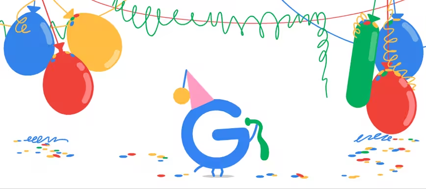
Google is turning 19 and we wanted to celebrate the world’s most popular search engine by showing off some of Alphabet’s family photos. We hopped in the Wayback Machine and took a look at Google.com from its birth to today.
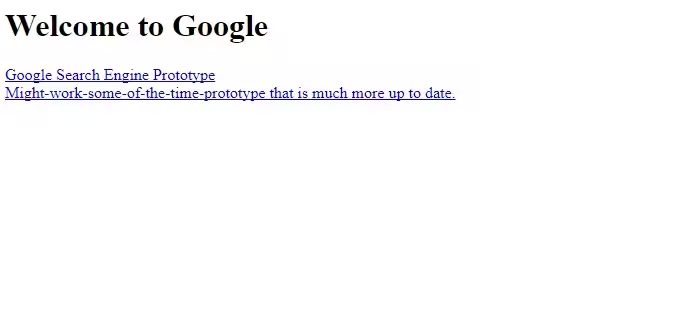
The company was founded in 1998, and even though Aerosmith’s “I Don’t Wanna Miss A Thing” was atop the Billboard charts, there wasn’t much to see:
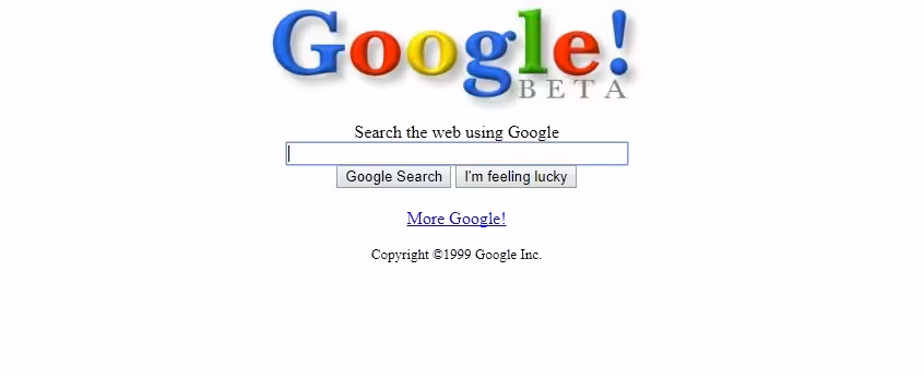
The first real version of Google.com came later, and a new age of text-based-search dawned upon a population that would soon turn a silly company name into a verb. Seriously, go Google it.
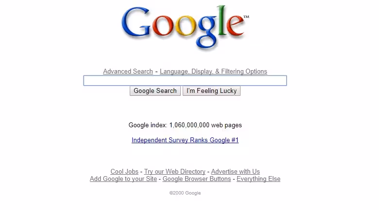
Then, off came the training wheels. The year was 2000 and what was left of a population decimated by Y2K were searching for “how to live in the postapocalyptic wasteland created by a tiny software glitch” on a search engine that was officially no longer in beta.

The 💜 of EU tech
The latest rumblings from the EU tech scene, a story from our wise ol' founder Boris, and some questionable AI art. It's free, every week, in your inbox. Sign up now!
Things looked pretty much the same for a few years until Google hit its “awkward teen phase.” Check out the ridiculous font and crazy punk-rock resolution in this image from 2003.
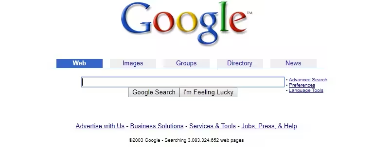
The above image has a weird symbol next to the colorful “Google” text and there’s absolutely no possible way to determine what the tiny letters “TM” mean.
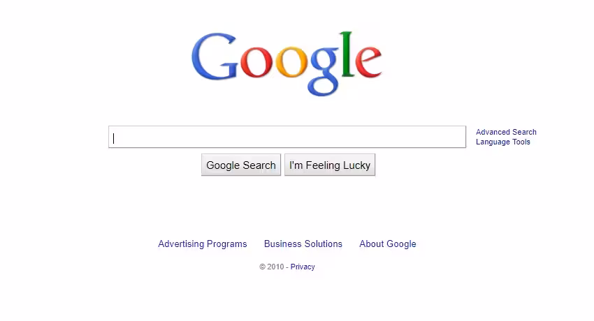
Things don’t change a whole lot, Google.com-wise, for the next 7 years. Then out-of-nowhere, in 2010, it drops this bombshell of an update — prepare your eyes for:
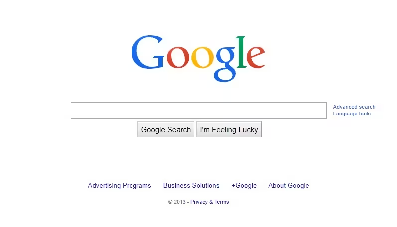
If that doesn’t blow your mind out of your skull and into your lap: sit down for this updated Google.com design from a year in which the most Googled question beginning with “what is” was “What is twerking?”
I know what you’re thinking: Google hasn’t changed since 2013 so that’s the end of this story. Well you’re wrong.
If you took the time to look it up you would have come across this story that explains why the next image is from 2015, when this happened:
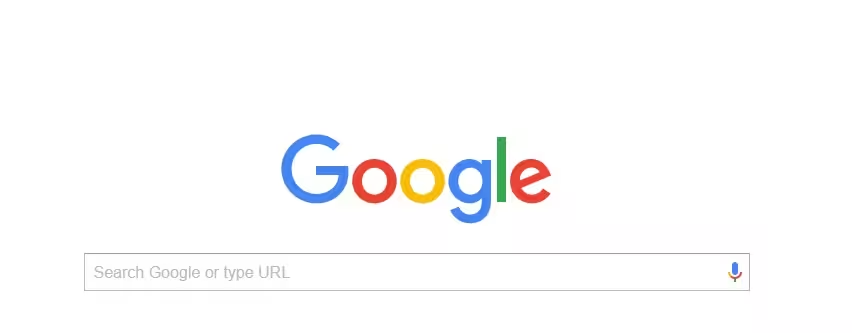
Google doesn’t change often, here we are in 2017 and Google.com looks like this:
We’re pretty sure that 19 years from now Google.com isn’t going to look much different than it does at this moment. Minor tweaks, here and there, every few years, seems to be a recipe for success.
Get the TNW newsletter
Get the most important tech news in your inbox each week.