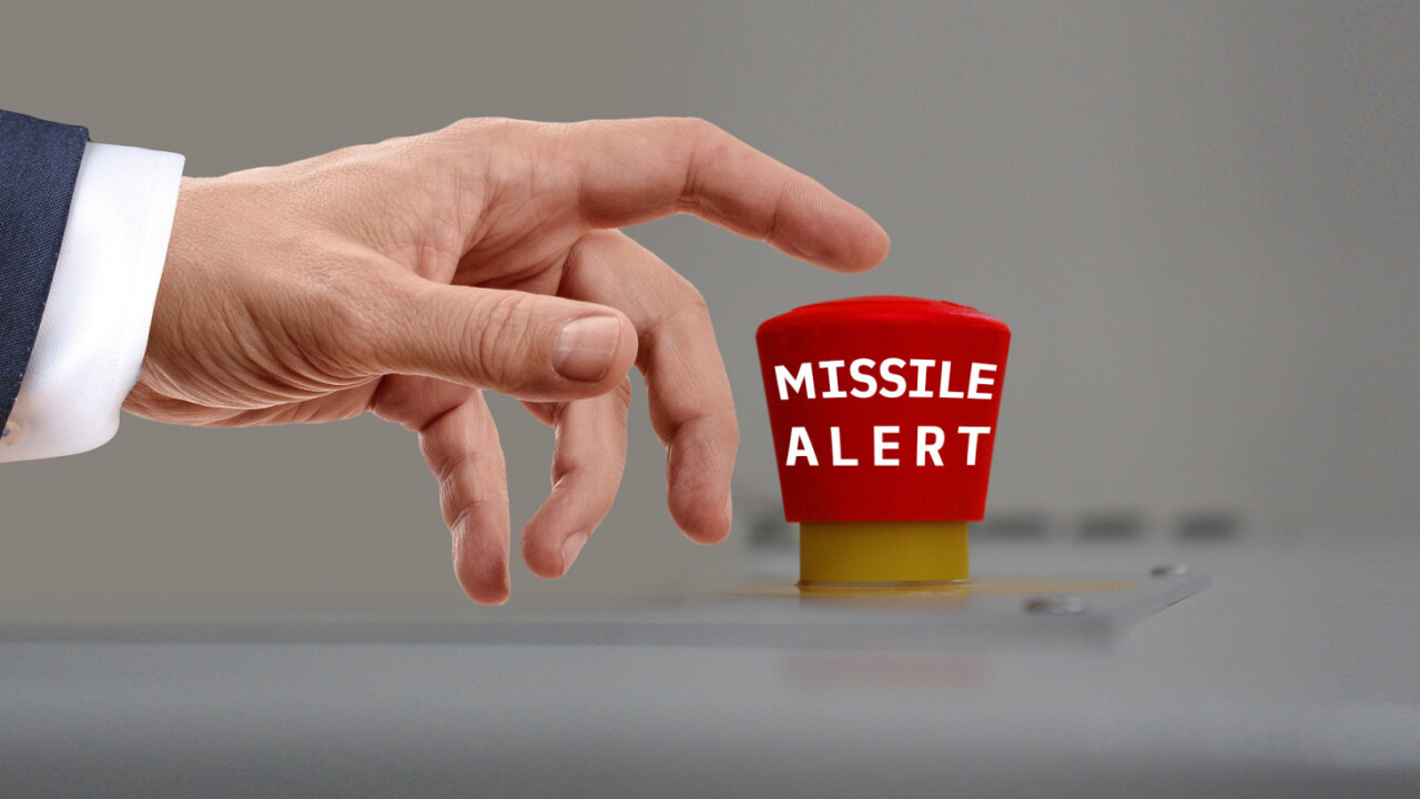
The panic that struck residents and tourists in Hawaii on Saturday morning over the past weekend – owing to a public emergency alert about an incoming ballistic missile that was mistakenly transmitted – could have been easily avoided with the help of good design.
The Washington Post reports that the alert was fired off by an employee at the Hawaii Emergency Management Agency who simply selected the wrong option in a drop-down menu while conducting a routine test of the state’s emergency warning system; per the story, the menu looked something like this:
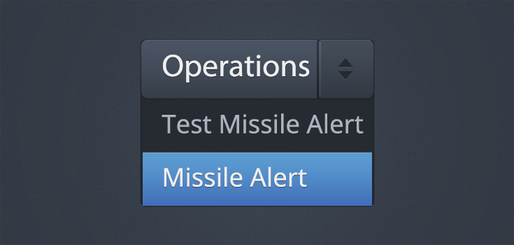
It took 38 minutes for the government to realize its mistake and issue a subsequent alert stating that the warning was sent in error.

The 💜 of EU tech
The latest rumblings from the EU tech scene, a story from our wise ol' founder Boris, and some questionable AI art. It's free, every week, in your inbox. Sign up now!
There’s an important lesson in interface design to be learned here. Fundamentally, you shouldn’t put buttons for testing and actual deployment next to each other.
In this case, it sounds like the decision to use a drop-down menu in the alert system’s software was a particularly disastrous one. Instead of making it easy to test the system safely, the interface seemed to have created a scenario where there’s always a 50-50 chance of making a huge mistake.
Drop-downs may be fine for certain functions in filling forms, but they obscure the menu of options available to users and require some precision to choose the right one. There’s no good reason for using this type of input element here, particularly when the consequences of choosing one option instead of another can be so drastically different.
Beyond attempting to engineer your interface appropriately for various functions, it also helps to rigorously test it to make sure that users can do they need to with minimal error arising from having to contend with your design decisions.
So, the next time you’re building an app, site, or missile alert system, ask yourself the following question: is it all too easy for my users to make mistakes because of the way my product is designed? If the answer isn’t a solid no, it’s time to go back to the drawing board.
Get the TNW newsletter
Get the most important tech news in your inbox each week.