If, like me, you write a whole lot on your computer – be that letters, articles, blog posts, prose, or poetry – you’ll know that it’s important to use a good text editor that helps you word good. Finding a legible font to go with it doesn’t hurt, either.
To that end, it’s worth trying the new duospaced font from the folks behind iA Writer. The Zurich-based team that made the popular writing app for mobile and macOS set out to create a font that’s better for writing than for reading – one that allows enough space for your eyes to scan through words and letters at your preferred pace.

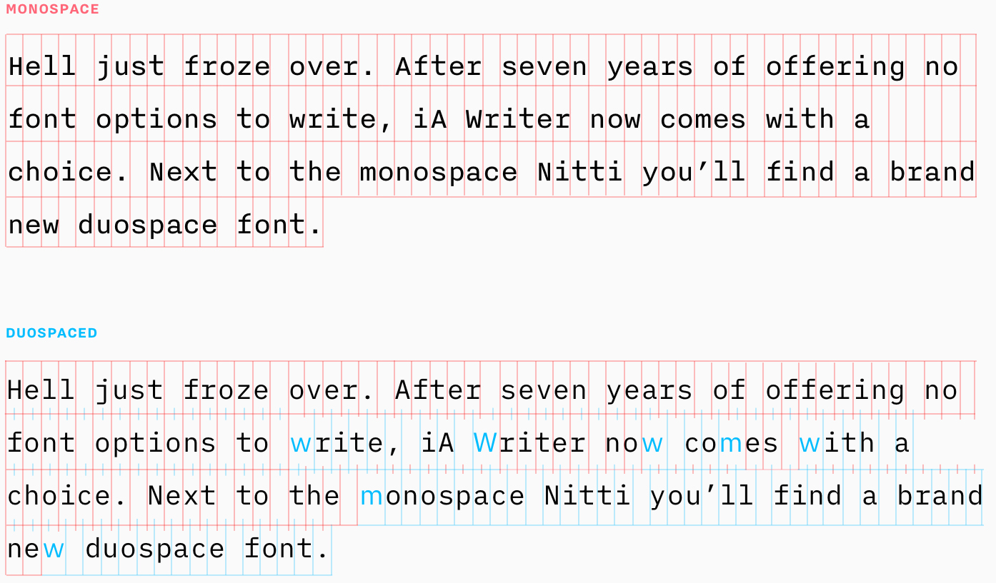
The company already offered a monospaced font called Nitti in its app, which fit each and every character the same amount of horizontal space. In its quest to create a better alternative, it decided to explore a duospaced option that gives 50 percent more space to the letters m, M, w and W. Here’s an example from iA that shows the difference between monospace and duospaced fonts:

According to iA, that fixes the problem of squishing those traditionally wide letters into awkward spaces, while creating a better flow and retaining all the benefits of monospaced screen fonts: “the draft like look, the discernibility of words and letters, and the right pace for writing.”
iA Writer Duospace is built on IBM’s handsome and functional new Plex typeface, which it unveiled and made open-source earlier this month. The best part: both are available for you to download and use in your preferred text editor for free.
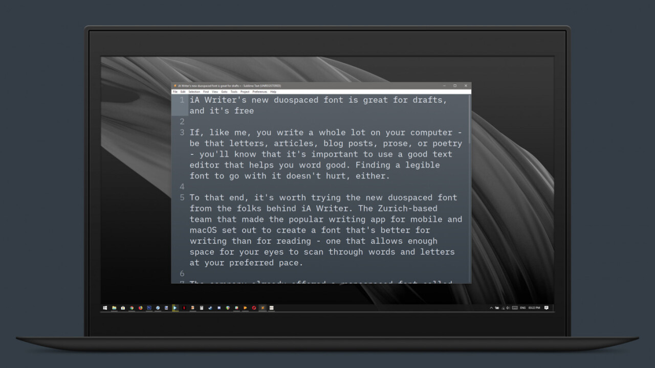
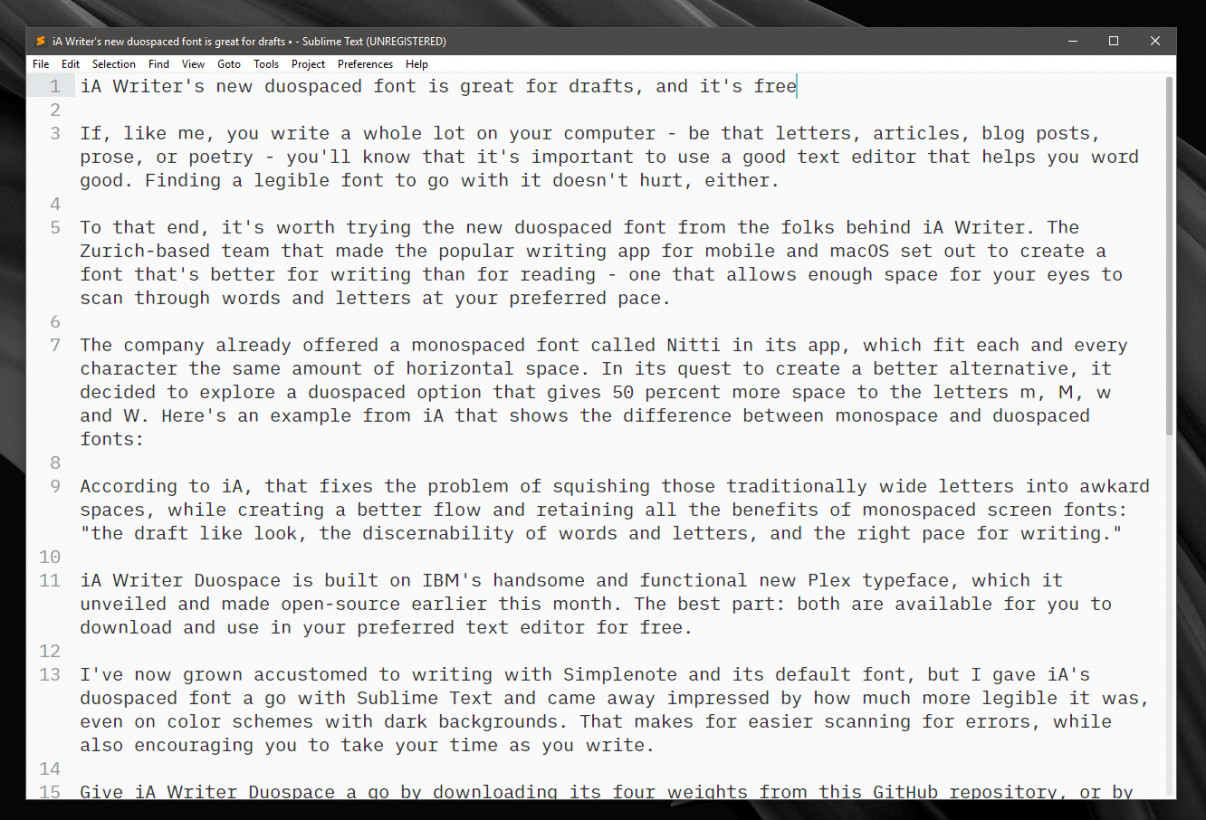
I’ve now grown accustomed to writing with Simplenote and its default font, but I gave iA’s duospaced font a go with Sublime Text and came away impressed by how much more legible it was, even on color schemes with dark backgrounds. That makes for easier scanning for errors, while also encouraging you to take your time as you write.
Give iA Writer Duospace a go by downloading its four weights from this GitHub repository, or by firing up the latest version of iA Writer for macOS and iOS. IBM’s Plex fonts are available here.
Get the TNW newsletter
Get the most important tech news in your inbox each week.


