If we look at the digital landscape in this day, it’s evident that most of the products we use on daily basis are deeply intertwined with the digital aspect of technology. When you open up a new website of a product you’d like to try, one of the first impressions you’re going to get will come from the design it’s using, which will set a tone for how you perceive this business from that moment on.
Knowing this, a business can tailor the UX design to reflect two things: Good asymmetric understanding of user experience, and impeccable handling of customer information.
However, to understand the concept of building trust with UX design, we have to first understand what trust means for users themselves.
- Honest values — a product’s description should always do what it says. If for example your product promotes better conversion rates through Facebook advertising, then the user will expect that exact end-result. To ensure that it is so, sufficient guidance and walkthroughs can be helpful to create an equal experience for all of your product users.
- Clear communication — telling it like it is. Hiding behind a carefully crafted copy can lead to your customers astray about the services that you provide, which will be detrimental to user trust over the long haul. If information is presented clearly with precision, user’s won’t feel like they’ve to look elsewhere to solve their problems.
- User protection — consumers are growing increasingly concerned about the security of their digital data — emails, credit cards, sensitive files — as nearly every week we see another huge breach of user databases. Telling your customers about the methods you use to protect their data will go a long way.
Creating a website that reassures the protection of sensitive information, has explicit design, and gives visitors an easy way to navigate the website for finding answers and solutions to their problems, you’re naturally going to create trust.
Meaningful design
The first step is always the design itself. The homepage, product features page, your blog, and knowledgebase. Not only does each of these pages — and any others — need to be aligned with the above mentioned values, they also need to work together in tandem to create a meaningful user experience that can take the visitor from one page to the next, without the user ever feeling like they’re seeing something that contradicts the impression that they’ve already gotten.
If you’re running a publishing platform, then it’s understandable that your website will feature a selection of different visual images, which will be attributed to each individual publication you make. Those images will regardless be relevant to the information that you’re sharing. But, there’s more to this.
What if your small business is about selling designer jewellery, and instead of using the photograph of your own store, you’re using a stock photo that outweighs the reality of what your store really looks like. And of course, this concept applies to any situation where you’re pressed to use a stock photo, rather than an actual photo of your product or business. User’s can easily pick up on these signals, and your own bad judgement will become the cause of user distrust.

Source: Coursera
I absolutely love the way Coursera has been designed. At no point you’re asking yourself if any of the content is going to be valid, or real.
The header part of the homepage in particular does a few things right:
- Minimal navigation menu that insists for the user to log-in into the service, indicating that to access the courses one needs to have an account, where progress will be possible to save for future access.
- Institutions navigation that can be accessed to see which universities Coursera is partnered with, making it easier for user to see if there’s a particular affiliation that they’d like to explore more about.
- A no-fluff header lead header that gives you a single sentence rundown of what Coursera is about, “Take the world’s best courses, online.” — the user doesn’t have to question this as the university brand logo’s clearly indicate that Coursera is affiliated with some of the biggest players in this sector.
- The accessible search function on top of the photograph allows users to directly tap into the pool of information, courses, that Coursera is offering. If you scroll down the homepage, there’s individually categorized course areas which can all be accessed with a single click.
As you can tell, each part of those design aspects hold some meaning, they’re meaningful. There’s no unnecessary flub floating around, like telling userswhy the courses are good, or how they work. All that information is individually explained through the course pages, because each one is unique.
Clear communication
A well-designed landing page will explain the purpose of your product unobtrusively, in such a way that the user has clear understanding of what it is that you’re offering, and has easy access to the checkout page if they decide to signup as a customer.
One of my favorite landing pages in this regard comes from Stripe:
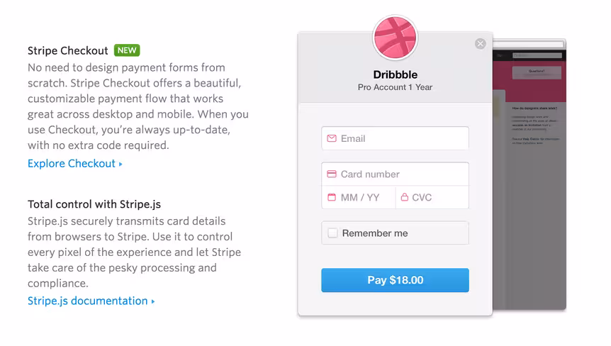
Source: Stripe
If you look at the Stripe features page, there are more than 20 unique features enlisted, each explained with short and straight to the point paragraphs, complemented with additional link resources to Stripe pages that explain how each feature works.
The copy is kept short and lucid, with anything else worth knowing listed as an external resource. The use of rich visual imagery gives potential customers a chance to learn about the product through visual learning, whilst adding an element of design-wealth to the page.
So, don’t think about it too much. If it sounds too much, then it most likely is. There are very few other things that will overturn user trust like ambiguous communication, which also means testing your copy for grammatical errors and punctuality: hiring an editor — if you don’t have one in-house — will go a long way.
Remember that copy — clear communication — applies to all aspects of your landing page, including HTML elements like buttons and widgets; although honest mistakes happen, users tend to see mistakes as incompetence.
Sensitive information transparency
With large scale data breaches happening left and right, it’s only right that digital businesses look for ways to reassure their customers that their way of protecting sensitive data is world-class.
For a rapidly evolving payment processor such as Stripe, security is a vital component of retaining customers, and reassuring those customers that the data that is being exchanged between Stripe and the customer using Stripe remains secure throughout.
On the same page that you saw Stripe features, at the very bottom there’s a neatly organized segment that shows how Stripe protects user data:
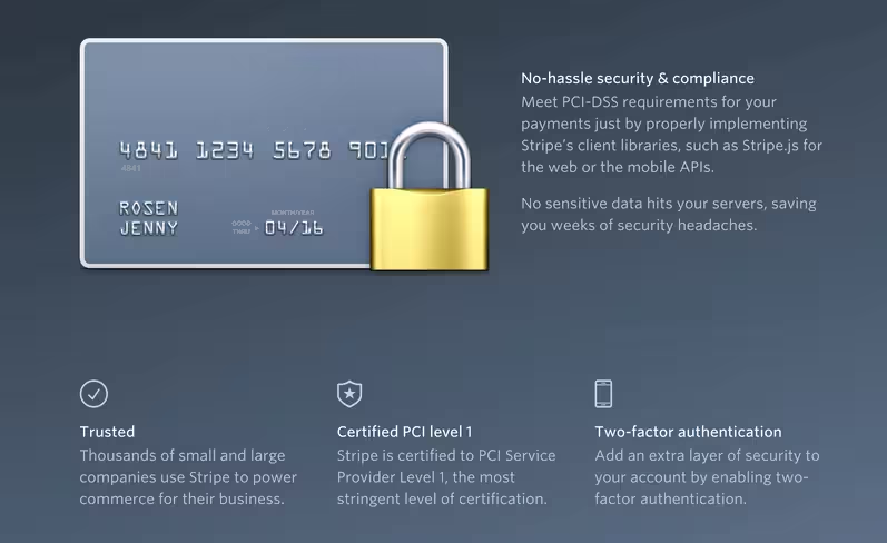
Source: Stripe
Perhaps the most important note of this segment is the statement, “No sensitive data hits your servers, saving you weeks of security headaches.”, so not only do you get to work with a payment processor that takes security seriously, you can rest assured that your own checkout pages won’t be leaking any sensitive information.
Another aspect of information transparency is associated with digital and cloud services that handle sensitive data, such as files. Take a look at Dropbox’s signup form,

Source: Dropbox
Even before you can create an account, Dropbox is asking you to agree to their terms of service, so that at all times you’re aware of the things that Dropbox can, cannot, and will do with the data that you’re sharing in the cloud. This applies to any product that you’re a part of, where your product might be in the position of handling customer data in ways that haven’t been previously described.
Customers need to know this information, so that in the event of a problem; both parties know where they stand.
Infuriating UI patterns
Dark patterns are a feature of the overall product or software User Interface that are designed to “trick” the user into taking an action against their own will, some dark patterns are also intrusive UI elements that block the user from taking a particular action unless another action is taken; usually to benefit the company employing such a “strategy”.
Late in May this year, Microsoft found itself all over the news because of the deceitful implementation it had made for users to upgrade to Windows 10.

Source: Microsoft
Even if users would click the “X” button to close the update notice, the actual upgrade of Windows 10 would begin, and although Microsoft suggested that the update could be stopped at any time, it had created a very distrusting user experience. There was also a story in the news recently which reported that a local Seattle resident experienced difficulties with her computer, after the Windows 10 upgrade failed to go through, this led to a settlement of $10,000.
But, Microsoft isn’t the only company that has been made to pay for its mistakes, LinkedIn had to settle for a $13M loss when the court decided that LinkedIn’s practice of allowing users to promote their network through “Add Connections” feature was unethical, and infringing of digital privacy. Anyone affected can now file a claim on the official settlement website.
The lesson for dark patterns is simple, don’t force users to do something that stops them from having a pleasant product experience, and don’t employ shady business growth techniques at the expense of your own customer comfort.
Creating trust using UX design
In this age of digital exposure, visitors who come to your website are already acquainted with trustworthy and reliable websites, so not only are their senses amplified, but they have reasonable expectations for how a business should portray itself on the web.
You might see yourself as an honest and authentic business, but if your content or design doesn’t live up to their expectations, then naturally they will feel that you’re either untrustworthy, or don’t care enough about your visitors to create a smooth user experience.
In cultivating trust through UX design, it comes down to your persistent efforts to create page designs that are naturally attractive, and provide a sense of stability. The irony is that you’ll hardly ever hear from those who disliked your provided user experience, because for them the first trust signals are everything.
Get the TNW newsletter
Get the most important tech news in your inbox each week.