Google’s Material Design is one of the most influential visual philosophies in design. It’s shaping the way people see and interact with interfaces because of clear design and usability guidelines.
However, Material Design goes beyond Google and Android apps.
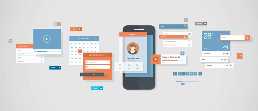
Designers are using the design philosophy in a number of ways — especially the concept of layered interfaces. Just as the name suggests, layering involves stacking multiple elements, like a deck of cards, to create a single, unified experience that is both functional and aesthetically pleasing.
Let’s Talk About Material Design
The idea of layering elements in an interface isn’t a new concept. However, Material Design takes it a step further — combining a tactile experience with a bold and vibrant aesthetic.

The 💜 of EU tech
The latest rumblings from the EU tech scene, a story from our wise ol' founder Boris, and some questionable AI art. It's free, every week, in your inbox. Sign up now!
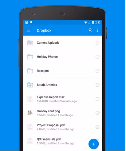
Photo credit: Dropbox
Before we go forward, let’s make sure we’re all on the same page as to what exactly is Material Design. Let’s review:
Material Design is a Google’s conceptual design philosophy that outlines how apps should look and work on mobile devices. It breaks down everything — such as animation, style, layout — and gives guidance on patterns, components and usability. According to Google: “We challenged ourselves to create a visual language for our users that synthesizes the classic principles of good design with the innovation and possibility of technology and science. This is material design.”
Material starts with mobile but extends to any other device. It is rooted in a few principles:
- Realistic visual cues: The design is grounded in reality and actually inspired by design with paper and ink.
- Bold, graphic and intentional: Fundamental design techniques drive the visuals. Typography, grids, space, scale, color and imagery guide the entire design. Elements live in defined spaces with a clear hierarchy. Color and type choices are bold and deliberate.
- Motion provides meaning: Animation is a key component of Material Design, but it can’t just be there for the sake of movement. Animations need to happen in a single environment, serve to focus the design and include simple and easy transitions. Movements and actions should mirror the physical world.
Understanding the “Tactile Surface”
One of the things that comes up a lot when talking about layered interfaces is the “tactile surface.”
Think of this as having multiple sheets of paper that are stacked together to create a framework for how everything within the design works. These sheets are a little different from physical sheets of paper in that they can change shape and form — such as stretch or bend — but work in a way that is seemingly realistic.
Photo credit: Google Material Design
As explained in Mobile Design Trends 2015 & 2016, treat the tactile surface is a container for content and information. The container is flat in design but has a faint shadow to separate it from other containers and layers. Other techniques to create separation between layers – such as textures, gradients or strokes – are unnecessary.
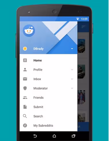
Photo credit: Reddit
You can see the separation in the layers for the Reddit app, above. There is an obvious top menu layer covering a greyed out main content layer. Even the main header image contains elements of layering and shading that emphasize a three-dimensional tactile surface.
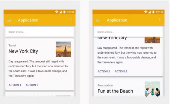
Photo credit: Google Material Design
As demonstrated in the Android Lollipop UI Kit, a tactile surface clearly established the relationship and function of content within a design. (Each container often has one job, such as a link or video player.) This approach also establishes depth, as elements in other containers are layered, creating a seemingly three-dimensional world.
Material is Made for Adaptive Design
Layered interfaces are inherently made for adaptive design. All of the design guidelines actually encourage a designer to work with an adaptive layout (whether you prefer adaptive or responsive is up for debate, however.)
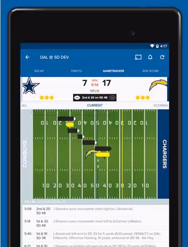
Photo credit: CBS Sports
When thinking about layered interfaces, it is important to consider how all the elements relate to one another.
Google recommends its standards because of a “flexible grid that ensures consistency across layouts, breakpoint details about how content reflows on different screens, and a description of how an app can scale from small to extra-large screens.”
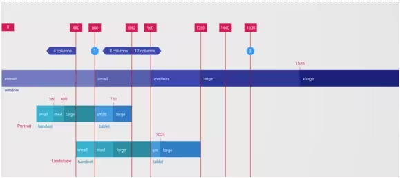
Photo Credit: Google’s Material Design Guidelines
Considerations include:
- Breakpoints: Widths include 480, 600, 840, 960, 1280, 1440 and 1600 pixels
- Grid: 12-column layout with margins and gutters (8, 16, 24, or 40 pixels) and a baseline grid
- Surface behaviors: UI adapts to the type of screen so that surfaces are visible or toggled to hide
- Patterns: Function is based on screen size, including reveal, transform, expand, reflow and divide
These considerations make it easy for designers to ensure their interfaces adapt for any device in any situation. They provide a baseline to help designers as they construct layouts for desktop, tablet and smartphone.
Material and Other Mobile Design Trends
When it comes to creating layered interfaces, other trends also come into play.
Material Design has borrowed plenty of design concepts from the flat aesthetic and other trendy techniques. In fact, some would argue that Material Design is a close cousin to Flat Design 2.0 because many of the visual treatments are quite similar.
What separate layered interfaces from totally flat design is that effects are needed to create more three-dimensional spaces and to mimic lighting. In essence, designers are bringing back some of the design tricks eliminated with flat. The difference is that they’re using these tricks to improve usability rather than simply as decorative accents.
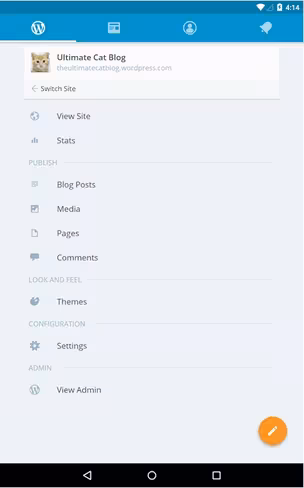
Photo credit: WordPress for Android
The colors most closely associated with layered interface design nearly fall within the flat aesthetic. The big difference is the vast number of color options that Google provides. Palette options are in the same vein though – bright, bold and fully-saturated hues.
While many designers opted for blues and reds when it comes to designing flat, more layered interfaces seem to feature deep purples and yellows. That’s likely because each of these hues is easy to pair with contrasting white or black text.
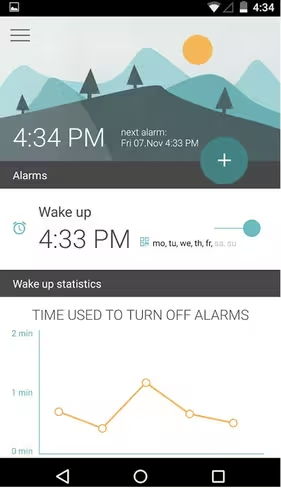
Photo credit: Morning Routine
Layered interfaces also work well in the space of minimalism, particularly when it comes to typography. Type is stacked with clear hierarchy and sans serif options are the preferred choice. Google suggests using Roboto as the dominant typeface and it comes with plenty of choices, from thin to bold to italic to condensed.
The variety helps create levels of type that guide users between elements. In the true spirit of minimalism, one font can pretty much do everything you need with proper sizing and scaling.

Photo credit: Field Trip
You’d be hard-pressed to find a website without a full-screen image these days and layered interfaces further emphasize the use of vivid, intentional imagery.
The Field Trip app, above, makes the most of a simple photo for this very purpose, showing that Material Design does not just use color, photos and effects solely for visual impact — they are an essential part of the design.
Finally, layered interfaces are perfectly made for cards, which we discussed in the previous chapter. Looking through the examples showcased, almost every design includes something with a card-like element. From smaller cards to full-screen options, these trends go hand-in-hand.
What’s Next?
Google released in July a few new guidelines, Material Design Lite, so that any website or app developer could make their products look more like Android apps.
As suggested in Mobile Design Trends 2015 & 2016, we’ll probably see more of these Android characteristics, maybe even in Apple’s iOS and other non-app areas. Material Design looks nice and it works well in a variety of places. Designers will want to take advantage of that and the lite version provides the perfect level of guidance.
Material Design Lite is also a good tool for designers and developers that want to create a unified app experience across the Android and iOS platforms, so that apps look, feel and function in the same way regardless of device.
Layers are definitely going to stick around, but the overall look may be a little more “layered” and a little less material, so that the design falls somewhere between Material Lite and iOS standards.
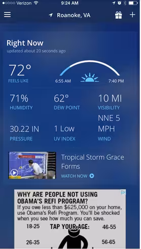
Photo credit: The Weather Channel
The Weather Channel iOS app is already using this approach. The app layers cards, colors and images. Where the design concepts overlap most is in the use of cards and the placement of geometric shapes. Where the design is “less Material” is in the lack of depth and shadowing so that the overall look is flatter and streamlined.
Gradients and monochromatic color layers are another way layered interfaces can continue to grow visually. Monochromatic color palettes are a classic design technique that make it easy to create sharp elements to fit almost any type of content.
Photo credit: Elevate
The Elevate iOS app uses a gradient background with multiple levels of cards in its design. The animations and movements are very Material Design in nature but the use of a gradient is not. This simple evolution highlights how designers will start to break the visual rules of layered interfaces while continuing to leverage its more functional aspects.
Designers will continue to evolve layered interfaces and Material Design concepts with darker colors and hues. Most of the apps available right now feature light and white color schemes, but darker colors will start to emerge.
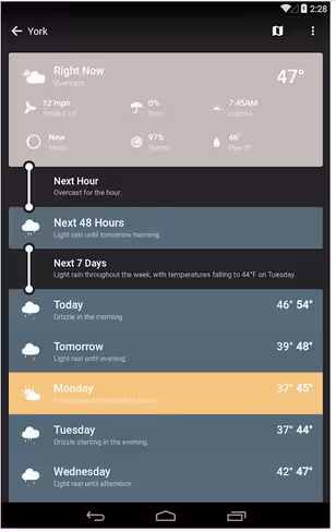
Photo credit: Weather Timeline
Weather Timeline is a perfect example of this. The simple change to the color palette is enough to really make this app stand out from all the others available. It still uses a style that’s distinctly layered, but the darker interface is simple and elegant. The colors for the entire design are less saturated and toned to match the darker aesthetic.
Takeaways
Today’s layered interfaces are just the start.
The simple visual style and high usability of this design style will continue to emerge and grow as designers — not just for Android — will latch on the concepts. What may be even more interesting is that the look of layered interfaces is really just an extension of a lot of the design techniques that have been growing in popularity for several years, including flat and minimalism.
At some point the pendulum may swing back to more “realistic-looking” interfaces, but until then this concept appears to have quite the foothold.
For more useful mobile design techniques, check out the free guide Mobile Design Trends 2015 & 2016. 79 examples of outstanding mobile design from companies like Slack, Tinder, Waze, and others are deconstructed into simple design techniques. The book also includes 61 useful resources for mobile design.
Get the TNW newsletter
Get the most important tech news in your inbox each week.