
Video games are designed to be fun, immersive, and addictive.
Game designers are well versed in the psychology of time wasting. They use badges, medals, levels, progressive stat increases, suspenseful storylines, and all sorts of other fantastic bits of design technique to highjack your mind’s reward systems and trick you into spending hours leveling up your character for approximately zero utilitarian value.
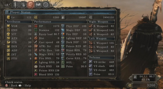
Photo credit: 8 Bit Gamer
In short, the average interaction design has a lot to learn from effective game design. In this piece, we’ll explore which videogame design techniques apply most towards improving site and app design.
The Art of Hooking Users
First to consider is the way that habit formation works in the human mind, and how gamification better exploits this process. According to product design expert and famed author Nir Eyal, all great habits hook users through four interconnected phases:
- Cues (or triggers) – In this context, the cues are the visual information that prompts a game player into action.
- Routines (or actions) – These are what the player actually does in the game, whether it’s fighting monsters, shooting bad guys, or solving puzzles
- Rewards – Tangible rewards include leveling up and unlocking achievements or items, while intangible rewards include the visual delight of advanced graphics and fun gameplay
- Investments – As players strengthen their character and advance in the plot, they become personally invested in the game’s events and final outcome
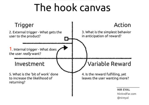
Photo credit: Hooked by Nir Eyal
As shown in Nir’s excellent book Hooked, you can also see how this “hook canvas” is built into some of today’s most popular products, like Pinterest.
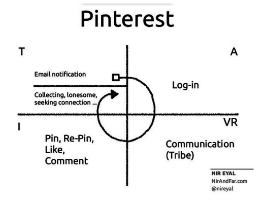
Photo credit: Hooked by Nir Eyal
Awesome games and gamified interaction design also clue users into the actions for which they’ll be rewarded. The key is ensuring the quality of the rewards are strong enough to create a habit in the user’s behavior.
In gaming, this must play out as a fun experience. Megaman jumps and shoots, the bad guy explodes and the path forward is cleared. And that leads to the user becoming enamored with the process of progress: jump, shoot, move forward. It’s a fun process that’s repeated in perpetuity without losing any appeal. The habit is formed and the player loves the game. Most importantly, they do so without really thinking about it.
Effective gamification is intuitive. It doesn’t force habits on people through superficial badge systems, but instead feeds off of people’s existing motivations and dangles a better reward in front of them.
What Works in Gamification?
As described in Interaction Design Best Practices, website and game UIs have a lot in common.
They’re both designed to be pleasurable and engaging. The truly great ones are also intuitive, requiring little to no explanation on how to interact or what a user needs to be doing in order to progress. And that’s a key point. One of the biggest buttons that games push is the need to progress.
Name a role-playing game and it assuredly has characters with stats, levels, skills, attributes—what have you. These games trade time spent for slowly increasing powers/abilities measured in standard numerals. This is what most people think of when they hear the word gamification.
One perfect example of this idea can be seen on popular image sharing site Imgur:
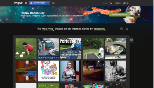
Photo credit: Imgur
Popular images, gifs, memes, and other kitten related material are spread around on the internet on a daily basis. Chances are many of these sharable posts originated either on Reddit, or its bratty little cousin: Imgur.
On these sites, you can get fake internet points for commenting on other people’s images or uploading some yourself. The more points you get the better your reputation becomes.
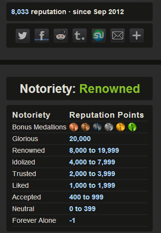
Photo credit: Imgur
In this way, engaging with the online community via posting and commenting becomes a competition. A social contest that drives further engagement and increases the site’s appeal to advertisers. From the gamified aspects of Imgur’s design we can draw a few helpful hints as to what’s effective in gamification as it applies to interaction design:
- Design intuitively – Allow users to learn through interaction with the interface
- Design for progression – have users work towards goals of increasing difficulty and greater rewards
- Design socially – allow users to compete or collaborate, make the experience shareable
These ideas obviously aren’t universally applicable, but they strike at the heart of what often makes gamified design so effective. Gamification creates a social experience that can be enjoyed and shared among friends.
Which brings me to Pokémon.
Gotta Catch ‘em All
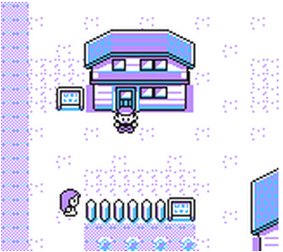
Boy, do I love Pokémon. This game absorbed months of my life as a preteen, and I’ve recently made the mistake of downloading an emulator that plays old school Gameboy ROMs on my phone. Thus the 1st generation of pocket monsters are now, once again, absorbing inordinate amounts of my time as an adult (56 hours and counting).
The reasons are a bit mystifying to me. It’s not a particularly pretty game, everything about it is simple. 8 bits, mild color schemes, downright irritating background music and noises—I play on mute—and worst of all: no trades with other players.
Even though it misses the admittedly powerful social aspect of the game (which made it much more than a simple RPG), this childhood throwback is still alluring enough to make me lose sleep trying to build the perfect team of unbeatable mini-monsters.
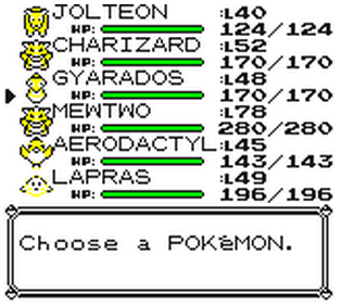
Aerodactyl best start pulling his weight. I’m sick of leveling him up and still no hyper beam.
So what is it that makes this game so addictive? Let’s break it down:
Intuitive Achievement
You know exactly what you’re doing, and why you’re doing it, almost as soon as you start the game. This is something extremely simple and really very clever that’s common to most old school games.
You start out with no abilities, no Pokémon, and little to no sense of purpose. Yet every action/interaction you make gives you more information about the interface and how you’re supposed to proceed.
You begin in your room and you’re free to explore/interact with your surroundings. You can access your PC, which does nothing yet, but gives you a clue as to how things are going to be later on. Finally, you speak with your character’s mother who gives you the first bits of advice on how to start your journey.
So what have we learned in the game experience so far?
- We know how to move from place to place in the game
- We know how to talk with other characters
- We know that we won’t be staying in one place for very long.
Then you go outside, speak with the other characters who deliver handy information about the Pokémon universe, each giving you another piece to the puzzle.
Finally, you try to move to the next area through some tall grass. At this point you’re introduced to the rest of the rules of the game. It all unfolds naturally within a few minutes of pressing start.
You’re initially given a little background information about the world you’re inhabiting, the freedom to explore it within set constraints, and a set path to follow. The path itself may not necessarily be linear, but it always leads you to your next important destination.
The game is intuitive. It teaches you how to play while you’re playing, no complex tutorial needed. No idiot proof directions, it simply trusts that you will have the intelligence to figure it out as you go along. It’s a design that displays the designers respect for the user. Or in this case, player.
So once again we’ve reinforced one of the main tenants of gamification: interaction should be educational. Beyond that, however, we’ve identified some other important ideas that make game designs and gamified interaction designs more effective:
- Allow for freedom of movement within clearly defined user flows. Users should be able to experiment with the UI without losing progress toward their eventual goals. Map out the different ways users can flow through your app to accomplish their goals, and refine each step to minimize overall friction.
- Respect the power of user onboarding. For example, as Digital Telepathy recommends, the “Do Something” approach helps users understand the design by making them complete a few key actions first.
- Allow the narrative of your design to unfold at a steady pace. Reveal information as it becomes important, don’t overwhelm users with too much data at once. Use progressive disclosure techniques like accordions and toggles to let users discover the right functionality at the right time.
- Great designs, like great games, tap into our need for emotional connection. Carefully selected visuals, compelling copy, and an overall narrative immerse people in a deeper experience.
- While visual appeal is important, it isn’t everything. You can still create highly enjoyable designs without taking the aesthetics to the nth degree .
Intuitive Web UI and Gamification
The aforementioned, Imgur, accomplishes many of the same things as Pokemon.
You’re free to immediately start browsing memes which allows you to get a feel for how the system works. Meanwhile, the navigation bar at the top of the page gives you the option to upload images or signup for an account no matter where you are on the site.

You immediately have freedom to interact with a clear path forward. No matter where you go within the website, you have a good chance of achieving your goals. And again, it’s all intuitive with very short user flows.
Interacting with the site is the same as learning how it works.
It also doesn’t hurt that there are so many self-referential posts on the site. So many, in fact, if you’re not familiar with the jargon or specific processes involved, it’s still easy to become acquainted with them over time. In other words, you can learn about the site’s history, common practices, etc. it’s overall narrative, at a reasonable pace– just by interacting normally.
And that brings up another big point, the social engagement that evolves around gameplay.
Player 2 Has Entered the Game
Competition breeds innovation and glory. No two ways about it.
Gamifying an online experience is an incredibly powerful mechanism for improvement in almost any respect. A perfect example of this is obvious in the many incentive based activity trackers.
FitBit and Social Motivation
FitBit is the obvious example. The interesting thing about FitBit is that it allows you to taunt your opponents or, if you’re more of a team player, cheer them on. So you have the option to collaborate or compete, whatever your preference may be.
Personally, I think competing against yourself can get somewhat stale. It is straight up tough to start working out. However, if you have a group of friends antagonizing you about it, then your chances of holding yourself accountable increase dramatically. People need that kind of adversity as motivation.
Though you can take it up a notch from just random taunts.
Incentive? Run For Your *%&$#@! Life
Zombies, Run! is a game that puts your edible little brains on the line in order to get your feet moving.
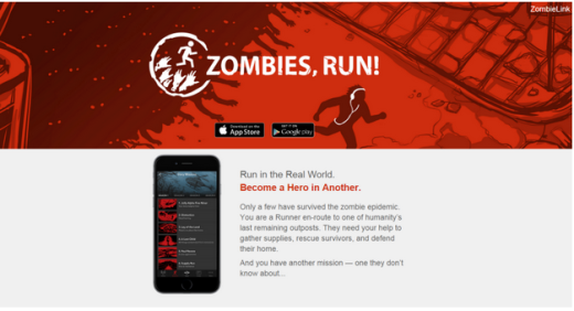
This game’s got it all:
- A fun and interesting storyline
- Multiple goals/side-quests and items to collect
- Ongoing narration as you reach benchmarks
- Plays your favorite music as you’re running—between important mission updates of course
You can even set up an interval run scenario where you have to sprint away from zombies as they appear at random. In case you’re unfamiliar with the term, interval running means sprinting to elevate your heart rate at a set interval, and jogging to bring it back down to baseline between sets.
But when you’re running from zombies it’s no longer for self-improvement. It’s for survival. And that makes me want to push just a bit harder. Not to mention, I want to rub it in my friends faces that I can survive longer in the inevitable zombie apocalypse than they can.
That’s what gamification is all about: incentivizing a desired behavior. Not just through social pressure (although that can certainly help) but also by making the experience of interaction a rewarding experience.
In essence: making it all fun and games.
Conclusion
A progressive narrative, an intuitive learning environment, enabling an activity to be either competitive or collaborative, and the overall enjoyable nature of gaming are all concepts that all apply to interaction design. Build an intriguing playground within which the user/player can explore and improve, and you’ll find they become self-motivated to engage with the design.
For example, fill your designs with visual cues for your interactive elements:
- Ghost buttons that fill with color in response to mouse hovers are like a web equivalent to a discolored wall that can be broken through in Sonic the Hedgehog.
- A navigation menu on a website could be an iteration of a pause/options menu. It’s all a cue to the intended action. Like any “pause” menu, you want it to be as simple and fast as possible so the user returns to the experience.
- Like an unfinished level, completion meters incentivize people to finish actions (e.g. fill out your profile on Linkedin).
Once a user is emotionally invested, you’ve successfully formed a habit of interacting with the design. And that’s what it’s all about. If you want to make your design addictive, you must make it habitually enjoyable.
If you found this post helpful, check out the free e-book Interaction Design Best Practices for 100+ pages of additional advice. Visual case studies are included from 30+ companies like Apple, Google, Etsy, and Behance.
Read Next: 6 examples of awful UX design
Image credit: Shutterstock
Get the TNW newsletter
Get the most important tech news in your inbox each week.


