Airbnb switched to its ‘Bélo’ logo roughly a year ago, and the curvy triangle certainly looked familiar to some. While many charged that it evoked a certain part of the female anatomy, at the time we noted that it had a very similar appearance to the logo for Automation Anywhere.
But actually, the shape of Airbnb’s exact logo was found in an old trademarks book by an eagle-eyed Redditor.
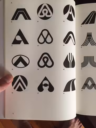
Posted in /r/design, what looks like the Airbnb logo sits, as plain as day, in the graphical representations for the letter A found in the 1988 edition of ‘Trademarks & Symbols of the World: The Alphabet in Design’ by Yasaburo Kuwayama. Although designers might nitpick that the Airbnb logo has a greater height than the one shown in the book, the resemblance is uncanny.
Especially when you consider the book is more than 25 years old.
It’s unclear exactly which company this logo used to represent — as the book’s name suggests, it is a catalogue of trademarked logos designed to aid in inspiration for designers.
There’s no questioning that the logo belongs to Airbnb now, as the company wouldn’t use a logo it didn’t have full rights to and protections for. But it’s an interesting little coincidence, and shows how even hours and months of design can produce results that have already been seen before.
UPDATE: The Redditor who spotted the logo, /u/FR_STARMER said in the post’s comments that the original logo was designed by Akisato Ueda for a Japanese drive-in called Azuma in 1975. The logo, with a credit, can be found here.
Get the TNW newsletter
Get the most important tech news in your inbox each week.