You might have heard about The Grid — it’s been endlessly running banner advertising on every tech website out there for the last few months. What you might not know is what it actually is.
On first look at its landing page, I thought it wasn’t real. The company claims it uses “artificial intelligence” to build better websites and calls it your “personal AI website developer.”
After seeing that non-stop advertising for The Grid around the Web and coming across its website repeatedly, I decided to get in touch with the team and find out what they were actually building. I guess its advertising worked.
I talked to Dan Tocchini, founder and CEO of The Grid to find out what’s going on and he agreed to show me what the team has been up to. The first thing I asked him was basically “what the hell is The Grid and why am seeing its ads everywhere?”

Tocchini, after explaining how ridiculously effective its display ads have been, boils it down to a service that “takes the chore out of actually getting websites,” because “they shouldn’t feel like work.”
He told me that when the team started out, it did a lot of deeper philosophical thinking about websites as a fundamental concept.
“We wondered what the f*ck a website is for” he said, continuing “a lot of people think they don’t need a website but actually have one” — it’s just Facebook, Pinterest or some other destination.
Websites should be that easy, says Tocchini.
‘AI websites’
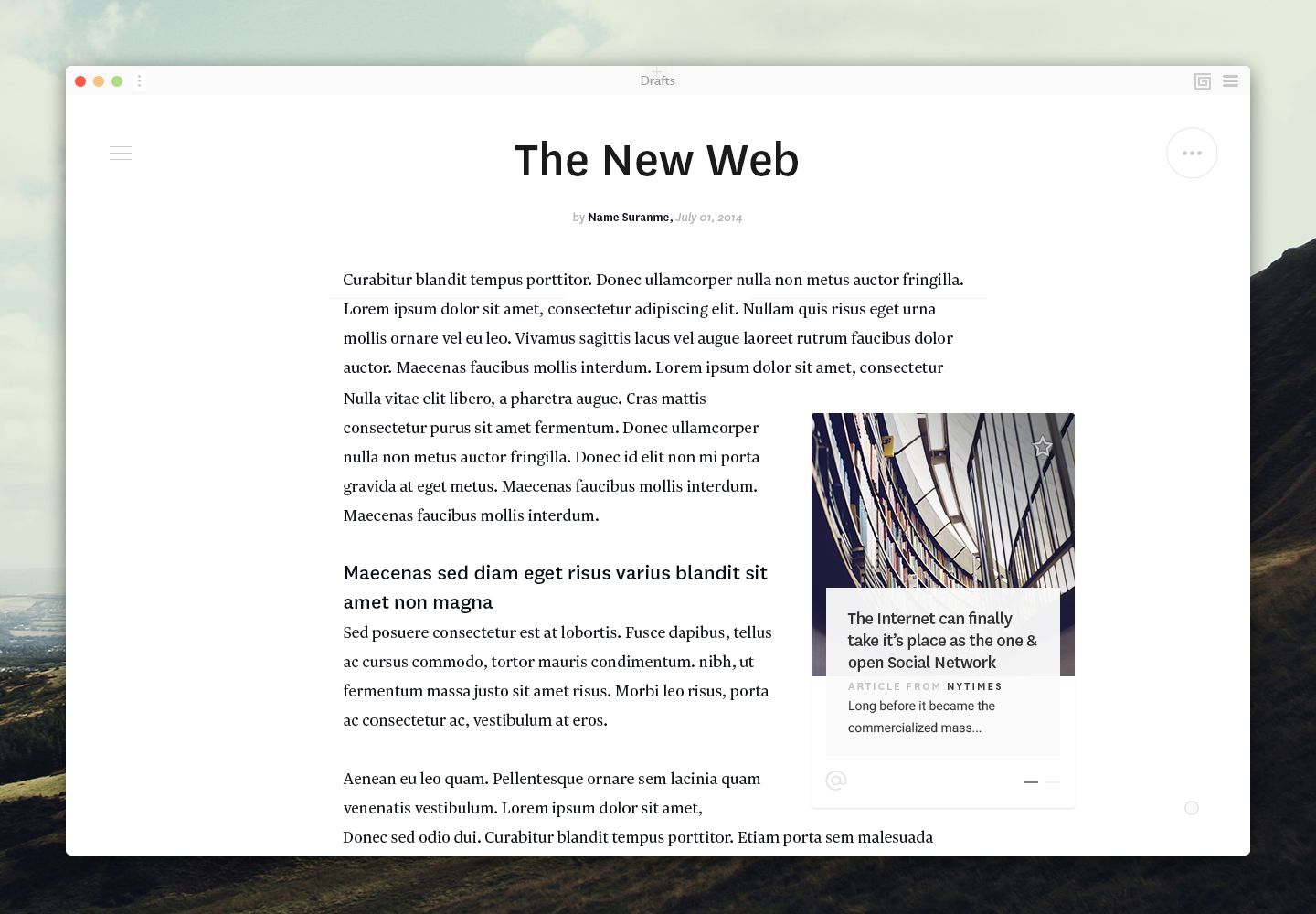
The Grid’s artificial intelligence sounds like it could be some sort of ominous overlord controlling your website, but in reality it’s there to take the complexity out of building a website.
The service utilizes ‘constraint solvers’ to figure out the “puzzle” of design. As in, computers are supposedly getting pretty good at designing things on behalf of us now.

An example of this, is a feature in The Grid that detects faces in photos and works to ensure they aren’t cropped out as it resizes to fit different screen widths. Another tool uses optical character recognition (OCR) to check that titles aren’t duplicated within images displayed next to text.
You can’t code or tinker with your layouts on a granular level like with competing tools. Everything’s done with sliders which are made up of “tens of thousands of options” that the system comes up with for you, to make it as simple as possible.
To start a your site you can create a color palette you like using a service like COLOURLovers or in Sketch, then upload it as an image.
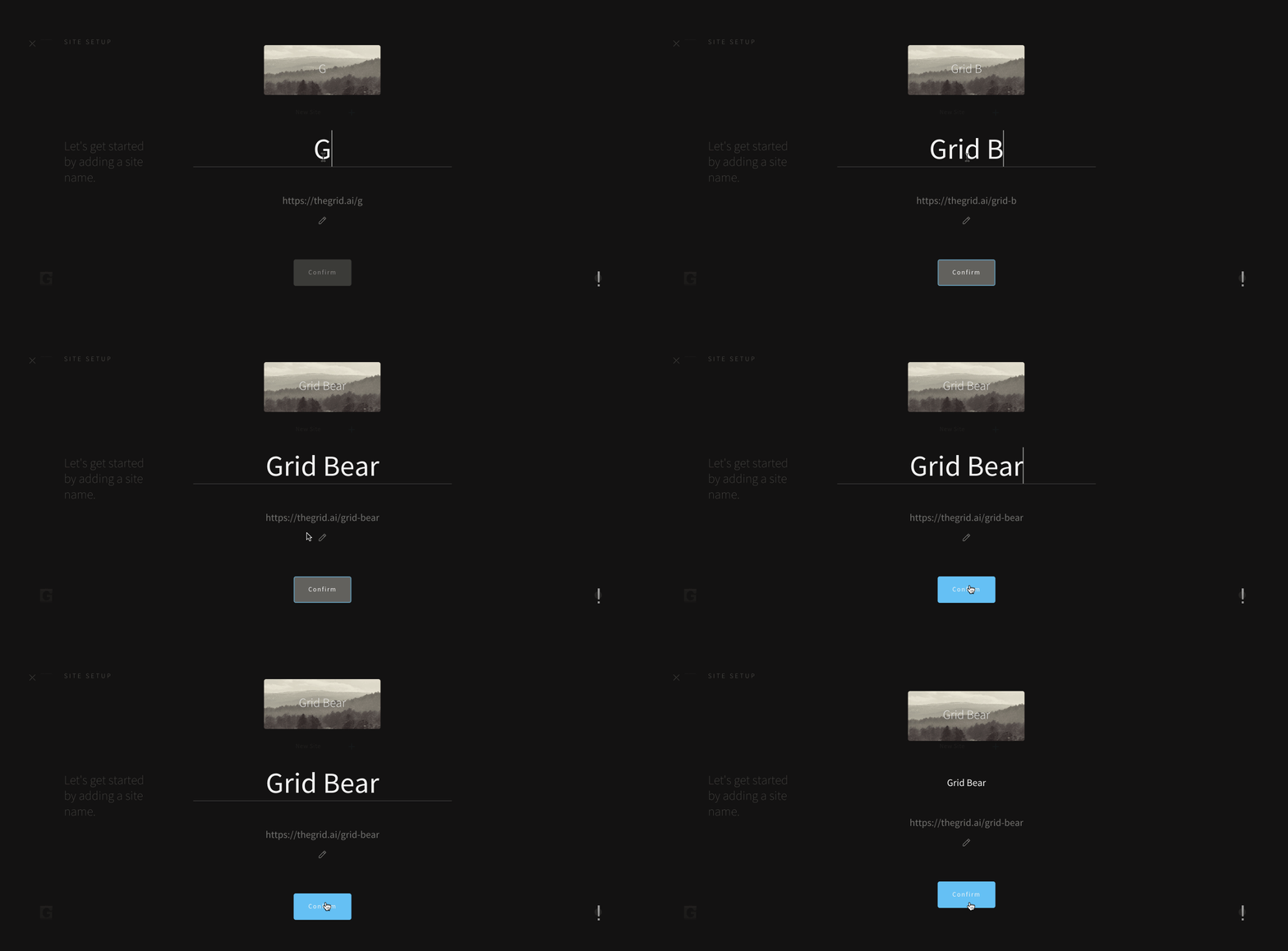
The service then extracts your color palette from that image and generates a site for you based on the combination of your content, color choices and a few other factors.
From there, you adjust your design using sliders that offer a number of automatically generated suggestions for you.
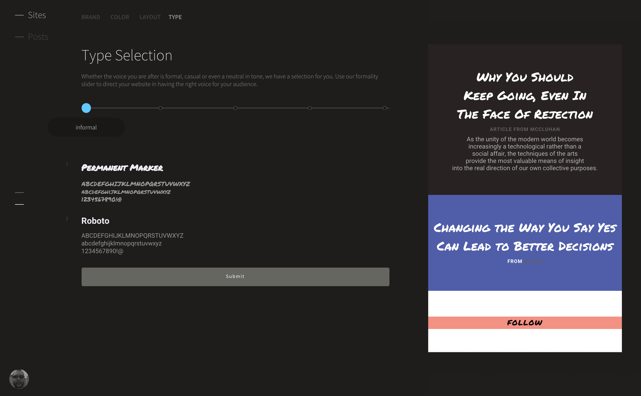
One slider demonstrated by Tocchini showed font pairings. On the far left is ‘informal’ fonts and far right is ‘formal.’
When demonstrating the feature to me, Tocchini got new font pairings he hadn’t seen before. He claims that there are so many possible combinations that every pixel on the slider represents a font pairing.
The font slider already supports script languages including Hebrew and Japanese so international users can also use the service from day one.
Another option determines the overall layout and can be dragged to choose the style of the site, whether it be a magazine style feel or more of a blog. A third develops the color palette of the site, depending on how bold you want to be.
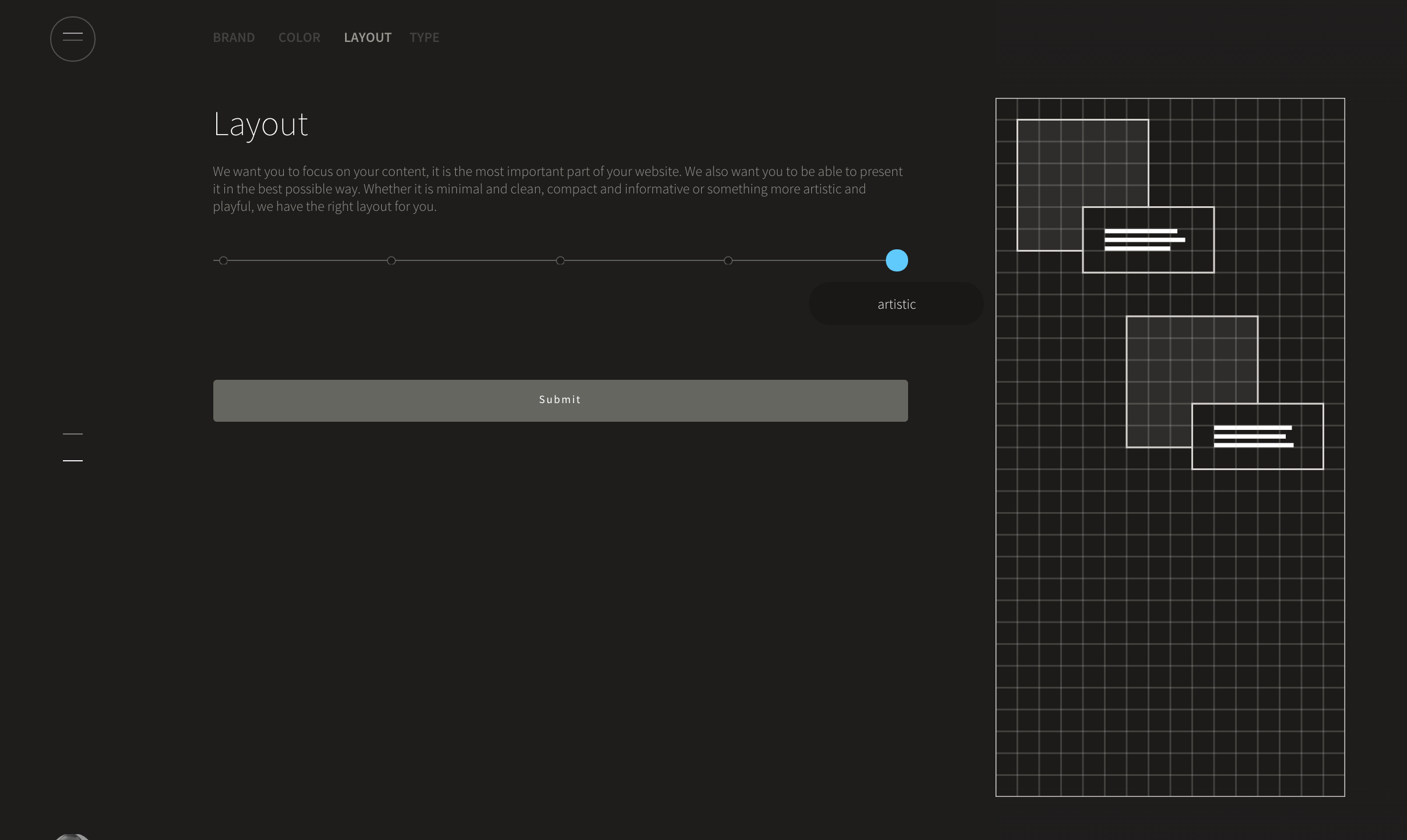
Once you’ve chosen the design, The Grid goes away and crunches for a few minutes to lay it out, deploy the design and pick the new color scheme. In the background, it analyzes the choices you made based on a combination of the sliders, your content and the imagery you uploaded, then computes a new layout using the Grid Stylesheet System.
A notification appears and your site’s ready. When you next head to your domain, your ‘AI designer’ — I can’t get used to that term — has changed the layout for you.
Most of the time the design turns out pretty nice, but very occasionally, the computer chooses a weird pairing of fonts or an odd color match up. To fix, you can just drag around the sliders again to tweak the design (which you can do in The Grid’s mobile app, too, if you’re on the go).
One of my concerns with the slider system is the sheer amount of combinations one can make. I’m worried about finding something that’s cool, then dragging away from it and losing it forever. Under the current system, that’s entirely possible, but there are plans to build a way to save particular pairings.
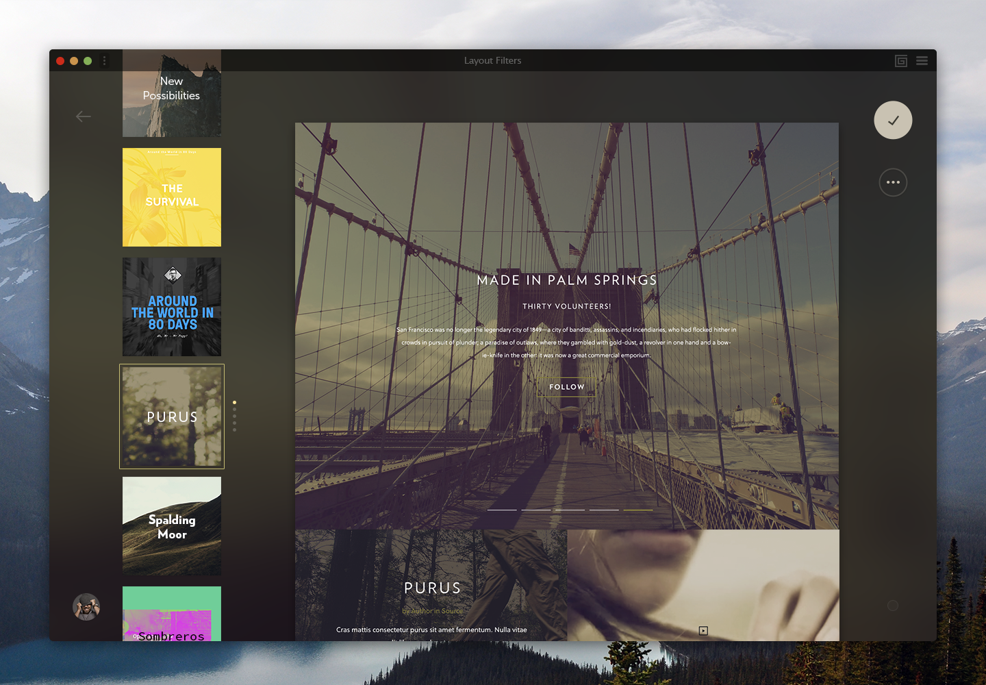
The Grid wants to make building attractive, functional websites as easy as keeping up a social network profile. The tech that was demoed to me is impressive, even in its beta state.
It uses a number of smart techniques to remove out the friction from building a website that most people simply aren’t good at. Choosing color schemes and fonts aren’t an easy feat for non-designers, nor is picking a great layout.
I asked if Tocchini sees Squarespace, a tool that uses pre-defined templates to make building websites easier, as a competitor. He doesn’t think it’s in the same league (I’ve asked Squarespace for comment on whether it thinks The Grid is a competitor).
The reshareable Web
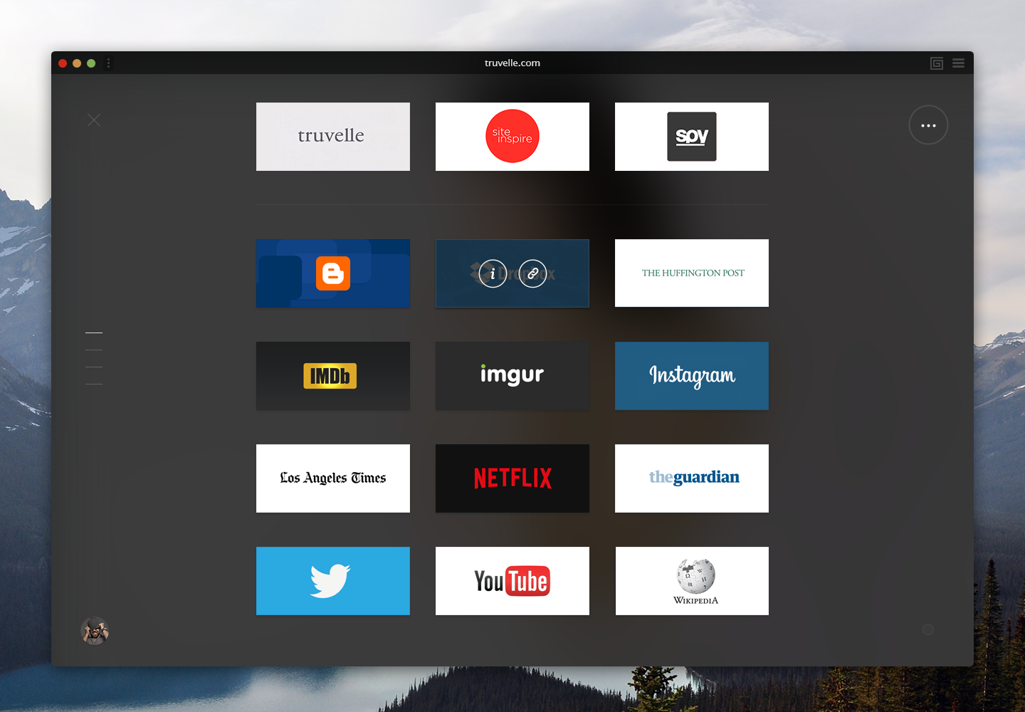
One of the core concepts of The Grid is that it functions very similar to how Tumblr’s Newsfeed works. You can follow things you like, comment on them and re-share with ease.
The Grid allows internal resharing, but also has the tools for sharing content from anywhere else on the Web on your own blog in a click or two.
Clicking The Grid’s Chrome extension grabs a chunk of the content, along with an image, then funnels it straight onto your blog with a nice layout. The same goes for the iOS app — pull up the share sheet and drop in the content to your own site. Those other sites don’t need to support The Grid — the service automatically recognizes their content deconstructs it for you.
When it launches, you’ll be able to follow other users on The Grid in a news feed as well as other sites that aren’t on the service and reshare them directly, without leaving. Think of it as a giant RSS feed… that lets you grab content for yourself.

The same tools recognize other sites’ content and shows it in your feed. They don’t need to provide special code or layout, The Grid just processes the site using the same tools and presents it on its own.
The Grid wants to do what Tumblr did with resharing… for the whole Web. In theory, it could be RSS reborn, which would be pretty amazing if pulled off the way it claims.
The Team

Who are the people behind The Grid? Well, it’s a bunch of engineers from interesting backgrounds across major Silicon Valley companies.
Leigh Taylor, Creative Director, designed the post editor for Medium before joining The Grid. The company’s co-founder and chairman, Brian Axe, was one of the creators of Google Adsense.
There are now more than thirty employees at The Grid, which has been working on its software for about four years. It raised $4.6 million in a Series A round in late 2014 and grew from 16 to 30+ in that time.
The deal with that crowdfunding campaign
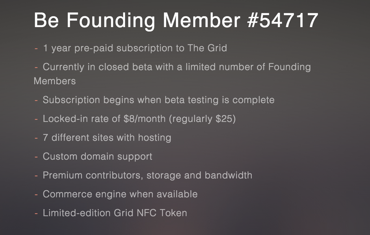
One of the biggest concerns I’ve seen surrounding The Grid is the crowdfunding it’s running.
There’s a long waiting list — over 50,000 people — to get in and the company asks for $96 up-front with no inkling of when you might be able to get access to the service.
The campaign has been running for just over ten months and has made about $5.1 million just from these pre-orders at time of writing by my estimate.
I talked with a few people who’d signed up for the service who say they’ve had very little communication from The Grid about when it might be available or what’s going on, with the team sometimes disappearing for weeks at a time.
I’ve come across the site a few times and felt the same way, so never committed the money. Over the last few months, I’ve noticed concern is mounting amongst backers on Twitter and in discussion threads on Designer News.
https://twitter.com/markjanson/status/626777537880924160
@thegrid Any update on the beta? It's been over a month since the last update and I am eagerly awaiting to test it out!
— Colin Davis (@davco9200) July 30, 2015
Dear @thegrid something wrong with the Beta rollout? Taking a lot longer than advertised!
— Dan Johnson (@dan_johnson) July 28, 2015
@StringStory I'm on the waitlist for @thegrid. Been waiting very very patiently for many many months now :( only 100 beta users have access.
— Julie Klimt (@JulieKlimt) July 28, 2015
When I asked The Grid about the lack of communication it told me “admittedly we’ve been busy working and haven’t come up for air to share and showcase what we’ve been working on as much as we’d hoped to since we launched our crowdfunding campaign.”
They say that it’s because “we’re better programmers than communicators at times” and are working to improve that by sending out more email and social media updates.
I don’t buy that excuse, as it seems like PR spin — in reality, I think The Grid bit off more than it could chew and promised shorter delivery times than realistically possible with a small team.
The company has just started doing live hangouts with backers and releasing videos of progress, though the long silence is fairly inexcusable for those who have put up almost $100 and waited for the service to show up.
So… when can those founding members can expect access?
Well, The Grid says it’s just invited its first 100 members to test the platform in beta. I remarked that it’s a pretty low number, considering there are 50,000+ others waiting and got this in response:
Our Chair and Co-founder Brian Axe was at Google during the Gmail launch, and CEO Eric Schmidt challenged the Gmail team to get to 100 happy users before rolling the product out to the general public.
Getting to 100 happy users might sound like an easy goal, but in reality it means making the user experience for those 100 users completely seamless and without friction, which is harder than it seems.
From there, it says that it’ll start scaling “sooner rather than later” and plans to start inviting a few thousand users in once it’s achieved that ‘100 happy users’ milestone.
That’s still a little vague for me to separate with my money, but should give those who have backed the company some sort of reassurance.
The problem with crowdfunding campaigns is that once you’ve got someone’s money, they’re eagerly waiting for you to deliver the product and any sort of delay can cause panic, then bring out the mob. Building software is hard… but better communication would help.
I couldn’t get a hard date for The Grid’s launch to the public, though it’s said “Spring 2015” in the past, a date that’s already passed.
As for pricing, The Grid will cost $25 per month per site, for those who didn’t pre-purchase access to the platform later this year. If you do jump on the crowdfunding campaign, the price is locked in for $8 per month, per site forever for up to 7 sites.
The Grid shows a lot of promise, even up against the lofty claims it’s making. I watched the team design a relatively unique site from start to end in ten minutes, just by dragging a few sliders and I’ve never quite seen anything like it.
There are plenty of tools out there that claim to make the Web friendlier and easier to build for, but The Grid’s use of simplified interfaces and backend smarts might mean the average person can get excited about it too.
If The Grid can make the future of the Web mean no more crappy restaurant or barber websites built with Microsoft Frontpage back in 2002, I’m all for it. I just want to know when I can actually get started.
Get the TNW newsletter
Get the most important tech news in your inbox each week.

