For UX and UI designers, your website is more than just descriptions of your work — it is your work. In a lot of cases, the site alone may determine whether or not you get hired, so do everything you can to make it perfect.
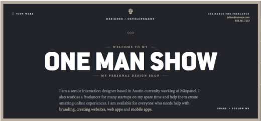
Source: Julien Renvoyé
Working for the wireframing/prototyping app UXPin, we interact with designers everyday (and hire them frequently). We’ve asked our colleagues, CEO, and Chief Product Officer about what they find works with UX portfolios, from both perspectives of those hiring and those being hired.
Use Case Studies to Show Problem-Solving Skills
While other industries can get away with presenting only the final product or explaining the results, UX and UI design is different. More than just seeing a well-made website, most employers want to know how you solve problems, and case studies show just that.
“Don’t obsess over visual showcases,” says Marcin Treder, CEO of UXPin. “It’s much more important to emphasize how you solve business problems through design.”
Each project has its unique set of problems and setbacks, but a skilled UX designer will make the final version seem like there were none. The better you are at design, the less apparent your problem-solving skills. That’s why portfolios need to give more background, so your prospective clients know exactly how you help the design process — and more to the point, how you can help them.
You can write your case studies in a variety of ways, whether a brief blurb or an explicit, step-by-step explanation. In general, though, you’ll want to cover the following points:
- Problem – Clearly state what the problem was. If you helped the client identify the “right” problem that needed to be solved, mention that.
- Solution – Why did you choose the solution you did, and what influenced your decision (for example, user testing or citing other research). This is a great opportunity to explain your process, which we’ll talk about in the next section.
- Personalization – Make it clear that you tailored the solution to this specific client — you don’t want to seem like a one-trick designer who uses the same band-aid solution for every project.
- Results – Of course you want to tout your success, but remember who is reading this. Avoid cliché buzzwords like “clout” or “engagement,” and stick with business metrics like conversion improvements rather than vanity metrics like pageviews.
One of the integral abilities a UX designer needs is story-telling, and case studies are the perfect avenue to establish yours. Don’t neglect the presentation of your case study, no matter how impressive the content is. Engaging the prospective employer here demonstrates you can engage the user later.
Source: Jackie Ngo
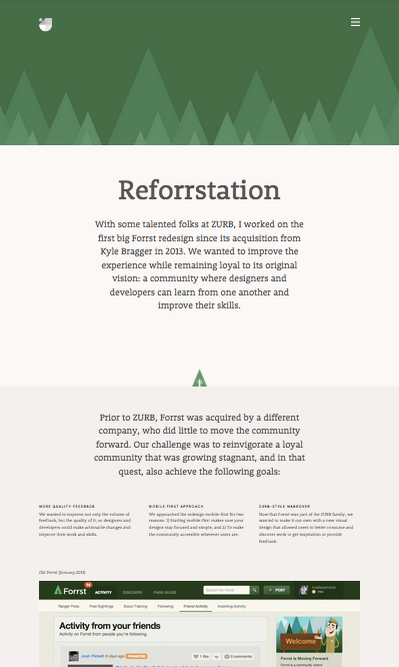
Jackie Ngo shows off her design skills and past experience with a fun animation as the user scrolls down. Each new screen is a new step in her process, creating a nice, linear narrative.
Explain Your Process
As with problem-solving skills, most employers will be more interested in your process than in the final product. This, however, is not always easy to describe, which explains why lesser portfolios stop after putting up screenshots or deliverables.
While posting a persona you made is not a bad idea, on its own it’s not enough. What user testing went into it? How did you test your users? What questions did you ask? How long did it take? These are the questions employers want to know.
Jason Mesut, who writes a website all about improving UX portfolios, shares this advice:
- Document the process – Keep the future of your portfolio in mind when working on your next project. Behind-the-scenes photographs, early screenshots, testing notes, sketches — these are all just as valuable as a flawless final product picture.
- Step-by-step explanation – Don’t gloss over weeks of work in a single sweeping statement. Explain — briefly — each step of the process and give context to the images.
Our advice is to include more than just proof of the final project. Any deliverables that show off your process are worth including. Read the free Guide to UX Design Process & Documentation for some inspiration on what deliverables are worth making in the first place.
Source: Veerle’s Blog
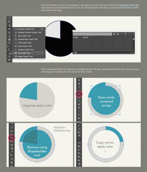
It may seem unnecessary, but designer Veerle Pierters posted a step-by-step instructional on how how she created a women’s cycling infographic, including screenshots of her work in Illustrator. Coinciding with Mesut’s advice, each image is labeled with a brief description of what she did.
Address NDAs Properly
To a lot of designers, non-disclosure agreements are the greatest threat to a good portfolio. It doesn’t have to be this way, though — there are a few ways to abide by its restrictions without limiting creativity. Here are some tips to how to handle NDAs:
- Request permission – Sometimes all you have to do is ask. If you have a good personal relationship with your client, they may show some leniency, especially if you offer to redact sensitive details. It all depends on the company, of course.
- Gray out or blur information – You can still get your main point across by obscuring only the problematic material. The prospective employer is interested in the big picture, not so much the specific details of another company.
- Recreations – If you can’t use the real thing, build a recreation to show what exactly you did. Just make sure you say that it’s a recreation.
- Original material – If you’re having a lot of difficulty with NDA, you can create a project all your own in your free time. This can demonstrate some UX concepts you’ve done in the past that you don’t have permission to post.
- Clever photography angles – Taking pictures at the right angle can save you a lot of stress from NDAs. A skewed angle of a whiteboard or sketch will make the writing illegible while keeping the meaning clear.
- Text only – As a last resort (because images are preferred), you can simply explain the project in a written account.
NDAs shouldn’t be a reason to exclude a project from your portfolio. With any of the tactics above, however, it’s never a bad idea to email the company to check that the workaround is acceptable.
Source: Mostly Serious
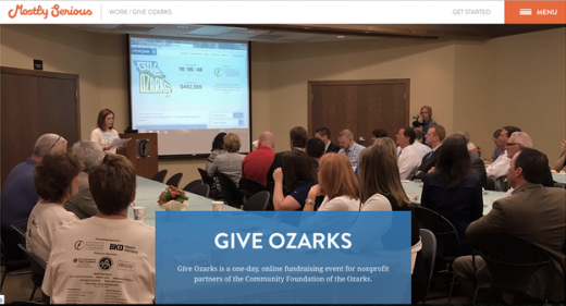
Through a mixture of final screenshots, clever behind-the-scenes photos, original infographics, and text to fill in the gaps, the design collective Mostly Serious outruns any legal concerns with their work.
-
Know Your Market
Before you even start thinking about a portfolio, you should know what kind of designer you want to be. Do you want to be a corporation’s in-house designer? What kind of corporation? Maybe an agency or freelance position would suit you more? If so, which industries would you target?
Photo credit: Ivana Mcconnell
While this questions are essential to developing a career as a UX professional, they also dictate how your portfolio is built. Answering the above questions will tell you which samples to include, and which tone to use.
Narrowing your range to satisfy a specific niche will help you land the jobs that you want instead of just settling for whatever you get. Your portfolio doesn’t have to say outright, “I do this but not that”; however, the tone and imagery you use will communicate this message subtly.
Add a Personal Touch
The UX industry is ripe with designers, and it’s up to you to set yourself apart. Most employers aren’t looking to hire a sheet of facts and statistics — they’re looking for a person.
Personality is typically shown in two ways. You can exhibit what kind of person you are through the tone of the site, along the lines of what we discussed above. The imagery, voice, and overall atmosphere will signal what kind of person you are. The second way to show personality is more straightforward — simply state facts about yourself in a description.
Writing for 99u, Mell Ravenel gives recommendations on personalizing your portfolio:
- Personal perspective – Give your opinions on your work, your industry, or the world in general. Even if employers don’t agree with you, they’ll still have a better idea of who you are as a person.
- Share your story – Personal details about where you grew up, how you got into design, or how many cats you own will complement your work experience. It may even explain your particular style or connect the dots between projects.
- Be real – Feel free to stray away from business topics. Include some of your hobbies, quirks, favorite movies, music, etc. to make yourself more memorable.
We’re not suggesting you make the site all about you without showcasing your work. At the end of the day, the site is designed for business purposes — but including a little personality is good for business.
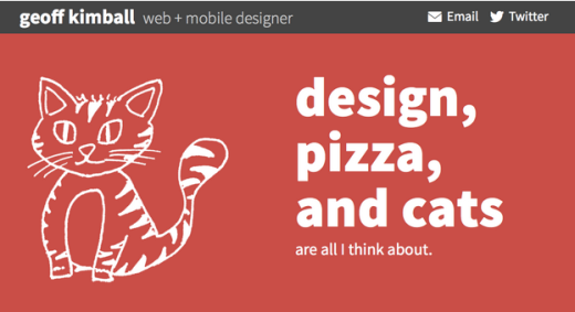
Source: Geoff Kimball
A fun sketch, a humorous tone, and a factoid about himself: Geoff Kimball takes a moment to add a little personality to his site, and gives the reader something to remember him by.
Never Lie
The person going through your site is probably experienced in hiring people, or at the very least they are researching you as one of several candidates. In either situation, they’ve seen a fair share of portfolios, and when nine out of the ten portfolios exaggerate their accomplishments, they start to notice.
Being honest in your portfolio applies mostly to differentiating your role from the role of your teammates. It’s not difficult to take credit for an entire project that was completed by a team, and your employer knows this. Moreover, they’re likely aware of the intricacies of the design process if they’re hiring a UX designer, so tricking them by taking credit for other’s work is not as easy as it may seem.
In Design Collaboration in the Enterprise, we explain how the ability to collaborate is just as important as other, more independant design abilities. UXPin Chief Product Officer Kamil Zieba sums up what employers are looking for when hiring for a team: “You can’t just show your skills in a vacuum. We specifically look for designers who bring out the best in the whole product team.”
Additionally, don’t embellish your talents, either.
Many UX designers talk about their prowess with the visual aspects of design. UX designers, though, deal with abstracts — how to construct the perfect product experience. This can be difficult to show, which is why many portfolios make the common mistake of focusing too much on stunning images of final products. This is why we emphasize case studies and showing your process — these are the skills of a UX designer more than a visual designer.
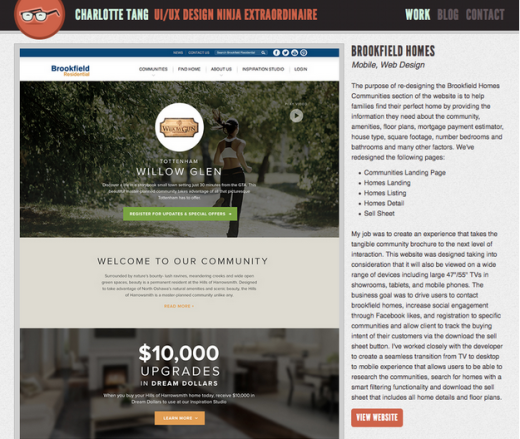
Source: Charlotte Tang
Charlotte Tang exercises tact and phrasing to convey honesty in her accomplishments without undercutting her role. Notice how she refers to the team as “we” and makes statements like, “My job was…” and “I’ve worked closely with the developer to…”
Get to the Point
Good UX designers get to the point quickly. Why would a portfolio site be any different?
Just like any other website, simplicity and navigation are fundamental. The prospective clients, like all other users, don’t want clunky or complicated interfaces to bog them down with unnecessary searches.
“I don’t need to see 10 projects,” says UXPin Chief Product Officer Kamil Zieba. “I only need to see three of them well documented (ideation phase, research, designs) and explained (what were our goals and why, what was the result).”
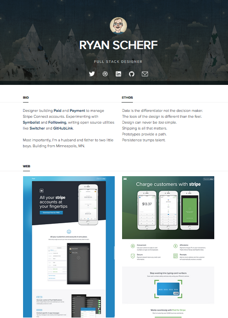
Source: Ryan Scherf
A one-page portfolio like the site of Ryan Scherf gets straight to the point. After succinct blurbs about his biography and philosophy, the site dives straight into work samples and ultimately a call-to-action. In this case, depth is more important than just breadth.
Feature Only Your Best Work
One of the easiest ways to get to the point is by only featuring your best work, i.e., trim the fat.
Especially in the case of employers with a list of portfolios to get through, people probably won’t read every piece of your site. When selecting what stays and what goes, ask yourself, “if this is the only example of my work someone sees, is it good enough?”
Source: Alex Fox
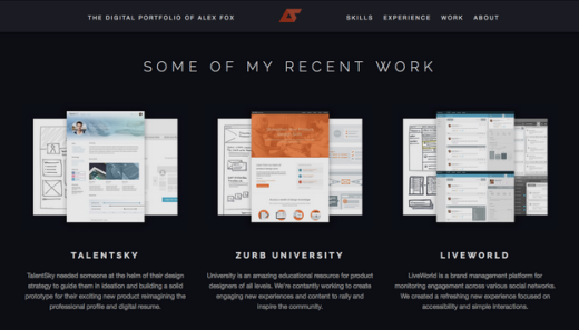
Alex Fox’s portfolio only features three samples, so they are (presumably) what he is most proud of. Additionally, take a look at how the picture for each project combines images from different stages of the design process. This is an excellent use of space, and keeps the screen compact and to-the-point.
Use Testimonials
Social proof is an excellent strategy for building trust on any site, but especially for portfolios where trust is crucial. Testimonials work especially well here: it’s one thing to talk about how great you are, but it’s another thing entirely when someone else does it for you.
Testimonials are easy to collect if you have good rapport with your clients. Mention to your best ones that you’re collecting testimonials for your portfolio and ask if they’d mind writing a quick, comment. Urge them to go beyond your work and talk about what they like about working with your person-to-person. Repeat until you have about 3–6 of these.
It should go without saying, but if you or your site won any relevant awards, be sure to mention them somewhere on your site. This kind of social proof is hard to come by, but valuable if you do.
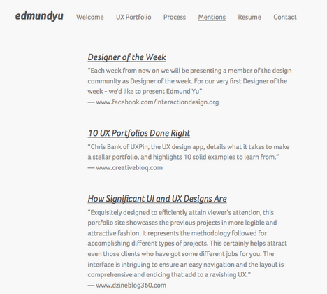
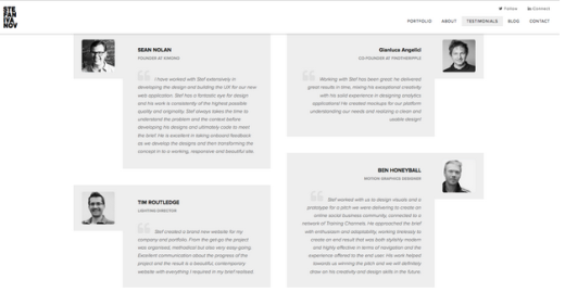
Edmund Yu dedicates an entire page to testimonials. Even without reading them word-for-word, just knowing there’s enough positive feedback to illicit an entire page on his portfolio gives him an innate credibility.
More Examples
For more examples of top-notch portfolio sites, take a look at five of our favorites before:
Mariusz Ciesla
Hugelier Design
Stef Ivanov
Nick Jones
Meng To
Additional Advice
If you’d like to explore more skills and techniques of great UI & UX designers, check out our free 109-page e-book Web UI Design Best Practices. The book explores techniques spanning UX design, visual design, and interaction design.
Read Next: 5 roles every great designer must play
Image credit: Shutterstock
Get the TNW newsletter
Get the most important tech news in your inbox each week.
