Jerry Cao is a UX content strategist at UXPin — the wireframing and prototyping app. To learn how to master the art of persuasive design, download the free e-book Interaction Design Best Practices: Time & Behavior.
There are times when 404 error pages frustrate and annoy you. Interestingly enough, there are also times when they delight you to the point you don’t mind the dead link.
But the difference between the two is not chance. Your 404 error page should reflect the same thought and design as every other page — more, even, considering that it’s mere appearance is already disrupting the user experience. But when dealt with properly, you can make the best of a bad situation by turning your 404 page into an unexpectedly pleasant surprise.
The Undeniable Power of Emotional Connections
Not to undermine the importance of functionality, usability, and the service provided, but the emotional connection a user feels to the site will most often dominate their overall opinion about it.
This article by Morgan Brown and Chuck Longanecker will explain the details, but to summarize, the human decision-making mechanism has evolved such that we “go with the gut” in many of the split-second decisions that comprise our interaction with websites. That means what we feel about a site is more important than what we think about it.
Source: Pillars of Great Design
With that in mind, being denied access to where we want to go and seeing a 404 page will make us feel… not so great. Such a misstep can drag down the entire experience, or even kill it if it’s the culmination of other annoyances (like unclear navigation or misleading microcopy). That’s why 404 pages must be dealt with special care.
The good news is that 404 pages also offer a refreshing opportunity for humor. It’s an awkward situation, the site not doing what it’s supposed to — but that surprise also enables it to be funny, as the user is not expecting the fun message the 404 can deliver. Below we’ll explain some of our favorite 404 pages, and why they make us love the site more, not less.
Make Your Users Laugh
One of the oldest ways to make an emotional connection, make your user laugh and they’ll find it harder to hate you for messing up their visit.
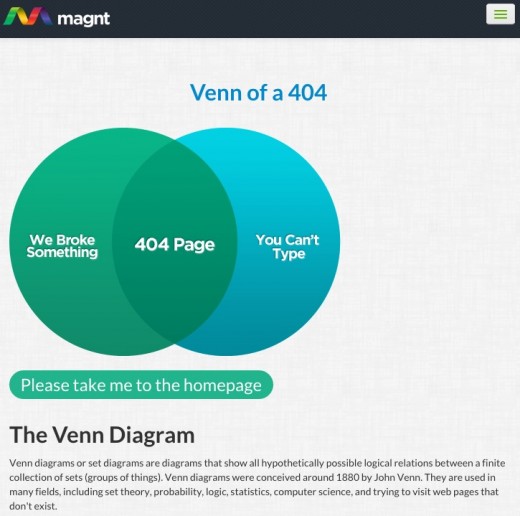
Source: Magnt
The 404 page for Magnt is, essentially, a visual gag. The Venn diagram made us chuckle, and that’s a pretty clear emotional connection.
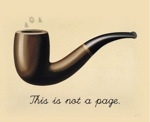
Source: Worrydream
Pop culture references are also popular on 404 pages (because if you can’t be funny, reference someone who is). However, this one from Worrydream has a classical and original spin. Notice the “404” written subtly in smoke.
Distract Users With Impressive Visuals
If you can’t make them laugh, try impressing them with your artistic talent. These 404s just look cool, and sometimes that’s enough to make the user change their mind.
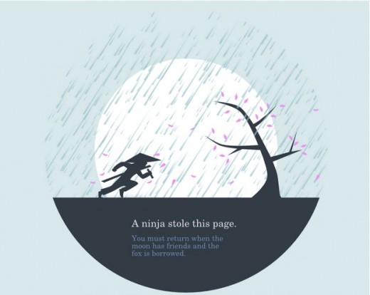
Source: Huwshimi
Ninjas seems to be a crowd-pleaser, and Huwshimi’s 404 page takes full advantage of this. The framing, technique, use of colors, etc. make this page a work of art, and we don’t mind seeing it pop up when browsing.
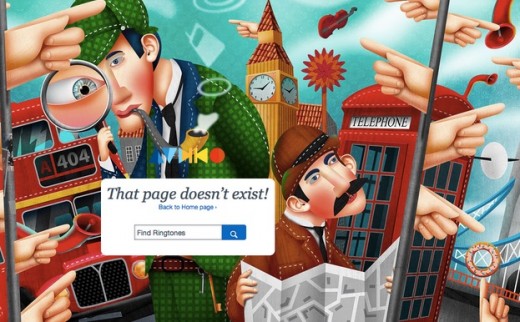
Source: Audiko
Likewise, the 404 for Audiko is so fun to look at, we’re likely to forget what we were originally looking for. While not as subtle as Huwshimi, this image is certainly more stimulating, and our eyes can get lost in the details.
Give Users the Power of Interaction
Can’t make them laugh or impress them with your artistry? Why not make a game of it…
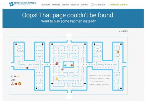
Source: Blue Fountain Media
… sometimes literally. The 404 page for Blue Fountain Media is a smart adaptation of Pac-Man right in the page’s “404” title. This is the kind of 404 page that you might visit intentionally to kill time.
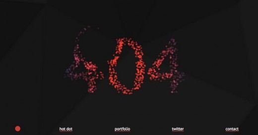
Source: Hot Dot
Another time-wasting 404 page is Hot Dot’s. Click anywhere on the “hot” dots and watch them scatter. This is more fun than you would think, and users will likely dwindle on this page long enough to forget where they wanted to go in the first place.
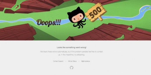
Source: GitHub
Not all interactive 404s have to be addictive. GitHub’s 404 is simple and doesn’t keep you long, but it is enjoyable. It adds only slight interactivity (the objects in the foreground move along with the mouse) to an adorable visual to make us smile.
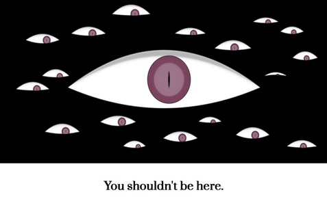
Source: Hakim El Hattab
Emotional connections don’t always need to cute and cuddly. Hakim El Hattab’s 404 page features a bunch of delightfully creepy eyes that follow your mouse around and blink out of rhythm. The foreboding message at the bottom is heightened a few moments later when the site automatically redirects you to the home page.
Complement the Page With Subtle Branding
The 404 page can also be an opportunity to promote your brand, as long as it encompasses one or more of the other elements. Don’t forget that Maslow’s Hierarchy of Emotional Needs still applies — make sure your brand assets complement the functionality and personality of the interface.
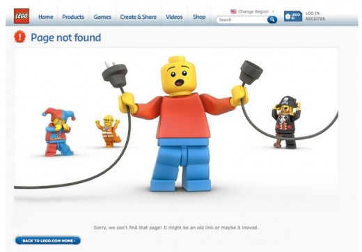
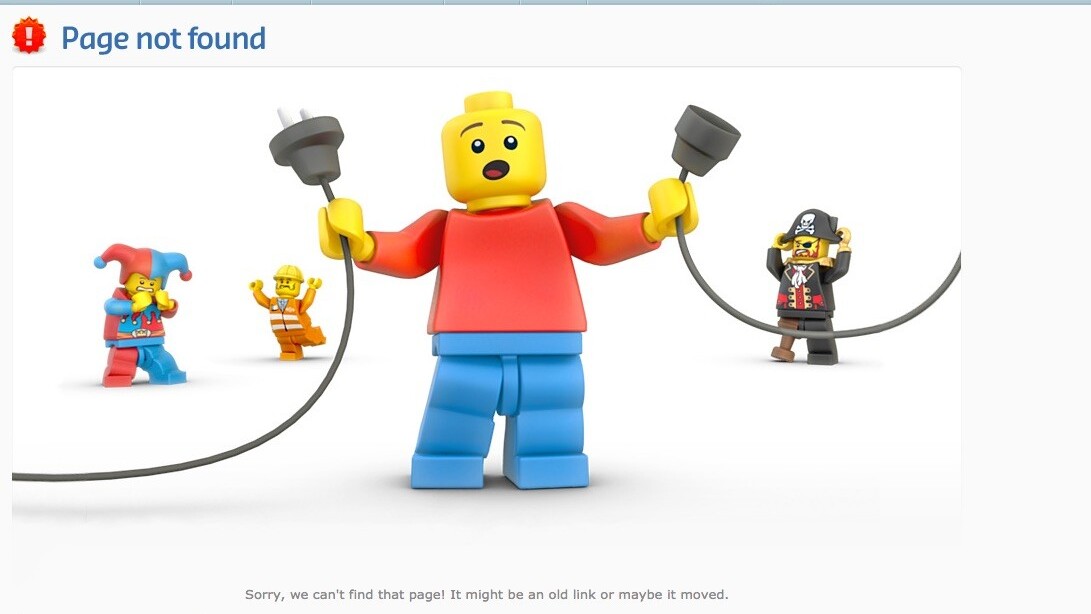
Source: Lego
The Lego 404 page, for example, uses humor and a funny visual, but it also uses its iconic characters. It’s simple, cute, and it reaffirms brand awareness. Just looking at this page brings back memories. On a more subtle level, also notice how they chose red for the foreground character to better highlight the sense of error.
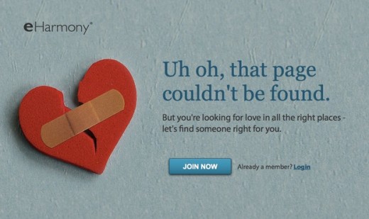
Source: eHarmony
Similarly, the 404 page for eHarmony uses interesting visuals while promoting the site’s theme of love (or lack thereof). A more below-the-waist joke might seem inappropriate for a dating site, but this subtle one fits in perfectly. They’ve also used this unfortunate turn of events as a conversion opportunity, tailoring their message to sell their service. It’d certainly be interesting to peek inside their analytics to see if these pages actually account for measurable ROI.
And the Winner…
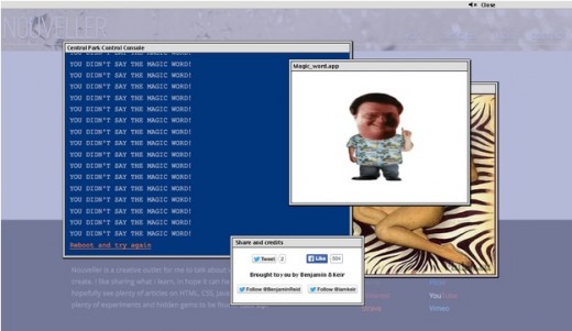
Source: Nouveller
As die-hard Jurassic Park fans, perhaps we’re biased, but we think Nouveller’s 404 page has it all. It starts with a DOS input of the Central Park Control Console, but after a few tries (interactivity), it breaks into Dennis Nedry’s famous “You didn’t say the magic word” screen (pop culture and humor). Another added element is the factor of surprise — this kind of out-of-the-blue reference is sure to be remembered if you weren’t expecting it.
Of course, the message doesn’t get out of hand since the “Reboot and try again” option takes the user back to the homepage. This 404 page has all the right elements: fun, interactivity, and still some baseline functionality to get the user back on track.
For more brilliant 404 pages, we highly recommend this analysis of 33 error pages from Creative Bloq.
Practical 404 Tips
Making your 404 page fun is only half the battle — there’s still a lot of practical factors to keep in mind. In closing, let’s review some general tips to remember when covering your mistakes:
- Link to Popular Posts — Take advantage of the fact that your user may not know where to go next. Recommend some your top content while they’re open to suggestion.
- Include a Search Bar — In the same vein as the above tip, include a search bar to help your user continue browsing without too much interruption.
- Give the option to report a dead Link — Allowing users to participate in making the site better will also give them a beneficial sense of satisfaction. At the very least, give them a support email address so they feel their voice matters.
- Explain the situation like a human being— Tell them exactly what could have went wrong (in layman’s terms), and treat the 404 page as an information portal. If your design allows for it, you can even include both a search bar and a link to recommended content. Just don’t hide behind the technical language we’ve always come to expect.
Treat your 404 page with the same design precision (perhaps even a bit more) as your other pages. With the proper execution, you might even gain some unexpected new fans as they share the clever designs across social media.
To learn more clever interaction design techniques, download the free e-book, Interaction Design Best Practices: Time & Behavior. Case studies are featured from 30+ companies including Google, AirBnB, Facebook, Yahoo.
Read Next: Designing websites that mirror how our eyes work
Photocredit: Lego
Get the TNW newsletter
Get the most important tech news in your inbox each week.


