Jerry Cao is a UX content strategist at UXPin — the wireframing and prototyping app. To learn more about content-first design, download the free e-book Web UI Design for the Human Eye: Content Patterns & Typography.
When users encounter text-heavy pages, their eyes can follow the F-Pattern, a subject we covered in-depth last week. But what about pages that are more visual? This week, in the second part of our design series on creating websites that mimic how our eyes work, we focus on the Z-Pattern.
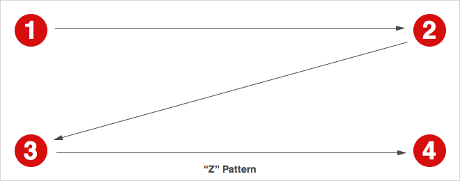
Source: Trend Web Solutions

The 💜 of EU tech
The latest rumblings from the EU tech scene, a story from our wise ol' founder Boris, and some questionable AI art. It's free, every week, in your inbox. Sign up now!
Think of the Z-pattern as the sister to the F-pattern. Both are naturally occurring eye patterns, as validated by eyetracking studies. The difference is in the type of content the user encounters. Usually, content-rich pages will trigger the F-pattern while pages with strong primary content are more suitable for the Z-pattern.
What is the Z-Pattern?
Where content is more spacious — or at least organized looser — a user’s sight will typically follow a pattern like the letter Z.
Like the F-pattern, the reader first scans a horizontal line across the top of the page, whether because of the menu bar, or simply out of a habit of reading left-to-right from the top. When the eye reaches the end, it shoots down and left (again based on the reading habit), and repeats a horizontal search on the lower part of the page.
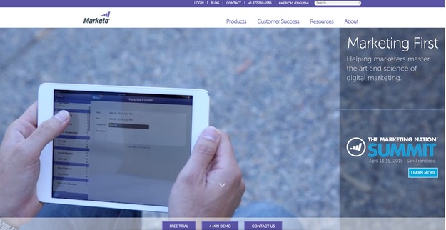
The Z-pattern is perfect for interfaces (like Marketo above) where simplicity is a priority and the call-to-action is the main takeaway. In short, the F-pattern organizes content, the Z-pattern emphasizes calls-to-action.
It’s easy to confuse the F- and Z-patterns based on looks alone, as they both are organized into horizontal rows. The key difference is in how the eye moves downwards.
Once the F-pattern is triggered, the user will scan a straight vertical line down the left side until it reaches something of interest. The Z-pattern, on the other hand, will more or less cover every line, which is why it mostly applies to pages that feature a small enough amount of content to make this feasible.
How to Use the Z-Pattern
We’ll again use a visual aid from Brandon Jones’s post to explain the Z-pattern.
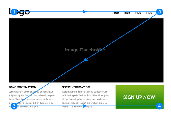
Source: Understanding the Z-Layout in Web Design
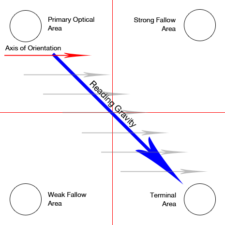
Using the above graphic, we can break down the Z-pattern into its key areas (based on Jones’ analysis).
It begins the same as the F-pattern: starting at the upper-left hand corner (Point 1) and moving horizontally all the way to the right (Point 2). As with the F-pattern, Point 1 is the most valuable spot, which is why it almost always houses a company logo. Again like the F-pattern, Point 2 is a great location for a call-to-action — however, not the main call-to-action, as we’ll explain below.
The Z-pattern then deviates on its own pathway. The prime area of the Z-pattern is the center of the page, the large expanse where the eye scans on its way down to the second row. The trick to this area is fill it with content that interests the user, while still urging their sight downward to the next line. This space usually hosts an image or an image carousel; something that will maintain user interest, but not enough to stop them from continuing to browse the site.
The user then again scans the next row horizontally, left-to-right (Point 3 to Point 4). Here is the main appeal of the Z-pattern; think of this layout as a minor build-up leading to Point 4. This is the spot where you want to put your most valuable content, usually a call-to-action.
Because Point 4 is the finish line, the row between it and Point 3 should contain content that pushes the user’s sight to the corner. This is an excellent place for a series of smaller gateways to other sections. Basically, the goal for this row is to incite title scanning, drawing the eye ultimately to Point 4.
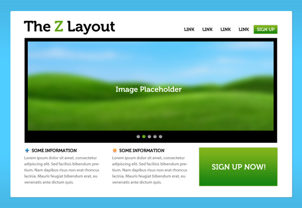
Source: Understanding the Z-Layout in Web Design
Another important factor of the Z-pattern is the background: you should separate it from the main framework as much as possible. The Z-pattern relies on its structure to achieve results, and a flashy background distracts the user. As recommended in Web UI Design for the Human Eye, it’s never a bad idea to keep backgrounds simple and muted.

Source: Understanding the Z-Layout in Web Design
The Z-pattern can even extend throughout the entirety of the page, repeating Points 1-4 if you feel that more value propositions are needed before the call-to-action. As you can see above, this is exactly what Evernote does by starting with a “Sign Up Now” call-to-action, guiding users through a few selling points, and finishing their repeated Z-pattern with payment option calls-to-action.
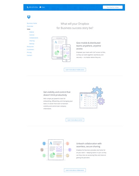
Source: DropBox
DropBox takes a visually simpler approach to this zig-zag pattern by doing away with any background images altogether. Instead, more functionality is built into the layout since a “Learn More” call-to-action connects each section of the winding pattern as your eye makes its way down the page. This also helps informed readers click to the next relevant page without needing to read all the copy first.
Why Is This Pattern Effective?
The Z-pattern is popular amongst designers because it adheres to the central tenements of web design.
There is a visual hierarchy and premeditated structure, plus it opens key visual pathways to both a brand and a call-to-action. While the F-pattern follows a route more organic to natural eyesight trends, the Z-pattern is a bit more refined for storytelling purposes (since you lead the user as they zigzag from point to point). .
Another benefit of the Z-pattern is its versatility. The central image can be enlarged or shrunk, the pattern can be repeated any number of times (to accommodate several different calls-to-action), and the content in each row can be anything that follows the unifying structure.
Source: 3 Design Layouts: Gutenberg Diagram, Z-Pattern, And F-Pattern
The Z-pattern’s fixed structure can also be its drawback. As a layout designed to control a user’s sight, it’s susceptible to unplanned distractions and anything that knocks the user’s vision off course. Remember that your user’s eye will always be attracted to the biggest and brightest elements on a page, so if you’re designing for the Z-pattern, make sure your complementary elements are entertaining — but not overpowering.
Takeaway
Both the F-pattern and the Z-pattern are widely recognized web design strategies, but each for different reasons. Determine the main goal of your site first and foremost — if it must organize a large selection of content, choose the F-pattern; if it leans towards eliciting a specific action as a result of visual narrative, choose the Z-pattern.
If you’re designing for the Z-pattern, don’t forget its emphasis on structure. Know where the key points are located, and how they’re best used. Remember to keep secondary content subdued so you don’t “derail” your user’s sight pathway, and don’t be afraid to take advantage of the layout’s versatility.
To learn more about content-first design, download the free e-book Web UI Design for the Human Eye: Content Patterns & Typography. The e-book offers practical advice on visual hierarchy, designing for readability, and creating visual language through typography. Design examples are also analyzed from 30 companies including Dropbox, AirBnB, Marketo, Hulu, and Evernote.
Read Next: How to design websites that mirror how our eyes work
Get the TNW newsletter
Get the most important tech news in your inbox each week.