Jerry Cao is a UX content strategist at UXPin — the wireframing and prototyping app. To learn more about how to create visually digestible interfaces, download the free e-book Web UI Design for the Human Eye: Colors, Space, Contrast.
Admit it, at some point in your life, you were impressed by an optical illusion.
It’s fascinating how our eyes play tricks on us, and it’s even more fascinating that we tend to side with our sight over our common sense. But optical illusions are often the result of the science of sight — the science of Gestalt.
Source: Gestalt Art
The Gestalt principles are the theories that analyze the gray areas of how our sight works. These principles explain how people perceive visual objects, and how variations in arrangement, perspective, size, etc. can alter this perception.
In this piece, we’ll take a quick look at the concepts behind Gestalt and only the most applicable principles for day-to-day UI design.
Pillars of Gestalt for Design
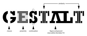
Despite how it may seem, the Gestalt principles are not the life work of some guy named “Gestalt.” Gestalt is actually the German word for shape or form, and lent its name to an early 20th century psychology movement, where the Gestalt principles originated.
Source: Gestalt Principles Composition
As the legend goes, in 1910, psychologist Max Wertheimer watched the way the lights of a railroad crossing flickered on and off (like lights “encircling” a movie theater marquee). It created the illusion that the lights were moving in a circle, even though they were merely alternating with good timing. This division between how we perceive visual stimuli versus what we see fueled the Gestalt movement for the next couple decades.
Wertheimer, along with his colleagues, developed theories on sight perception that, more than half a decade later, are foundational to web design. The theories expound on Aristotle’s simplistic but classic axiom, “The whole is greater than the sum of its parts,” as applied to visuals. The Gestalt principles tend to revolve around a handful of similar concepts. While relating to all sight perception, these ideas are especially applicable to web UI design.
Let’s take a look below at the four properties behind Gestalt.
Emergence
When trying to identify an object, we (humans) first attempt to identify the object’s outline, and then match it to outlines we already know. It’s only after this outline pattern identification that we start to notice the details of an object, the parts as separate from the whole.

The above picture is often cited when explaining Gestalt principles. In it, the viewer identifies the dalmatian all at once, instead of something like, “there’s a dalmatian leg, there’s a dalmatian head. Put them together, and…”
Application to Web Design: Shapes and contours should take precedence over lesser details (no matter how creative they are or how stunning they look). It doesn’t matter how fascinating a clickable button looks if your users don’t know it’s a button. Like we described in Interaction Design Best Practices, these “signifiers” help suggest the function (known as affordances).
2. Reification
Because visual stimuli is so inconsistent, our brains are wired to “fill in the gaps” when information is missing. This allows us to comprehend visuals even when they’re vague or limited.

Source: Gestalt (Principles and Laws)
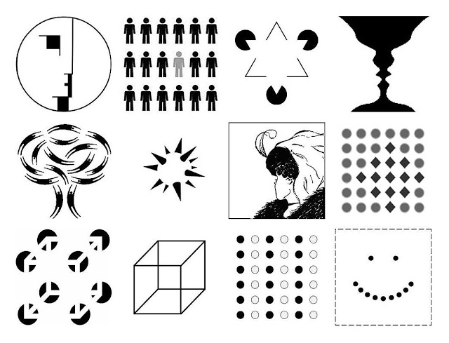
Each of the above examples is a bit of a trick. In reality, they are all ambiguous and incomplete shapes, but our brains can still make sense of them. For example, in Figure A, our brain tells us that the three incomplete circles are connected by a white triangle.
Application to Web Design: In addition to horseshoes and hand-grenades, “close” also counts in web design. As long as you have enough information to communicate an object, the user can fill in the rest. This means you’re allowed to be creative with your use of white space, treating it as another design tool instead of an empty canvas.
We’ll explain this further below when discussing Closure.
3. Multistability
If an object has more than one interpretation, the mind will alternate between the different interpretations since it can’t see both simultaneously. The longer a viewer focuses on one interpretation over the other, the more dominant that interpretation becomes.
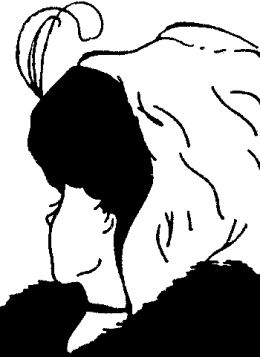
Source: Two Faces or a Vase
This is the basis for many popular optical illusions, like the one above. Viewers can interpret it as an old woman or a young woman, but not both at the same time.
Application to Web Design: Avoid multiple interpretations, if possible. Double-check that your designs can only be seen the way you want them to be seen, strengthening your influence over how the UI affects the UX. Usability tests can help identify these problems, even if you get a fresh pair of eyes on a design from whoever’s sitting next to you.
4. Invariance
Like Reification, invariance is another tactic our brains use to comprehend visuals despite glaring inconsistencies. Invariance shows that we recognize outlines and patterns of objects despite differences in perspective, rotation, scale, or even slight deformations.

Source: Gestalt (Principles and Laws)
In the above examples, we can distinguish the objects in A as different than the objects in B, even though they’re similar. However, we also can understand that the objects in A are the same as the objects in C and D, even though they’re distorted.
Application to Web Design: Invariance may not have as direct an impact on web design as the other tenements of Gestalt; however, it is often applied to CAPTCHA tests, as invariance is one advantage humans seem to still have over robots.
Our 5 Most Useful Gestalt Principles
In 1954, decades after Wertheimer first paused to stare at train lights, Rudolf Arnheim compiled and boiled down the Gestalt principles into the book Art and Visual Perception: A Psychology of the Creative Eye. As designer Carolann Bonner suggests, there are five principles that are most helpful on a daily basis:
- Similarity
- Figure-Ground Relationship
- Grouping
- Closure
- Continuation
We’ll describe them in detail below:
Similarity
Objects that look similar are perceived as similar.
This has huge implications on web design, a field that values communicating information in the quickest and easiest terms possible. By creating two elements with a similar visual thread, you can explain each’s purpose in a way that feels intuitive.
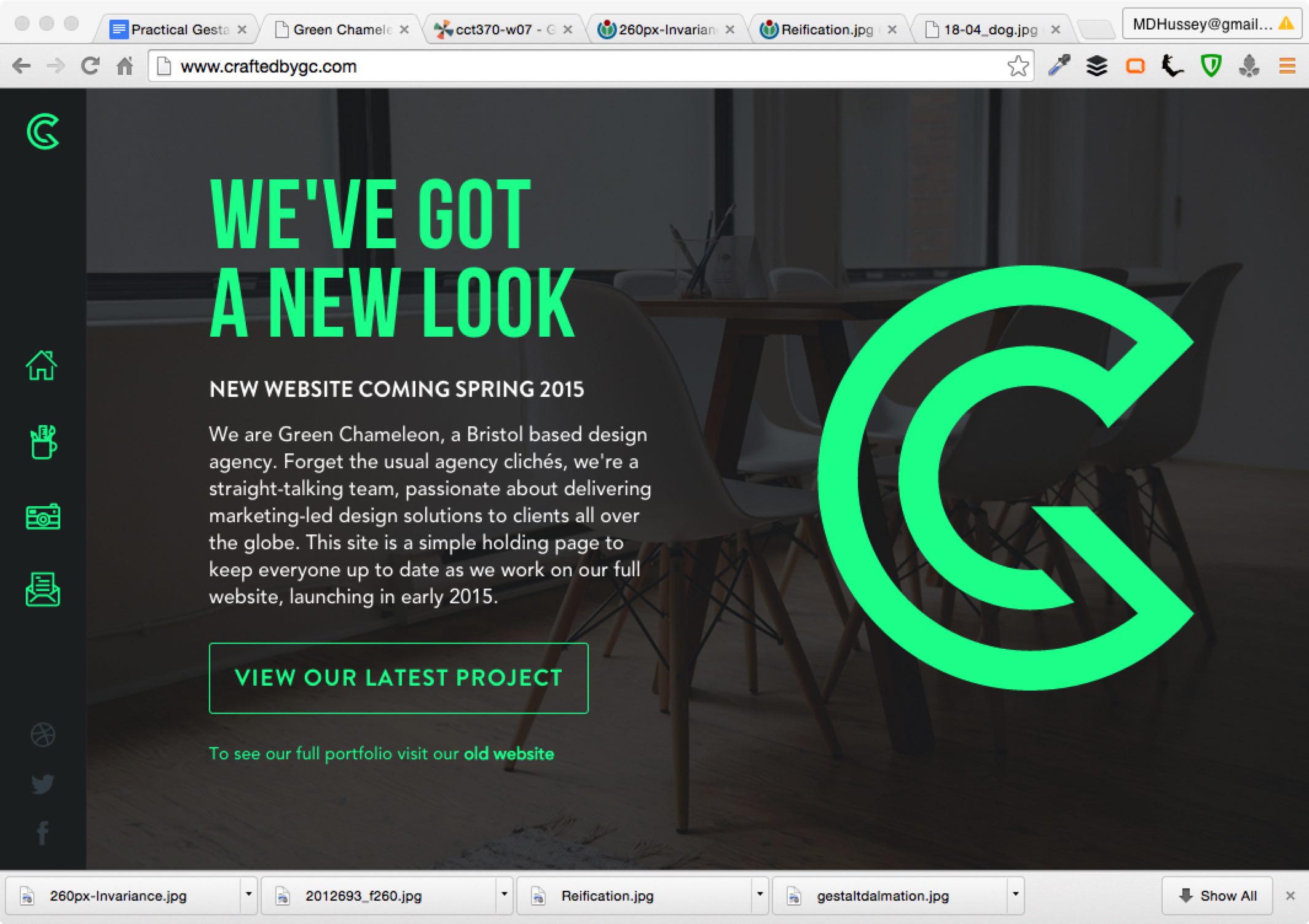
The similarities don’t have to be glaring. As shown in the above example from design agency Green Chameleon, the navigation icons all look different. However, the similarities in color, size, spacing, and placement of icons all suggest that each icon represents the same level of navigation (top-level).
Upon hover, an interaction is triggered that slides out the text to explain each site section further. This interaction pattern works especially well for vertical navigations since it saves space but doesn’t sacrifice functionality (provided the icon metaphors make sense).
These relate to patterns and consistency, topics discussed in Interaction Design Best Practices. A clever designer will use similarity to convey meaning, saving time in explanation and smoothening the experience.
2. The Figure-Ground Relationship
Elements are perceived as either figures (distinct elements of focus) or grounds (the background on which the figures lie). Steven Bradley lists the three types of figure-grounds relationships, which are each represented in his graphic below:
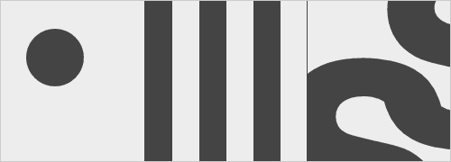
Source: Gestalt Design Principles
- Stable — (left) it’s clear the circle is the figure and the grey space is ground
- Reversible — (center) each column has equal claim to figure or ground, creating tension that can be used in dynamic design
- Ambiguous — (right) while it’s still unclear which is figure and which is ground, there’s a lot more room for interpretation left to the viewer
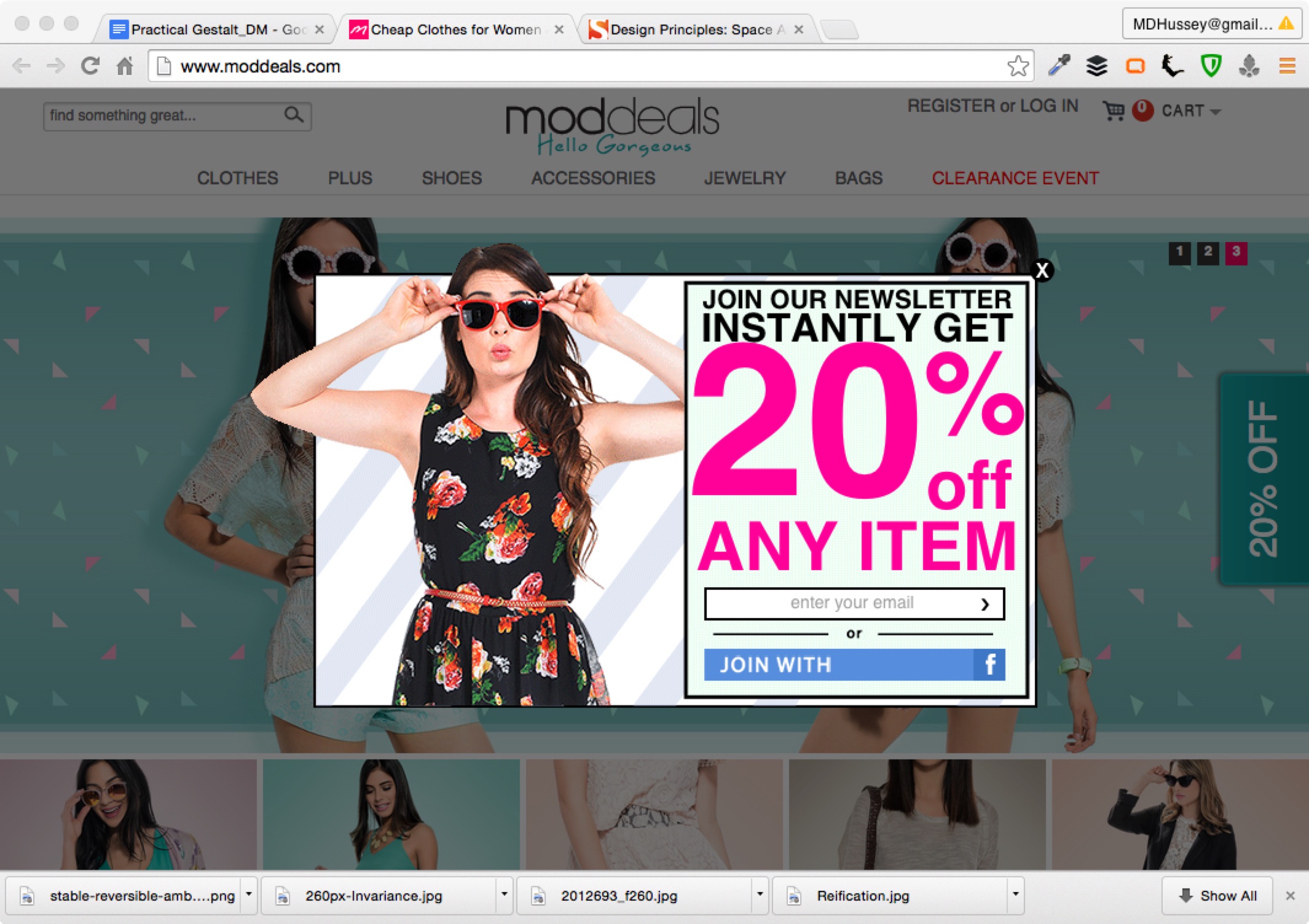
Source: Moddeals
In the above example, Moddeals shows a common pattern that exploits the figure-ground relationship. When the newsletter ad appears, the rest of the page goes darker, pushing in into the background. Additionally, the user can still scroll the page, however the newsletter ad remains in a fixed position, cementing it as the figure set apart from the ground.

On a much subtler note, the site for the German film Tannbach takes a more layered approach to figure/ground.
To emphasize the human relationship in the film, the designer makes the two people sharp against a blurred rustic background. Through the use of color and typography, the actual interface becomes the “primary figure” with the couple becoming the “secondary figure”. As a result, the user visually connects with the couple but still understands how to navigate the site.
It’s a fairly clever implementation of a simple Gestalt principle and shows that you don’t need to interpret the meaning as just “make a menu pop out against a blurry background.”
3. Grouping
Items that are dissimilar can still be grouped together to appear similar. The Gestalt principles suggest at least 2 ways to utilize grouping to show relatedness:
- Enclosure — Enclosing dissimilar objects together within a perceptible boundary will unify them in the viewer’s mind.
- Proximity — Objects grouped closely together will be perceived as similar, especially if separated from other groups by even more space. This also ties into the time and spatial elements of Hick’s Law, which we described in Interaction Design Best Practices.
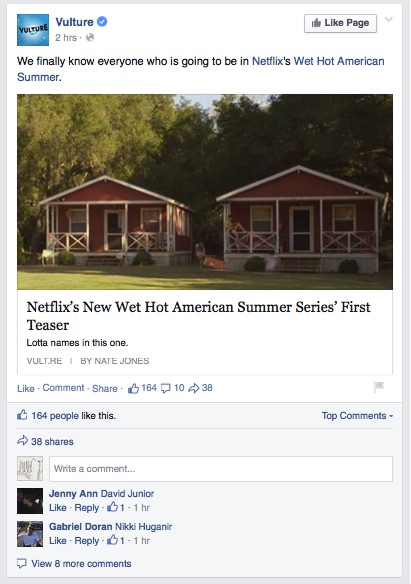
The above Facebook example applies the principles of enclosure and proximity.
The entire post — title, photo, description, comments, etc. — are all enclosed within the same box, set apart from the grayer background, which utilizes both enclosure and the figure-ground relationship. Within the post, options like “Like,” “Comment,” and “Share,” are all located in close proximity, suggesting that all are ways to personally interact with the post (not to mention their related size, font, and color utilize the principle of similarity).
By putting the controls next to the relevant item, the designer spares the user from the hassle of researching, memorizing, and diving into complex user paths. This also relates to the point about making clicks easy because you want to minimize the path between the user and the goal. The simplification of the system allows basic common sense to triumph over lengthy and involved explanations.
4. Closure
Based on the principles of Reification that we talked about earlier, closure is the principle that humans will provide their own closure to incomplete objects by filling in the gaps themselves. This can be used to a designer’s advantage, firstly by affording them some leeway with partial designs, and secondly by encouraging minimalist styles that communicate elegance.
Take a look at the grid layout from Abduzeedo below. Even though there’s no clear borders on each piece of content, the alignment helps our eyes complete the “grid” created by each of the three images. As such, we see three columns of text instead of one large chunk.

Closure also applies to interactions, creating meaning by filling in gaps within actions.
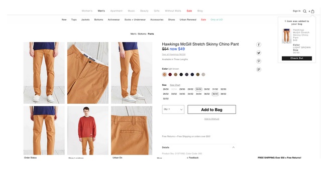
As designer Carolann Bonner explains, Urban Outfitters uses closure to skip a few steps, making the “Add to Bag” interaction very smooth. Click on her GIF to follow along as we describe the steps after clicking “Add to Bag”:
- The button text “Add to Bag” becomes “Added!”
- The number of items next to the shopping bag in the navigation updates accordingly.
- A small modal slides down from the shopping bag to visually confirm the item was added.
As a result, we understand when an item is added to our shopping cart without any implicit action. We don’t need to visit the shopping cart page to verify, or drag and drop any items (which increases friction). By skipping the right steps, the interface provides enough feedback while keeping the interaction weightless.
For more information, Andy Rutledge wrote an excellent piece on applying closure to web UI design.
5. Continuation
Related to closure, the principle of continuation states that a user’s eye creates momentum as it moves from object to object, giving lines a special power in layout design.
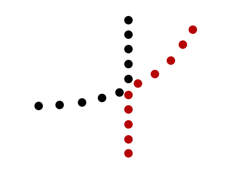 In the above visual aid, viewers perceive a straight line and a curved line — not a bent black line and a bent red line. This makes the power of continuation greater than that of colors, itself a powerful visual tool for showing similarity.
What this means is that users perceive items on a line or curve to be similar to each other.
This has the most obvious effect on site navigation, since items on the same horizontal plane appear to have the same level of hierarchy.
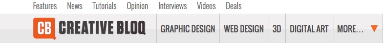
In the below navigation example from CreativeBloq, you can see that all navigation items on the first line represent types of content. All navigation items on the second line represent categories of content. The site doesn’t need to call out this difference since it’s communicated through the principle of continuation.
To learn more about Gestalt principles, check out this helpful tutorial from Tuts+.
Takeaway
Understanding Gestalt principles gives you greater control over your visual hierarchy, helps create more harmonious designs, and increases the likelihood that your message is communicated to your audience. Combining the general principles — emergence, reification, multistability, and invariance — as well as the finer principles — similarity, closure, the figure-ground relationship, etc. — will open up an entirely new level of visual design for your web interface.
To learn more about how to create visually digestible interfaces, download the free e-book Web UI Design for the Human Eye: Colors, Space, Contrast. Visual case studies are included from 33 companies including Tumblr, Etsy, Google, Facebook, Twitter, Medium, Intercom, and Bose.
Read Next: How to change user habits with interaction design
Get the TNW newsletter
Get the most important tech news in your inbox each week.