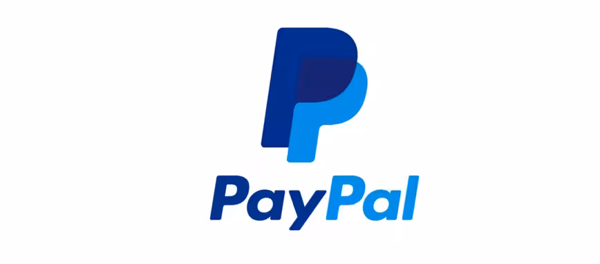
PayPal today introduced a slight logo redesign for its online and mobile payments service.
Frankly, it’s not too far removed from the logo that preceded it, with the same overall design that shows two ‘P’ characters resting on top of one another. PayPal is using a darker blue for the highlight, but it’s the same adjoining name in italics. Each ‘P’ in the new monogram is also filled in the center, which should make it more noticeable from afar.
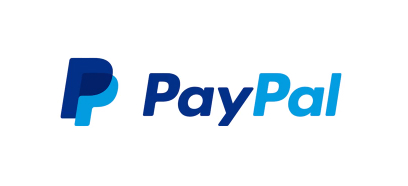
On its website, PayPal admits that the new logo is a small improvement over its forerunner. “Our new logo is not dramatically different,” the company said, “rather it’s an update on what millions of people look for and use every day, around the world. We want this update to confer a sense of momentum that embodies our vision of optimism, progress and empowerment.”
The new branding was developed by Fuseproject, who has worked on design projects for OUYA, Jawbone and One Laptop Per Child (OLPC) in the past. It’ll be promoted with a new brand campaign and will be visible across all of PayPal’s apps, services and advertising materials moving forward.
Is it an improvement on the previous version? Or still lacking a bit of va-va-voom? Let us know in the comments section below.
Get the TNW newsletter
Get the most important tech news in your inbox each week.