With each passing year, the ability to understand and write code becomes increasingly valuable. The demand for competent developers is growing and the required skill set is seeping into professions where it simply wasn’t relevant a decade ago.
Codecademy has built an unparalleled reputation around its free platform for learning programming languages such as Ruby, Python and JavaScript. The courses are plentiful, accessible and modern, with a strangely addictive system for tracking, sharing and comparing progress.
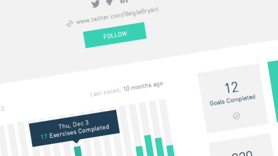
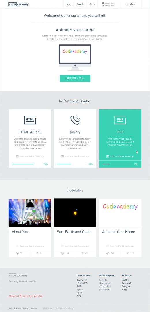
 With over 24 million users, Codecademy is seeking further growth with a radical site redesign. The screenshots I was sent in advance look gorgeous, with beautiful layouts, typography and iconography permeating every nook and cranny of the site. Colors are used sparingly, but the splashes of teal ensure the site looks vibrant, welcoming and cutting-edge.
It feels like a space where you’ll want to spend all of your free time.
Manuel Lima, the design lead at Codecademy, has detailed the design principles that were used to guide the massive site facelift. It’s a fascinating read, but to summarize the New York-based startup has focused on content, stripping away form fields, unnecessary controls and navigation elements. It’s a spartan aesthetic, but one that promises the same level of functionality as before.
Aside from the new look, Codecademy is also improving what its platform can offer. The new dashboard is a marked improvement over the previous version, with clearly defined areas for partly completed projects and courses. The company is also debuting a new feature called Codebits, where users are able to share completed projects with the rest of the community. The hope is that aspiring programmers will use the feature to showcase their skills to employers.
If you’ve ever used portfolio sites such as Behance or Dribbble, you’ll know what they’re aiming for. “We’ve been testing our new learning interface for weeks and we’ve seen it applied in an amazing number of ways — from designers at major firms winning new consulting work because of their ability to build their designs to students in high school making personal webpages for themselves,” Zach Sims, CEO and co-founder of Codecademy said.
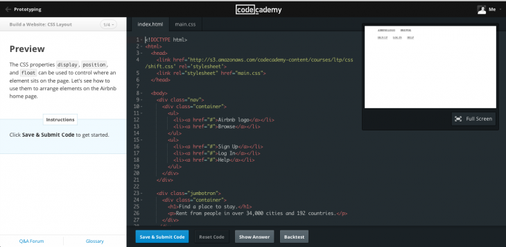
These projects will continue to exist under the Learn tab, where users can also choose a programming language and course to learn from. Codecademy appears to have larger ambitions for the initiative though; today, it’s launching a step-by-step course that will teach users how to build Airbnb’s homepage.
That’s right, the room-letting service that people flock to every day.
Just sign up and Codecademy promises to guide you through the process, showing you how to experiment with chunks of code, add and subtract different parts of a page, and learn the lingo used by web developers the world over.
Codecademy has experimented with an iOS app, but the real draw of its service still lies on the web. For people such as myself, who didn’t learn how to code in school, it’s an invaluable service. A redesign and a suite of new features is just a timely reminder that I need to log back in and enroll on some courses.
Read Next: On a mission: How Codecademy is helping the UK government to get programming into the classroom
Get the TNW newsletter
Get the most important tech news in your inbox each week.


