David Arnoux is Head of Growth and co-founder of Twoodo, helping your team organize itself using simple #hashtags.
Lean methods have been famous amongst young and agile companies for years, but they haven’t necessarily penetrated larger businesses yet. Its main principle is that scientific data and tests should be the basis for decisions – not opinions or assumptions.
The creation of an engaging and successful website requires a strong commitment to design and user experience. The most important link between your product and its design is to get people to do what you want them to do right from the very first visit. We call this the First User Experience (FUE).
For some companies, it’s getting a visitor to create an account. For others, it’s getting them to give you their email address or buy an item of clothing. As a general rule, you want to get the visitor to see the value your website offers and upon leaving, be able to clearly explain it to others.
Even healthy-looking companies like Twitter still face this issue. Good UX design and onboarding processes minimize friction by being clear and enticing.
So how do lean methods help you solve this?
1. The Minimum Viable Process
 Josh Seiden, author of Lean UX, says the process of creating a product should be conducted in a lean way. This means that each step of development and design should be looked upon as an opportunity to cut waste in order to reach the goal – creating the minimal viable product.
Each member of the team should constantly look at how they are doing their part of the project, and evaluate if they could be doing it more efficiently, or if there are aspects that are unnecessary.
Applying lean consistently will ensure that long-term costs are kept low, by reducing the likelihood of failure at a later stage. This is because there is high certainty of overall success due to each small step being validated.
Similarly, if all the individual components of a physical device are made excellently, as a whole the device will perform at its best possible.
In creating a minimum viable product, no team member just jumps in and starts putting together a large piece of a product or service. Let’s take an online service as an example. The idea is not to spend weeks or months perfecting a landing page and an onboarding process, but rather building a basic, scrappy version and putting it online as soon as possible.
The whole team must be involved in the brainstorming, testing and creating of:
- The most basic realization of the product in order to test it (see next section on the “minimum viable test”). The idea is to test the concept before spending hours on design.
- Analyzing the results and reiterating based on them, and the possibilities of the tools and skills of the team.
- Building a slightly more complex version of the minimum one.
- Rinse and repeat until the product has been iterated to perfection = attains its goals in a satisfactory way.

…but the team must also divulge how they do their work. In discussing how a team member does the job (tools used, time spent, steps taken etc.) the rest of the team can offer suggestions on how the process might be made faster, more efficient or better quality.
The minimum viable process forces the whole team – designers, engineers, market researchers and business managers – to work together intimately from the earliest stages. They can suggest shortcuts from their own unique backgrounds (for example a designer will know that using a wordpress template is faster and just as good as the programmer’s idea of building a landing page from scratch).
This maximizes the potential of their combined knowledge and resources. The result is the ability to deliver more value to the user in faster iterations.
Why? Because the product is being built in faster, validated micro-steps based on user feedback and user data.
2. The Minimum Viable Test
“It’s dangerous to do too much at once.” – Thomas Wendt, Lean UX Advocate
It can take some creativity, but it is very important to decide on the right test. It may even take multiple tests.
Seiden talked about creating a “sandbox.” You must create a test that, even when it fails, does not harm the overall project.
But defining safe parameters is something unfortunately grey. The most common parameters for choosing which tests to run are complexity and impact. How complex and resource hungry is the test going to be? How much impact will it have on the success of the website.
Of course, the ideal scenario is to run low complexity, high impact tests.
Here are ways of running a minimum viable test:
- Make a simple prototype (this could be a simple drawing) and get out on the street to show it to people
- Explain the idea to your friends and see if they are interested
- Build a basic website explaining the idea and have a “put me on the waiting list” button
- Ask on forums
- Ask followers on social media
- Do a low-dollar crowdfunding campaign
- Email questionnaire to your target audience
…and many others, depending on what you are trying to test. A/B testing and multivariate testing are also a useful way of minimally testing some finer details such as color, location of features, copy and so on.
What the minimal viable test prevents is building features that will ultimately fail or never interest users. This may be a feature the team is convinced will work, but in the end does not achieve product-market fit.
We discovered this with a Chrome extension version of our product; people just simply didn’t want to know about it, despite us feeling like “kings of the world” for thinking it up! A difficult part of the learning curve of lean UX is accepting that your expertise from experience cannot be the final word in decisions.
This hurts many egos, and also traditional workplace values that seniority equals knowledge. Data cannot be refuted, but often is for personal reasons.
“Your assumption may be correct, but without data it’s just luck.” – Wouter, Lean UX Designer
The pleasure derived from lean is the strong evidence it provides that your idea is valid. It can be tedious to wait for approval for every decision from the audience, but it’s normally worth the wait.
The great thing about applying lean UX to enterprise is that you can use it without causing a backlash on your brand. This is accomplished by:
- Testing ideas under a pseudonym
- Testing incrementally so as not to cause a backlash from users
It’s hard to “think lean” when we’re so used to listening to the oldest guy in the room giving us his opinion on what should be done. I’d say stop listening to experts and start listening to your user (or future users).
It’s better for all that you stop wasting time and start applying scientific methods to your validation process.
3) Let’s take a look at a real MVT that we performed
Here’s some context before we jump in. We are a teamwork app. One of the huge challenges we face is convincing people that email is an inefficient way of collaborating.
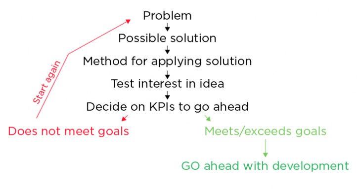
Defined problem: Getting people to switch to a collaboration tool and stop email
One of the problems we faced in building a social collaboration tool was that some members of a team just didn’t want to start using a new tool. They’d rather stick to email. So we decided to integrate email to our existing platform.
Defined solution: Integrate email
A user suggested we should build a Gmail extension that would live inside your Gmail inbox. Our gut feelings unanimously told us this was an awesome idea and that we should jump right in.
Defined method: Create a Gmail extension
That’s where lean came in. Instead of starting to wireframe the idea, design it, code it and tweak it over the next couple of weeks, we agreed to test the idea.
This was an easy decision to make – a team of five rarely has leftover time during work hours! A larger team may make the mistake of going straight to development.
Defined test: Build a landing page (on Unbounce, no coding needed) with an explanation and an “I want it button.” Visitors who clicked on the button would receive an email stating the product was in the development phase but that would be the first to access the private beta. If we could get enough people to show their interest the idea would go ahead.
Defined KPIs: We assigned three days to gain at least 400 qualified visitors to the page. Qualified meant that they used Gmail and knew what Gmail extensions were.
There are many way to find such visitors (some are listed here). If less than 20 percent signed up, the idea would be considered a failure and we’d have to keep iterating before we would start building.
Results: 8.12 percent conversion rate = Fail. Not enough people showed interest.
We had even taken the precaution of creating two slightly different versions of the landing page in case one would outperform the other. The better version only reached 9.13 percent conversion.
Conclusion: Don’t start building yet. Iterate and try again. We went on through two more iterations of the test before we finally found a solution that worked.
Applying such a process is best achieved when you surround yourself with people of multiple competencies rather than one single speciality. Without knowledge of the possibilities of the various tools we use in the total creation of products, the leanest approach cannot be achieved.
So if there’s rule #1 for choosing co-founders and early employees, it’s going with multi-skilled rather than singularly proficient.
There is no one-size-fits all approach, and new ideas come about all the time on how exactly you design the parameters of your testing. These tools from Visual Website Optimizer can help to control some of the chaos:
4. How we combined lean SaaS and lean UX
When we created our company we had a notion of what we wanted to achieve and some assumptions on how to achieve it. We wanted to create a new way of collaborating that reduced friction as much as possible.
“You need to think: what is the least amount of things we can do to test the idea?” – Lis, Lean UX Designer
Our CEO had a coding background and found that simple commands achieved a lot. Why not bring this feature out and create a seamless system of organization?
People were being introduced to simple commands such as the #hashtag on Twitter and the +plus on Google. Online conversations were also using *stars to highlight emotional or important words. This was the first validation: people were using symbols to organize information.
So how would such an idea be brought to reality? We decided on what crucial actions people would need to use our product successfully:
- Be able to effectively label information
- Be able to create a network of colleagues
- Be able to discuss the information in a conversation-like style
The central part of the system was going to be the labeling, which is what we tackled first. We used a whole bunch of symbols (>, #, *, +, @) to convey collaboration. But people found it too confusing to learn so much, even though for us it was “just five symbols!”
A two-week long A/B test comparing all the symbols against using only @, # and + to accomplish good collaboration showed us that less was more. That was based on our first private beta users’ feedback.
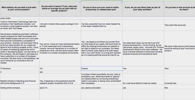
Our minimal viable test was to build a basic prototype, invite a small number of people on, and to do an extensive questionnaire (and sometimes interviews) to learn from them. We were surprised at how many people we willing to answer the questionnaire. Almost 70 percent of people answered – so don’t chicken out of doing surveys!
When the core basic elements were secured, we looked to competitors for options on how to design an interface that would suit what we wanted our audience to accomplish. They needed to be able to put in tagged information, have conversations about it and then extract the tagged information into a checklist. It needed to feel social.
With that in mind, the logical colors to choose were light and airy. There had to be a minimalist view to reduce confusion and distraction. A feed-like design would be familiar to users from both conversations on forums and various social media platforms.
We relied on family and friends to give us kneejerk reactions. We’d show it to people at conferences and ask what they thought. We’d frequently ask our super-users from the private beta stage about the choices we had made, and how we could make it more intuitive.
The faster you iterate based on solid data, the better your company will perform.
There’s no easy way of applying the lean to your workflow or lean to your testing. Developing a lean method with your team will take many trials and errors before getting it right. It’s a mindset that has to be developed. If it can be achieved, the benefits to be reaped are enormous.
Get the TNW newsletter
Get the most important tech news in your inbox each week.


