
Denis Duvauchelle is the CEO of Twoodo. Twoodo lets your team get rid of internal emails once and for all using an efficient and easy-to-learn hashtag system. Denis is passionate for sharing tips and tricks on startups, online collaboration, and working remotely. He likes getting things done fast and is deeply in love with pizza.
“There can be as much value in the blink of an eye as in months of rational analysis.”
― Malcolm Gladwell, Blink: The Power of Thinking without Thinking
Today’s generation is the first to grow up entirely on a diet of technological solutions to all of life’s problems. There are more than one billion smartphone users in the world, and this number continues to climb. What does this mean for entrepreneurs, innovators and disrupters?
Well, it means that there are millions of technologically capable people out there looking for solutions to all their little gripes and complaints. And preferably, these solutions will be quick, painless, effortless and pretty.

The 💜 of EU tech
The latest rumblings from the EU tech scene, a story from our wise ol' founder Boris, and some questionable AI art. It's free, every week, in your inbox. Sign up now!
The first thing they read may be the last thing they ever see… of you.
A study conducted by Carleton University (Canada) in 2006 gave the infamous statistic that Web designers have 500 milliseconds (i.e. half a second) to impress and engage a user landing on their page for the first time.
Let me just repeat that one for you. 500 milliseconds.
In the seven years since that study, it still holds true that a blink of an eye is as much time your company has to win or lose a user. For good. This “gut feeling” reaction is unlikely to change over time not because the company has not improved its service or product, but because the person subconsciously instils a belief that they are right and support it by following their original decision.
We are terribly stubborn as a species! Take my example: I first tried out Twitter in 2009 – I didn’t like it, care about it, or find it interesting. Three years later my sister encouraged me to give it a go again, and with a cynical eye, I signed up again. Now I love it. But I had to have an external agent push me to it.
In 2012 alone, 51 million websites were created. Consumers are bombarded by options – no wonder they can only spare half a second!
Ouch! How do I retain people in half a second?
Full design planning is crucial if people’s eyes are what process and decide their next step. Here’s an example. Just compare this site to some of these. Which one would you recommend to your kids? Alright, so that might be a bit extreme… but you get the picture. The sooner you make the necessary changes the better – otherwise you’re going to have to re-brand in the future to ensnare all those that gave your product a negative judgement in the past. A study by the University of Basel, Switzerland in 2012 looked more deeply into the results of the 2006 Canadian study and proved what all tech users know to be commonly true. There are two crucial factors that give a negative first impression:
- High visual complexity = Too much stuff on the page
- Low prototypical (“normal” or “expected”) design = Where is all the stuff I expect?!
The most subjectively “beautiful” websites in this study had a combination of high “prototypical” design and low visual complexity. Combinations of low VC or high PT also reduced the “beauty” of a website.
Actions you can take
1) Templates
This might seem like a no-brainer but you’d be amazed at how many startups and programmers prefer to build a landing page from scratch. Sure enough, 95 percent of the time it’s faster and safer to use customizable templates.
The best templates are developed based on eye-tracking data and knowledge of user habits and expectations. They’re well balanced, ergonomic and intuitive.
A fast track to getting the right template is to buy it. A paid-for template is worth the investment because it has good coding behind it and is based on good data. The documentation on the setup is usually very well detailed, the code is Web-responsive, cross-browser friendly, there’s dedicated sections for your images, videos, tag line, logo and it’s all in the right place! The icons are clean, centered, well-padded and the layout usually follows grid systems giving your page perfect balance. All future customizations are not too challenging because of the intimate knowledge the creator has of the template.
Basically, they look freakin’ awesome.
The first thing to do is to make sure you know what the objective of your landing page is. Is it to get user to sign up? To sell a product? To watch a video? Here is a great example of a website with a clear goal and a clear design.
After finalizing your goal, make a list of the trily vital stuff. Do I need a sign-up form? Do I need to put a video and/or slideshow? Do I need my tagline to be up there? Keep these in mind when you are searching through templates. It’s also important to make sure that the template is responsive, so it looks good on mobile devices as well.
It all depends on what you are doing for your company. If you are just doing a landing page, then you will probably use WordPress (apologies for the bias!). Some of the best themes can be found here at Themetrust or Themeforest, and there is also this giant: Template Monster.
Another hack that works (sometimes) if you know of a sexy website that you’d like to imitate, is this:
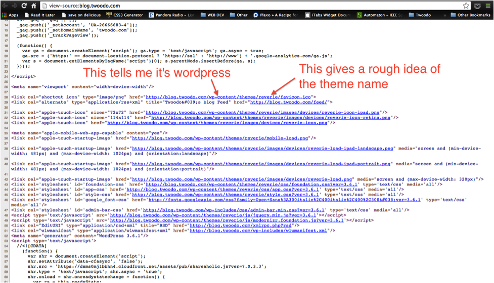
- Right click > “View source” and check the links for the CSS or JS to see if it’s WordPress, Joomla etc. and what is the theme name. Then search for those on Google.
Basic rules to follow:
Keep the noise down and stand out subtly
What you don’t want is a page that has too many types of visual stimulation going on. Common mistakes are still pictures, animations, different sized and typed fonts, multiple colour schemes. What your website needs is what users expect to see.
A good place to look for inspiration and to see what others are doing are listings like Startupli.st and Betali.st. View enough of them to start to see patterns in design and layout. You’ll quickly get a grasp of what’s currently trending.
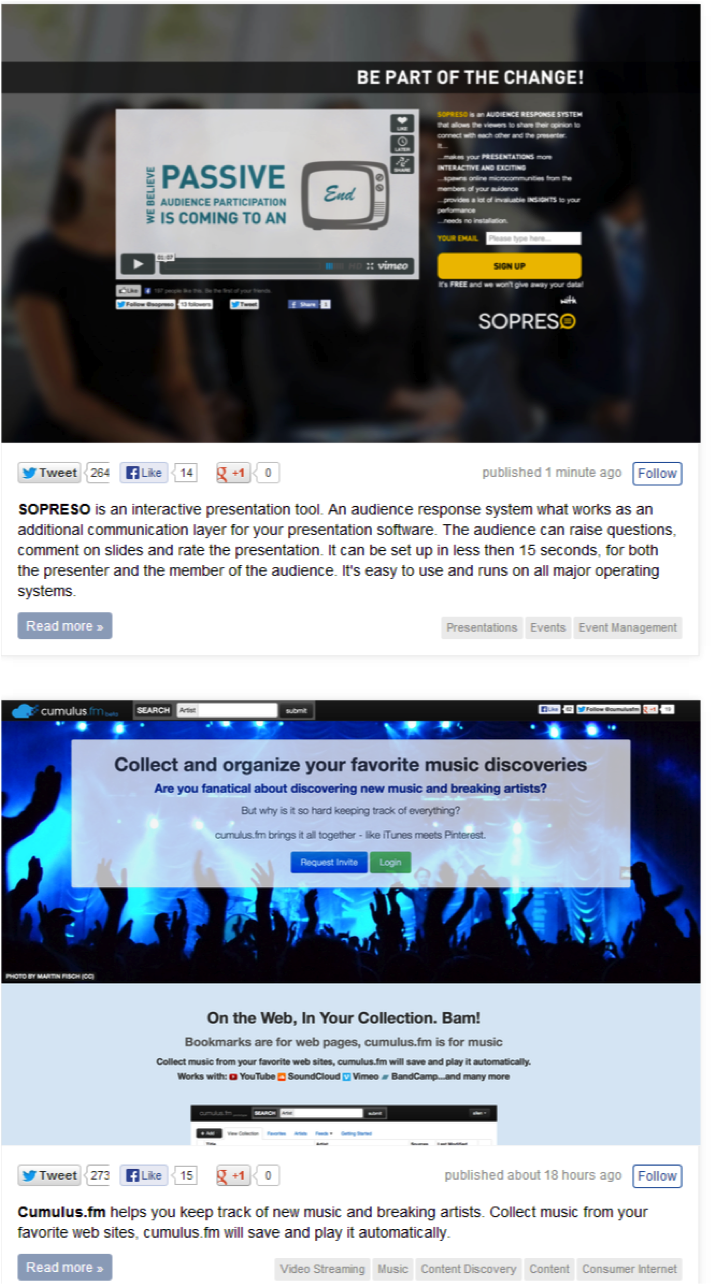
Here are two new companies on BetaList. Can you spot the similarities?
Trust in the halo effect
The halo effect can save your website if it has followed the rules of minimalism and simplicity but still lacks a touch of panache or individuality.
The halo effect refers to how even though something has some minor flaws, the overall effect is positive and reassuring – and most importantly, trustworthy. It is a type of cognitive bias known more famously in teen movies, where the girl takes one look at the guy, falls head over heels with him, and overlooks the douchebag tendencies because beauty beats badness in our crazy human brains.
So, should I ever become bold and push the boundaries of basic design on my website?
There are two basic categories in design aesthetics each with different features – classic and expressive aesthetics.
Classic aesthetics are:
- Clean
- Clear
- Pleasant
- Symmetrical
- Creative
- Original
- Sophisticated
- Use special effects

As the aforementioned studies went deeper they proved more commonly-held facts. First, that new users will read the most on your website and longer users will stop reading notices and information. They also noted that long-time users eventually got bored with the simplistic presentation that captured their imaginations in the first place.
The conclusion that can be drawn is that after you have a strong established brand, you can get away with more exciting design elements because your users are reliant on you and loyal to you.
Remember… the first five seconds are really about design
The first five seconds can last an eternity. Even if a person says they have changed their opinion or interpretation, it still affects their sentiments towards your website at an implicit level. It is much less effort to capture the users as they land on your page than to have to physically hustle people. Make the most out of your opportunity.
You can also take some content and design tips from this infographic by Calvin Sellers.
2) Heatmapping and metrics
Your next step is to fine-tune the position of information, the size of it and the colour. To do this, you can use two techniques. A very cheap and effective one, or a sometimes more expensive (but also very effective) one.
First the cheap one. The coffeeshop test involves taking your (fully-charged) laptop and smartphone out into the streets and tapping the elbow of those in cafes. Ask them for a knee-jerk reaction to your website/app, and make sure to record their reaction.
Go to enough people so that the reactions begin to overlap – then you know you have reached data saturation (i.e. no more new news). Surprisingly almost everyone you’ll ask will say “yes.” Build a strategy of improvement based on these reactions, then go out and do it again until people tell you it’s perfect.
Now for the other one – heatmapping tools. These actually map out where the user’s mouse goes, so you can see if most users stay on the top fold (i.e. don’t scroll) and potentially how much time they spend on each section. It’s not the most reliable, but the closest to watching real-time activity.
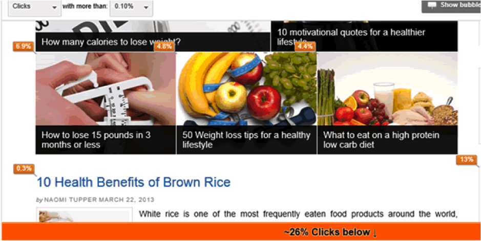
Google Analytics offers a simple version of this; it’s called in-page analytics. Based on the numbers given, you can figure out if there are images or links that need moving or removing. This is mainly based on your own best digestion of the numbers.
Here’s a sample screen capture:
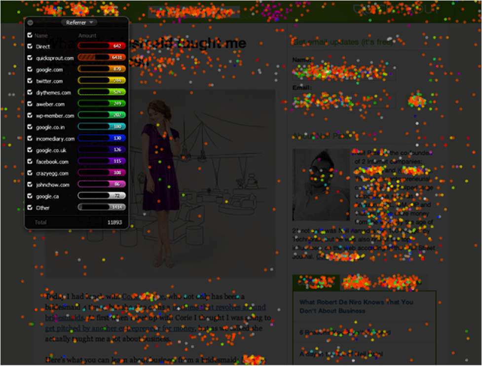
There are more sophisticated (and expensive) tools. Crazy Egg offers a much more thorough overview, with three different types of heatmaps.
There is the standard heatmap, which uses colours to show what is getting the most clicks. Then, there is a scroll map which tells you how far down people scroll before stopping – and also what they pause on the read the most. Finally, they have a confetti map options which looks like a typical heatmap but has the added feature of telling you who clicked where.
Mouseflow offers the heatmap and the scrollmap as well, as does ClickTale. Clicktale is interesting for new websites as it is free for up to 5,000 pageviews per month. Mixpanel offers a very detailed breakdown of the numbers and is free (up to a point) if you include their badge on your site. Each of these services have their own variations of features – it depends what you want.
Eye-tracking tools overlap a little with heatmaps. If you can pay for it, a combination of eye-tracking and heatmapping will give you excellent insights. However, using more than three analytics tools at once will be counter-productive as you will spend far too much time deciphering the numbers.
Conversion and retention combined are the Holy Grail
With all of the information interpreted from mapping and analytics, from coffeeshops to templates, you will be able to refine your website to optimal user retention and higher conversion rates. Good luck!
Marketers, developers and CEOs: Want to learn how to persuade your customers to click, buy and subscribe? Sign up to Persuasion Profiling: Make Your Customers Click at TNW Academy before tickets run out! Image Credit: Sergey Nivens/Shutterstock
Get the TNW newsletter
Get the most important tech news in your inbox each week.