

Everyone who is anyone is talking about responsive design these days — and everyone certainly has a strong opinion about it. But, whether you love it or hate it, responsive design is bound to go mainstream in 2013. Every business from Harvard to AOL are embracing responsive design as the wave of the future, and more websites are popping up on every device with an internet connection with conforming layouts.
Take a look at these new, smart and stylish responsive layouts and get inspiration for your next website. Spanning across different kinds of companies, strategies and aesthetics, all of these websites have one thing in common: great responsive design.
What’s your favorite responsive design website? Let us know in the comments.
1. BBC

The world’s biggest news outlet hopped on the Internet’s biggest design trend in the summer, and the designers were thrilled about finally reaching a universal design layout across all platforms. The design’s minimalist look provides a blank canvas for the news outlet to show off beautiful photos — even on a mobile device.
2. Disney

The magic-making family entertainment giant tasked a mammoth responsive design project on a (comparatively) tiny group of 30 developers, and brought it to fruition in October. The design succeeds by preventing major scaling of the content within the website, meaning that big videos and interactive elements don’t lose their size across platforms.
3. Zurb

Some of the companies that show off the best responsive design layouts are also in the business of creating them. That’s the case with Silicon Valley-based web design firm Zurb. The overall layout solves the common problem of too much white space by cleverly switching graphical elements from desktop to mobile. The result is a full and vibrant look that always sizes perfectly.
4. Design Week Portland

Facilitated from start to finish by Portland design and typography firm Scribble Tone, Design Week Portland’s website defines the meaning of “fully realized.” The whole layout is a crash course in popular web trends — including but not limited to single-page design and customized web typography — but it doesn’t feel wrote or schmaltzy. The overall layout is young, hip and backs up the conference’s credibility as an authority of good design.
5. The Next Web
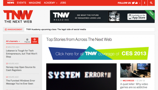
How can you talk about responsive design without acknowledging the platform that’s presenting the work? The Next Web underwent a change in late 2012 to keep up with the readership — as more and more people continue to use their phones for reading, it becomes more important to keep a consistent layout on any device. That’s why responsive design is becoming so ubiquitous among publishers: it looks good everywhere.
6. A Book Apart
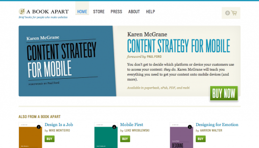
When a company writes the book on responsive design, it’s a no-brainer that theirs will be amazing. A Book Apart, the educational retail arm of popular web design blog A List Apart, is easily one of the best examples of an ecommerce website that takes full advantage of responsive design. This is because the layout manages to maintain an orderly product display system that intelligently conforms to devices without remaining cluttered. Add to it the company’s flawless aesthetic eye and branding, and it’s a (fitting) master class in design.
7. AIDS
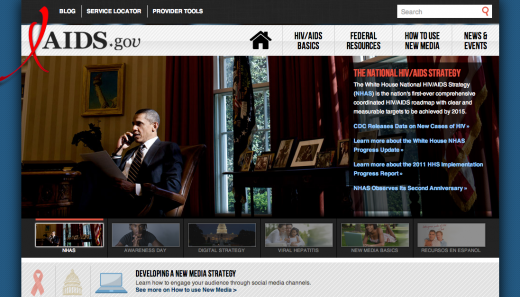
Even government websites are hopping on the responsive design train, and the AIDS.gov website manages to balance a strong message with strong design. The group cites awareness in the design’s unveiling this summer: ” Building AIDS.gov responsively allows us to focus on the goal of ensuring any person, anywhere, in any situation and on any device can access basic HIV information.”
8. CSS Grid
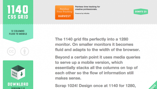
Unsurprisingly, some of the best examples of responsive design are actually tools to help other developers recreate the same experience. CSS Grid is a free product that allows developers to build websites for the larger, 1280 pixel resolution monitors that are rapidly becoming the new standard — and shrink back down to a mobile layout. It’s just as cute as it is useful.
9. Tattly
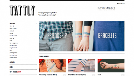
Temporary tattoos? Who knew that a responsive design could make a kooky product beautiful. Design-heavy temporary body art company Tattly took advantage of the flexible layout to make their tattoos the start of the show, and it works. And with a bit of hipster typography, the company makes a strong statement without being cliche.
10. Harvard University
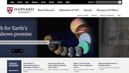
Clean and classic Harvard University embraced responsive design without losing decades of online brand-building by incorporating the university’s longstanding aesthetic (Harvard crimson, anyone?). The result is a forward-thinking layout that doesn’t read too modern. This website is the perfect example of the difference between layout and design.
11. Time

In an October article detailing redesign decisions, Time managing editor Catherine Sharick says that goal was to finally give all readers the same exact experience: “Because one unified site will feed all the different platforms, mobile users will for the first time have access to all of the same rich content available on the desktop TIME.com site.” Time’s design is minimal, readable, and practical — everything a global news site needs to succeed on all platforms.
12. Boston Globe

While more recent designs have come out from other outlets all across the world, no one wrote the book on responsive design like the Boston Globe. The news corporation’s paid subscription service reads perfectly anywhere at any time — worth the extra cost simply for its ease of use.
13. This Is Responsive
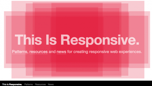
The brainchild of Github user Bradfrost, This Is Responsive is another tools site that shows off the positives of responsive layouts. The biggest feature of the relatively sparse website is the perfectly responsive animated shape in the middle of the layout, which conforms beautifully across different platforms. Responsive animation is really a cutting edge concept, and this website promises the next wave of the future.
14. Notre Dame
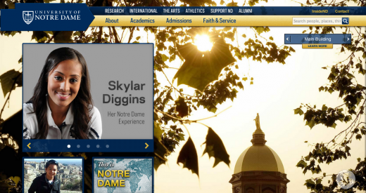
In devising a responsive design for Notre Dame’s new homepage, the college’s in-house team succeeded in breaking the mold of the traditional college website. This is seen best in mobile view, which emphasizes strong graphic elements and minimizes the navigation bar — definitely not a classic educational look. Simple and smart, Notre Dame hit the jackpot with their design.
15. An Event Apart

The folks at A List Apart didn’t stop their responsive design strategies with A Book Apart — they gave the same treatment to the website of their design conference series An Event Apart. In context, the website is in lock step with the company’s clean aesthetic — with just the right amount of bold imagery to make a statement.
16. Happy Cog

Bold, sharp and whimsical, the layout of website design firm Happy Cog shows that the best way to show off talent is to wear the product. The company is able to show off so many different color schemes and personalities on the site — and it looks perfect everywhere.
17. SB Nation
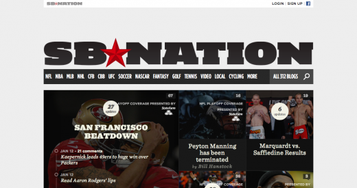
Sports fans, rejoice: every single one of SB Nation’s 312 local-friendly blogs are now in responsive design. The layout’s strength is in its versatility: it is able to withstand the varying colors, accents and logos of each sports team. That alone isn’t an easy feat, but the design is also perfect at distilling the mobile version to the stories that matter without losing its sharp look.
18. Spigot

Web design and development firm Spigot sells beautiful work right on their homepage — it’s hard to deny how cute the whole layout is. The best part of the whimsical, minimal look is the shifting animated icons that work flawlessly on desktop and mobile. It’s a difficult to pull off, but the company manages to make it look very easy.
19. Google Cultural Institute
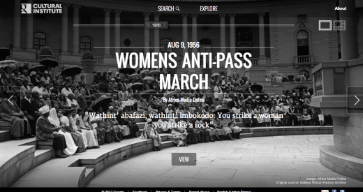
The Google Cultural Institute is one of the few sites that the tech giant has given a responsive design makeover — and it’s the right choice. The website’s focus on history and art make it prime for a clean and simple cross-platform presentation, and the responsive look manages to look cutting edge without sacrificing the elegance the Google Cultural Institute has developed.
20. Starbucks
For coffee king Starbucks, the reason for adopting a responsive layout was simple: research, and plenty of it. The company found that more and more customers were accessing their website via mobile, and responded by taking their smart branding to the smartphone. The content-forward site is easy to read everywhere, and is a consistent with Starbucks’s signature look. It’s both beautiful and functional.
21. iaWriter
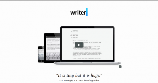
When selling a cross-platform writing app, it’s very very important to ensure your website is just as striking on a desktop as it is on a phone. Luckily, iaWriter took the hint and has taken to a responsive design to sell its cross-platform word processor and it works like a charm. Clear, concise and to the point, the iaWriter layout doesn’t change a thing in its many views — a feat not often seen even among the best responsive designs.
22. illy

Sleek and smooth like an expensive car, illy issimo’s US website is definitely the sexiest responsive web layout out today. It also does well as a responsive ecommerce site, ensuring that the product takes front and center over everything else. Bellisimo.
23. Sony
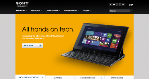
Sony was one of the first big companies to hop on the responsive design bandwagon in 2012, and it still remains one of the smartest designs out there today. Striking and seamless, there’s plenty to love about Sony’s future-forward design. It definitely sends the message that Sony’s a trendsetter in the mainstream tech world.
24. dConstruct

It’s hard to look at UK design conference dConstruct’s homepage and not smile at it’s absolute cuteness. It’s also pretty smart — in mixing its responsive design with strong geometrical features, the website changes in interesting ways as it sizes up and down. It’s delightful on all platforms.
25. Grey Goose

Bar none — Grey Goose is absolutely gorgeous. Smooth and cool, with a gray color scheme and pared down modern typography, the layout exudes luxury on just about any device. More than perhaps any other website, though, is its stunning look on a tablet. Many websites focus on the desktop/phone dichotomy, but the striking look of Grey Goose on a tablet makes it clear that the device should never be ignored.
26. Donedone
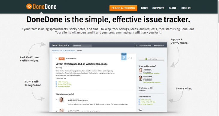
It’s awesome when you see an inspiring responsive design, but it’s downright earth shattering when you find one that’s packing more than just good looks. The best thing about issue tracking system DoneDone’s layout is that it actually works with the service. Users who are tracking issues on their mobile device will have an easy and pain-free experience — a blessing in design.
27. Maximin

Okay okay, yes, Maximin is a game. A browser resizing game at that. But, what’s underneath the hood of this clever timewaster is really a responsive design system — the site is smart enough to recognize the different sizes of the browser and conform the game to the design. You can’t use it on a mobile device, but you can sure have some fun with it.
28. Microsoft

What would this roundup be without mentioning Microsoft? The PC OS juggernaut has gone through a major branding redesign in the last year, and a part of that big makeover is a slick responsive layout. There’s a lot to love with the design, and it’s a classic minimalist layout that’s perfect for shifting platforms.
29. Contents Magazine
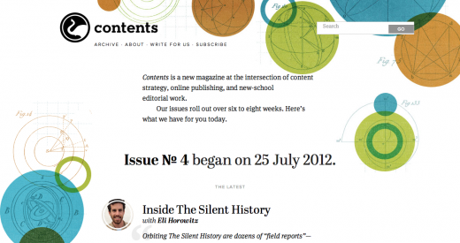
It’s hard not to have a perfectly beautiful responsive layout and design when the person who created your look is the godfather of responsive design. Ethan Marcotte himself built the website of Contents Magazine from the ground up and it shows. It’s beautiful, functional and flawless — enough said.
Image Credit: Jeff Pachoud/Getty Images
Get the TNW newsletter
Get the most important tech news in your inbox each week.


