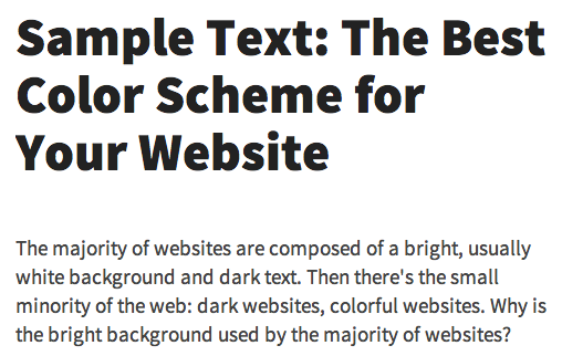
Typography is finally emerging as a key element of Web design with the rise of Web fonts, but now many designers are finding themselves a bit overwhelmed with all of these new choices. Sticking with defaults, like Helvetica, Georgia and Arial, is no longer necessary in most cases, but embracing the complicated world of typography is confusing enough to make any novice’s head spin.
To help ease this transition, designer Tommi Kaikkonen has created an interactive guide on perfecting your blog’s typography. In the event that you don’t have a blog of your own, many elements of this guide should still help you start understanding how to use layout, visual hierarchy, line height and color in your favor.
Some of the finer details in the guide, such as implementing small caps, many not seem immediately necessary, but are worth considering after you have your layout and fonts in place.

Check out the guide via the link below. For more, you can take a look at all of TNW’s typography-related posts here.
➤ Interactive Guide to Blog Typography,
h/t: Matias Corea & Sean Blanda
Image credit: Thinkstock
Get the TNW newsletter
Get the most important tech news in your inbox each week.


