Anyone who’s ever tried their hand at designing a typeface will know that it’s a wildly difficult process, and to actually come out at the end with something beautiful takes an extreme amount of skill, taste and patience.
 Type design isn’t meant for everyone, but typography is, and nearly every designer works with it every day. This is exactly why we’ve teamed up with Type Release creator Sean Mitchell to share with you some of the latest typefaces released this past month. These are his findings:
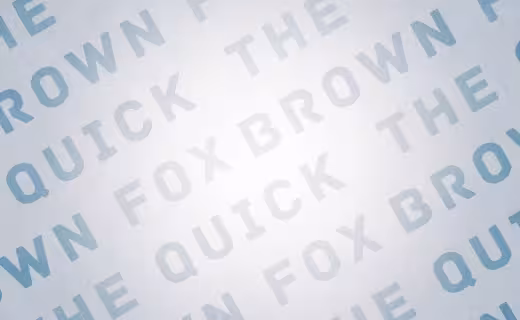
Trim
 Created by Göran Söderström of Letters from Sweden
Knud V. Engelhardt (1882-1931) was an architect, printer and designer from the country of our laid back neighbours, Denmark. Knud’s characteristic letter forms have already made a strong impression on some modern typefaces. Most notably is probably Skilt Gothic by a fellow Swedish compatriot, where Knuds way of trimming the diagonal stems is one of the spices used to give the typeface its character.

The 💜 of EU tech
The latest rumblings from the EU tech scene, a story from our wise ol' founder Boris, and some questionable AI art. It's free, every week, in your inbox. Sign up now!
Fighting against the desire to make something similar, this new typeface instead takes the concept to a whole new level by trimming not only diagonals, but all possible letters!
The result is something – different. Trim comes in a large family including manually hinted webfonts and high quality desktop fonts. Some are fat, some are skinny and some are just lagom.
➤ Trim
.
Colfax
 Created by Eric Olson of Process Type Foundry
A refined oval sans serif of 20th century origins and 21st century sensibilities. Influences ranging from the gruff Aurora Grotesk series to the elegant Neuzeit are paired with a subtle geometry and typographic utility to inform this family of sans serifs.
➤ Colfax
.
Chartwell
Created by Travis Kochel of TK Type
A tool for easily creating graphs, disguised as a font. It utilizes OpenType to interpret and visualize the data. The data also remains editable, allowing for painless updates.
.
Tablet Gothic
 Created by José Scaglione and Veronika Burian of Type Together
Originally engineered as a titling type family, meant to help designers working on publications that require output as hard copies and a variety of digital platforms at the same time. As such, it is a grotesque sans serif that looks to the future of publishing with a clear understanding of its history, and reminiscences that go back to nineteenth century Britain and Germany. Tablet Gothic delivers the sturdy, straightforward and clean appearance expected from a grotesque, but it allows itself a good measure of personality to make it stand out on the page.
.
Adelle Sans
 Created by Adelle Sans José Scaglione and Veronika Burian of Type Together
This sans serif counterpart to the award-winning Adelle type family proposes a cleaner and more spirited take on the traditional grotesque sans. As typical with TypeTogether fonts, the most demanding editorial design pieces were taken into consideration when engineering Adelle Sans. The combination of its lively character and unobstrusive appearance that is inherent to grotesque sans serifs make it an utterly versatile tool for any imaginable graphic application, whether it is branding, signage or advertising. Without any doubt, the key word behind Adelle Sans’ design is flexibility.
.
Novel Sans Rounded
 Created by Christoph Dunst of Atlas
This soft humanist sans serif has a carefully attuned character design and a well balanced weight contrast. Having no inktraps the typeface works perfect in reading sizes as well as for display purposes. Many similarities with the other members of the Novel Typeface Family enable designers to combine the four families and reach highest quality in complex typography for both editorial and brand typography.
Novel Sans Rounded Pro comes in 6 weights and contains small caps, an extra set of alternate glyphs, many ligatures, lining figures, hanging figures, small caps figures, positive and negative circled figures for upper and lower case, superior and inferior figures, fractions, extensive language support, arrows for uppercase and lowercase and many more OpenType features.
.
Henriette

The redefinition of a classic. In the 1920s the Viennese government decided to standardize the street signs across the city. A typeface was especially constructed for the purpose. It was available in a Heavy and a Bold Condensed version, to support short street names as well as longer ones. As the years went by, the typeface was adopted and redrawn by several enamel factories. These adaptations lead to variations on the design, and to the fact that there isn’t a Viennese street sign font but 16 – in part severely – different versions. Henriette is not a digitization of any of those versions; rather, it is influenced by all of them.
➤ Henriette, Created by Typejockeys
.
Magallanes
 Created by Daniel Hernández of Latinotype
Say hello to the new Magallanes Family, designed by Daniel Hernández, a contemporary neo humanist sans serif font. Its strokes and terminals are related to the calligraphic strokes from humanist typefaces. It comes with 8 styles, from Ultra Light to Black, each with its true italics. Every weight comes with alternative glyphs for a more dynamic use. Magallanes is the perfect titling font to complement text faces in magazines, logotypes, etc.
.
Tikal Sans
 Created by Miguel Hernández of Latinotype
A bloody Mayan ritual with no reading sacrifice. Tikal Sans is a glyphic family of twenty weights Mayan inspired designed for Text and Display sizes. The Details curved terminating strokes ended in sharp edges inspired in the ‘virgula’ Mayan glyph that means ‘the spoken word’. Tikal is also known for being the largest city of the Mayan Classic Period and his name means “Lugar de Las Voces” (place of voices). With a contemporary large x-height with OpenType contextual alternate letters offers a functional look with a friendly touch. The Thin and Black weights are great performers in display sizes the light, regular and medium weights are well suited to longer texts.
.
Alright Sans Web
 Created by Jackson Cavanaugh of Okay Type
With Alright Sans, Jackson Cavanaugh set out to create a typeface with simple details and a warm underlying structure. Combining elements of the classic grotesque and humanist sans resulted in a straight-forward workhorse with an affable personality.
.
Girga
 Created by Dino dos Santos and Pedro Leai of DSType
Triumphant, vigorous and strong. These were the keywords for the design of Girga, named after an Egyptian city in the Sohag Governorate. The power and strength of the Egyptian letterforms were balance with a few sans serif forms so the darkness of the text and the fatness of the overall glyphs could be kept.
➤ Girga
.
Krul

A typographic interpretation of the lettering style created by Dutch letter painter Jan Willem Joseph Visser at the end of the 1940s, which decorated the traditional brown bars of Amsterdam.
The very high contrast and rhythm of the strokes in this typeface make it especially suited for media applications conveying a sense of elegance and sophistication.
➤ Krul, Created by ReType
.
Greta Sans
 Created by Typotheque
Greta explores a multidimensional continuum of possibilities, going beyond the relationship between weight and width, dissolving the boundaries between display and text typefaces. It is a powerful toolbox capable of dealing with the most complex typographical situations.
.
Geneo
 Created by Stéphane Elbaz of Typofonderie
A synthesis of historic and present-day visions of typography, a slab serif constructed on an oblique axis. Its subtle contrast evokes both Renaissance elegance and the robustness of the Egyptian typefaces that were in vogue during the 19th century.
Geneo falls halfway between the classic styles of Garamond and Fournier, with aspects of contemporary slab serifs like Rockwell, Boton, and even Le Monde Courrier. From this blend of styles and genres, it emerges with a singular identity perfectly suited for modern illustrations of quality, savoir-faire, and culture.
➤ Geneo
.
Aranjuez
 Created by Angel Koziupa and Alejandro Paul of Sudtipos
Neo-psychedelia in an upright cross-breed of pseudo-wood deco and ornamental calligraphy, complete with alternates, swashes, endings, playful contrast treatments, and even background possibilities.
➤ Aranjuez
.
Comalle
 Created by Juan Pablo De Gregorio of Sudtipos
An organic typeface that rescues some elements of handwritten script, but its stroke does not necessarily answer to a literal calligraphy structure.
So Comalle could produce a powerful impact on the page, it was designed with thicker strokes than its counter forms. The objective is that the black of the letter fills the page and causes a fastest visual impact than typographies that balance blacks and whites.
➤ Comalle
.
YWFT Nim
 Created by Jackkrit Anantakul of YouWorkForThem
All about layering. Bevel effects, outline effects, 3d effects, shadow effects-all are possible and uniquely powerful with YWFT Nim, making for a near-infinite amount of variety and style. Modern and clean, with a nod to architectural forms and figures, YWFT Nim is ideal for striking headlines and posters, and declarative of a strong, individual functionality.
➤ YWFT Nim
.
FF Tisa Sans
 Created by Mitja Miklavčič of FontFont
FF Tisa Sans is Slovenian designer Mitja Miklavčič’s follow-up typeface to FF Tisa. Whether used together or separately, both of his families are excellent choices for branding projects and complex editorial applications. The original FF Tisa is one of the new-millennium favorites in the FontFont library. Upon its release, the typeface found its niche with print designers. But FF Tisa Web was a quick hit, too, and became a go-to selection for web designers the world over.
Despite its cross-media appeal, Miklavčič originally drew FF Tisa to meet the technological and aesthetic requirements of contemporary magazine design and printing. His primary goal was to develop a softer, more dynamic take on the nineteenth-century slab serif wood type genre. A large x-height and pronounced serifs help make FF Tisa extremely legible in text sizes. A few unique details-including slightly exaggerated ink traps and a fairly upright italic-are particularly visible in display sizes.
.
FF Scuba
 Created by Felix Braden of FontFont
A readable contemporary sans, with a distinctive character. The initial concept for the family emerged during designer Felix Braden’s search for an offline companion for the Verdana typeface. After he couldn’t find the exact tone that he was looking for, he set off on the development of a new series of types.
➤ FF Scuba
.
Bombshell Pro
 Created by Emily Conners of Emily Lime
A passionate hand-calligraphy font that includes long connections between letters so you can create beautiful headings or signature looks.
.
Bergamot
 Created by Emily Conners of Emily Lime
Inspired by vintage apothecary labels, but this font is actually quite modern in both style and effects.
➤ Bergamot
.
Edmondsans
 Created by James T. Edmondson of Lost Type Co-op
A hard-working display face in three weights, featuring some useful niceties like small caps, non-lining figures, and a few alternates.
.
Keepsake
 Created by Stephen Miggas of Aerotype
A tattoo inspired script that has five members that can be combined to provide a range of creative options.
➤ Keepsake
.
Logomotion
 Created by TipoType
A typeface specially designed for logotypes, but can also be used in headlines, posters & signage. It has many OpenType feature programming, that give a more playful and rhythmic spirit, creating an interesting geometric-sans and script mix.
.
Gemma
 Created by Mota Italic
Gemma wants to be your best friend. Like best friends, she’s there for you for you when you need her. When you have some complex typographic situations she provides an extensive and impeccably crafted range of characters and styles. When you want to kick back she’s also ready to party with loads of fun additions.
➤ Gemma
.
Quatro Sans
 Created by Mark Caneso of p.s.type
An undeniably modern typeface with construction principles that attempt to find the balance between machine and hand. The result is a typeface that could find its way into various design situations and feel right at home in them all.
.
Bariol
 Created by Atipo
A rounded, slightly condensed typeface, available in four weights and designed with the versatility and readability in mind.
➤ Bariol
.
These are just a few of the killer typefaces that have come out over the past month (give or take a week). If you think we missed something, feel free to share it with us in the comments below!
While you’re at it, definitely check out Type Release.
Get the TNW newsletter
Get the most important tech news in your inbox each week.