If there’s a topic that’s bound to get designers riled up into a fiery debate, it’s the issue of choosing the best font for reading to use on the screen. For most of the web’s life, designers haven’t had much flexibility when it comes to setting the type for their sites, and type decisions have almost always come down to choosing one or two web-safe fonts (a small collection of fonts that are installed on most users’ machines) and setting the font sizes.
CSS’s @font-face has garnered significant attention in the past year as browsers expanded their support for it and major type foundries began developing web licenses, making services such as Typekit possible. What many people don’t realize is that @font-face isn’t new–in fact, Internet Explorer 6, every web designer’s headache, supported it before just about everyone else.
There were many problems with Microsoft’s implementation. The company limited support to the their own proprietary, DRM-protected format to reassure foundries that designers wouldn’t be able to upload fonts in their libraries and in so doing make those premium fonts available to sneaky downloaders. Instead of dealing with Microsoft’s format and having to design fallbacks for every other browser, designers stuck to web-safe fonts and @font-face remained obscure. To make matters worse, embedded fonts require add to a page’s download time, and before high-speed connections became the norm it simply wasn’t worth the load time tradeoff.
That’s why, until recently, web typography remained a primitive art–the tools were simply not there to work with. Things have changed now, and we can start to explore beyond the serif versus sans-serif debate–though that’s as good a place as any to begin.
Serif or Sans-Serif?
There are two main types of font: serif and sans-serif. A serif font contains structural details that adorn the ends of the lines used to make up a letter or numeral–these adornments are called serifs. A sans-serif font is just what it sounds like–a typeface without serifs.
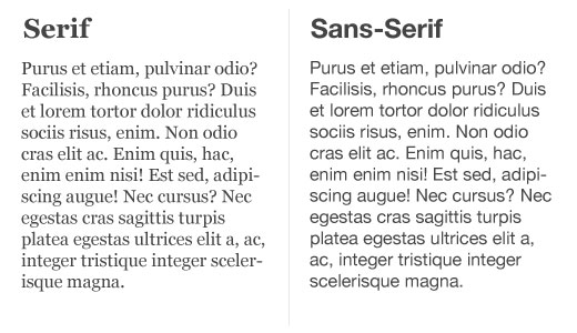
In the image below, you can see two fonts that are frequently billed as among the web’s most readable. On the left is a serif, Georgia, and on the right is a sans-serif, Helvetica.
In print design, we’re told that serif fonts are considered the most readable. The serifs purportedly serve as aids to the eye, moving you from one letter to the next in a smoother fashion. Given this age-old knowledge, it would make sense to assume that serif fonts would also make for a more readable experience on the screen, right? But as if to make life more difficult for designers everywhere, that’s not the case.
When low resolution screens were common, it became apparent that fonts designed for print didn’t look right on screen. Print fonts were vectors, geometric instructions detailing the outline of each character, which worked well for printers that commonly started at resolutions ten times higher than computer screens and higher. But when you took these fonts and viewed them on a screen capable of showing a tenth of the resolution, there simply weren’t enough pixels to display the details of the typeface naturally.
To counter this issue, font designers created bitmapped fonts. Instead of using vectors, lines that could scale smoothly to any size, bitmapped fonts described each character on a grid of pixels. The problem with this approach was that the font designer had to create bitmaps for each font size, and when you tried to use an unsupported size, the characters would appear jagged and pixelated. It’s exactly the same principle at work when you take a digital photograph, which are also bitmapped, and enlarge it beyond the resolution it was taken at.
Today, our devices boast screens that have higher PPI (pixel per inch) counts than ever before. On devices such as the iPhone 4, the display is so dense that research shows the individual pixels are no longer visible to the human eye.
The bottom line is that the fewer details a font needs to convey a character clearly, the more readable it will appear on a broader range of screens. To the frustration of designers, there are still people using displays that are more than ten years old, and a good screen font doesn’t neglect technology that is still in widespread use. Our displays are becoming more and more capable, but the adoption rates need to catch up before typographers can breathe a sigh of relief.
Designers love to argue on this topic, but the current consensus–at least as close as anyone can get to one–is that sans-serif fonts are still superior for screen body text, and serif fonts are best used for headings. For many users with newer displays, though, the difference is negligible.
What’s the best typeface?
So we know what type of font looks best on screen–but what about the best typeface for readability? Personally, I doubt there is any one typeface to rule them all. There are typefaces more suited to screen body text readability than others, and from that group you can probably settle on a group of the best choices–but there are other factors to consider, such as the situation the font is used in, and even personal taste. Obviously, fonts designed specifically for the screen are going to do a better job than sans-serifs designed for print.
As a Mac user, my own favorite place to start a new web project is with Helvetica. It’s often only a starting point until I make a decision based on the project’s needs, but it looks great on the screen. Helvetica looks less flattering on Windows using default fonts, but that’s okay–simply set your font to sans-serif in lieu of specific font names and Mac users will see Helvetica while Windows users see Arial.
When we’re able to use @font-face services such as Typekit, our options open right up. For instance, one of my favorite readable fonts served by Typekit is Proxima Nova.
What are the best typefaces? Well, you tell us.
We want to know what your favorite on-screen fonts are, and why. Tell us all about them in the comments.
Get the TNW newsletter
Get the most important tech news in your inbox each week.