If you squash every scene from the The Matrix into one image you’ll get something that looks like an old fuzzy TV screen. Look a little closer though and you’ll see the entire movie unfold, all without watching a single scene.
As you scan from left to right and top to bottom the colors flip flop between dark greens and oranges and blues and purples. If you know the film’s plot even just vaguely you’ll be able to ‘watch’ it unfold just by following the changes in hues and tones: the colors themselves tell the story.

This was no accident. The film uses two different color palettes to create quick visual cues about which world the characters are in: sickly greens and oranges for inside the Matrix and stark and haunting blues and purples in the ‘real world’.
Yet this isn’t the only film that uses color to tell the story. Think about the original The Wizard of Oz from 1939 where the film becomes color as Dorothy reaches Oz, signalling her moving into a new world. Or M. Night Shyamalan’s The Sixth Sense, where the color red is used specifically to signify anything in the real world that has been contaminated by the other world.

The <3 of EU tech
The latest rumblings from the EU tech scene, a story from our wise ol' founder Boris, and some questionable AI art. It's free, every week, in your inbox. Sign up now!
Color has an incredible ability to tell stories and infer emotions, which is why so many film auteurs—not to mention designers and marketers—have spent time trying to understand its hidden power. But are there any universal rules when it comes to using color?
How our minds deal with color
To understand how color can influence our thinking, we need to first understand the basics of how our mind deals with aesthetic stimuli. Things like color and other visual cues have the ability to shape people’s perceptions in two ways: through emobodied and referential meaning.
Embodied meaning is intrinsic—it’s inherently inside something and doesn’t rely on our emotions or experiences to have meaning.
Referential meaning is dependant on the network of associations activated when we are exposed to the stimulus. In other words, wecreate meaning through what we immediately think of when we see it.
While some studies have tried to argue that there are intrinsic meanings behind each color (such as green is for growth or yellow is optimistic) most of this research is flawed and almost all empirical studies show that there is no one universal meaning for each color.

This graph from Information is beautiful shows what color most commonly represents what emotion across cultures. Look at number 84: Wisdom. In Japanese and Hindu cultures wisdom is purple, while it is brown in Native American and blue in Eastern European. Or Love, which is bed in the Western world yet green in Hindu, yellow in Native American, and blue in African cultures.
What almost every study will tell you is that how we feel about a color comes from the culture we were raised in, our own perceptions, and our past experiences, not from any intrinsic value they might have.
The power of association
So if we can’t use any intrinsic meanings behind colors to influence people, how can we work with the referential meanings that colors have? That’s where color association becomes so important.
Neuroscientists have found that the associations we have with visual information (such as color) is one of the most powerful factors influencing us when we make quick decisions. New studies have even suggested that this is evolutionary—that we might like the color blue because a blue sky signals good weather while darker colors are linked to danger and are consistently ranked as more depressing and less appealing.
These associations go beyond survival, however. In the Impact of Color in Marketing researchers found that anywhere from 62 percent to 90 percent of snap judgements about products can be based on the color alone.
So certain colors can influence the way we act. But if there aren’t any clear-cut answers how do you choose a color that will have the desired effect when each person’s associations are different? For the most part, you can’t. But what you can do is create your own referential meanings around your colors.
“Creating a color story is one of the quickest ways to connect all your values in a visual manner.”
Studies on color and branding have shown how important it is to choose colors that support your brand’s personality. In The Interactive Effects of Colors the researchers found that the relationship between brands and color hinges on the perceived appropriateness of the color being used for the brand.
In more basic terms, the color needs to feel like a good ‘fit’ with what’s being sold.
Think about Apple’s use of white: how it perfectly embodies their values of clean, minimalist, and simple designs, or Victoria’s Secret’s heavy use of pink in their branding. Both companies are using color to play into their personalities.
And beyond just making you more recognizable, people like being able to quickly identify things. Additional studies have revealed that our brains prefer recognizable brands, making color an incredibly important part of your identity.
As authors Labrecque and Milne state in their study Exciting red and competent blue: the importance of color in marketing:
“As brands pair with colors, brand associations and colors become linked in memory, thus semantic meanings of color are created through a dynamic and reflexive process. Importantly, the activation of color associations, as well as their influence on affect, cognition, and behavior, may occur without a person’s conscious awareness or intention, operating as a non-conscious prime with the ability to activate various motivations “
It might be an unlikely place to look for inspiration but lets look at comic book superheroes for a second. In his book, Understanding Comics,author Scott McCloud talks about the power of costumes and color schemes to create a unified meaning (or association) with a hero:
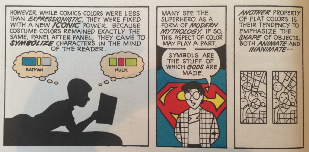
Your color story is an opportunity to create your own symbolic meaning that can effect the way people think when they see your brand or work without them even knowing it.
As McCloud says: “Symbols are the stuff of which Gods are made.” So how do you go about creating your own color story?
Step 1: Choose your colors
To get started we need to think back to Apple and Victoria’s Secret and how their main colors naturally feel in-tune with their values. Ask yourself what color brings up the associations you want with your brand? If you make outdoor equipment you might want browns or dark greens—something that makes us think of the forest. If you’re an NGO helping to provide people with clean water you probably want to stick with something ‘cleaner’ like light blues or white.
Once you’ve chosen your main color you’ll want to learn some color theory to find complementary hues.
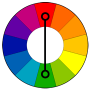
There are three basic categories of color theory that are useful when trying to create your story: the color wheel (which logically lays out an arranged sequence of hues), color harmony (which is how colors interact), and the context of how colors are used.
For getting started with a color story, we’ll focus on the first two: the color wheel and harmony.
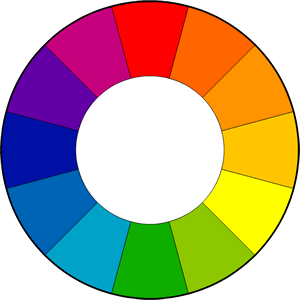
The first color wheel based around the primary colors of red, yellow, and blue was developed by Sir Isaac Newton in 1666 and has remained an important way to display color. For what we’ll be using, we can look at three types of wheels: Primary colors, Secondary colors, and Tertiary colors.
A primary color wheel has only 3 colors: Red, yellow, and blue—which, in traditional color theory, are the three pigment colors that all other colors are derived from.
A secondary color wheel includes green, orange, and purple—colors that are made by mixing the primary colors together.
A tertiary color wheel brings in hues such as yellow-orange, red-orange, blue-green, and yellow-green. These are made by mixing the primary and secondary colors together. (You can continue to go on mixing colors and making more complex wheels but for the sake of argument lets stop here).
Now that we can see the different types of colors and where they naturally fit on the wheel, it’s time to look at how they work together. Just like in music, color harmony is when something creates a visual balance that is both pleasing to the eye and also engaging.
Out minds are hardwired to reject both under- and over-stimulating information, so it’s important to create a palette that delivers both visual interest and a sense of order. Too much visual information and it feels too chaotic; too little and we move on to something else.
One way to create harmony is to use analogous colors—three colors that are side by side on a color wheel. As you already have your main color, you can choose the two closest ones. For example, if you want your company’s main color to be green your analogous complements would be yellow-green, and blue green.
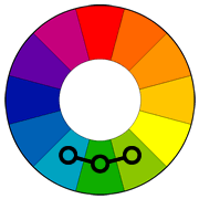
Another method, and one that can be more striking, is to use complementary colors. Complementary colors are any two which are directly opposite each other on the wheel, such as red and green (think Christmas!) or yellow and purple.
If you want to expand and find other colors that work, you can use the analogous complements to your main complements: so your four-part color story could include green, yellow-green, red, and purple-red.
This is a very basic look at color theory and there are some great resources out there to help you find complementary colors for your story.
Step 2: Create harmony (or chaos)
Let’s forget about staying in visual harmony for a minute.
The psychological principle known as The Isolation Effect explains how items, text, images, or whatever, that stick out are remembered more clearly. Studies since 1933 have proved that when ‘one of these things is not like the others’, we have an easier time recalling it.

Remember how I said earlier that our minds are hardwired to reject over-stimulating visual stimuli? You can use this to your advantage to make something stand out on your page or in you design. Using a color that isn’t harmonious with your main story is a great way to make something stand out, like a sign-up form or some other call-to-action. In the above example, pairing a bright red button on a light blue background causes our eyes to instantly be drawn to it.
If you don’t want to go so far as to purposefully create disharmony, or if this feels too ‘pushy’ to you, another method is to think of color context. Play around with your complementary colors and see how the color of what you want to stand out reacts to them.
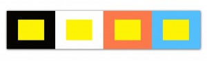
See how the same yellow reacts differently to the background color above? It becomes more vibrant with black, less brilliant with white, blends in and becomes more muted with orange and ‘pops’ with cyan. Once you’ve got your main color story down it’s a matter of experimenting with how other auxiliary colors can change their meaning.
Step 3: Give your colors meaning
Now that you’ve found the colors you want to use the next part of your story is the most important: creating a set of rules.
This is where you create symbolism behind your colors by aligning your values with the story. You can do this however you want and the process can be as basic as just saying “red signifies innovation and green signifies environmental consciousness”. But if you’re having trouble defining the values that you want to get across, one great exercise is to write a four-word story.
- Start by asking yourself what adjectives pop up every time you talk about your company or the products you make. Don’t throw any ideas out.
- Next, eliminate any that are totally off the mark and organize the rest into groups. You might have one that talks about your advantages, or descriptors of your customers/audience.
- After you have groups, consolidate them down until you have four and pick an ‘essential’ word from each.
- Now that you have your four words rank them from most to least important. The most important, which will probably be your brand/product/company, is assigned your main color, while your second most popular (your main feature or how you make money) is given the complement.
- After that, assign the rest of your attributes to colors.
These are your color rules. In the context of your company, these colors will always align to the values you’ve assigned them. Just like blue-purple signified the ‘real world’ in The Matrix, your colors will have similar meanings that your customers will come to understand both consciously and unconsciously.
Colors aren’t just for your customers
Color stories aren’t just a way to embed your brand’s values and create recognition, they’re also a way for you to identify whether or not a new project is a good fit.
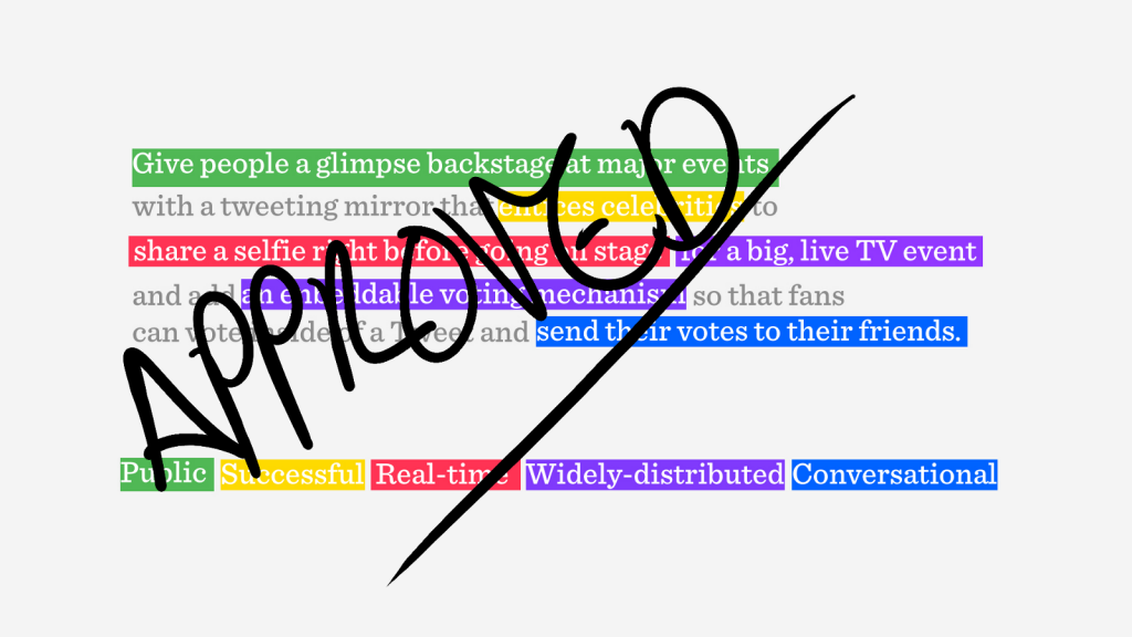
James Buckhouse (who is where the four-word story exercise comes from) tells a story about his time at Twitter and how he was in charge of giving meaning to the company’s colors. To do this, he first needed to understand what values the company wanted to embody and create his own set of rules. As an occasional speech writer for the C-suite, he started by analyzing the adjectives used in public speeches, breaking them down into initiatives that stretched across the product, business, and company as a whole. Each of these initiatives was then assigned a color.
With these rules in place, whenever a new project would come up James could write a 50-word project description, color-coding each word that was connected to a value, and quickly see whether or not it would be a success.
As someone who writes for a living it’s incredible for me to see just how quickly a color, tone, or hue can represent ideas and values that might take pages to get across in writing. Our minds are wired for visual learning and we’re able to understand things quicker when they are presented to us in a visual way. That’s why understanding how color works, even on a basic level, and applying it to your company or your work is such an amazing and quick way to give it meaning beyond the surface.
Your color story is your chance to become iconic. It’s why you can recognize an iPhone from across the street or a McDonalds sign that’s 20 miles down the highway. So pick a color and get started!
Read Next: The Colors of Motion is an interactive visualization of movie color
Image credits: Laura Lee Moreau, Cinevenger, Information is beautiful,Robert Mills, Color matters, Help Scout, Kapow Art Now, James Bunkhouse, Shutterstock
This post first appeared on the Crew blog.
Get the TNW newsletter
Get the most important tech news in your inbox each week.