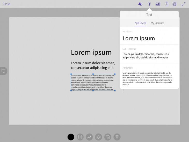
If you’re a designer, and have the motive or opportunity to create a usable comp from start to finish on-the-go, you are in luck. Adobe has launched Comp CC, a new iPad app that lets designers work with their Creative Cloud account to quickly fashion a usable comp — complete with the same assets you would use in the final version.
Comp CC seeks to bridge the gap between mobile and desktop for creating layouts for all kinds of projects.
With Comp CC, you could begin your mobile, web or print layout on the subway, stop off at the coffee shop and tweak it some more, and by the time you arrive at the office (on time, of course) you just need to upload your work to the computer and place the final touches.
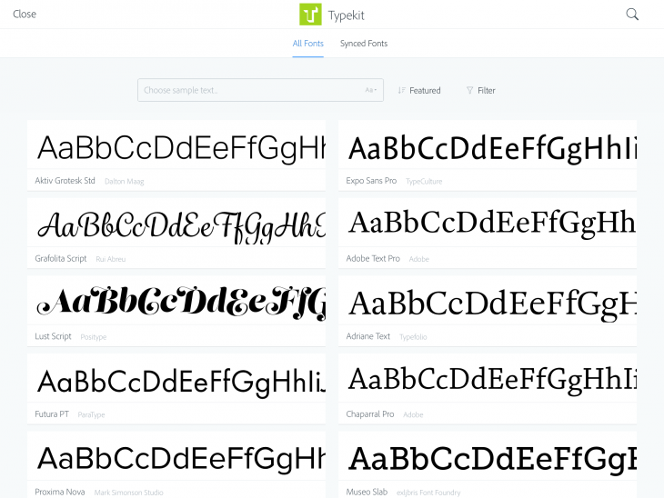
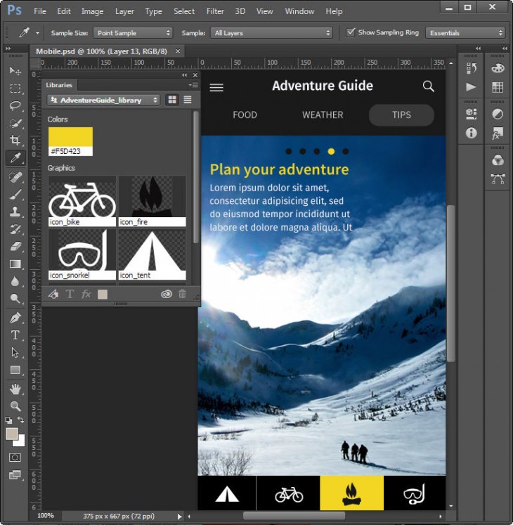
Adobe envisions this “connected creativity” as increasingly useful because the creative process today so often involves touch screens. Apps like Comp CC seek to remove the barriers between creative ideas and their implementation. Not only does the app let you sketch out drafts, but you also can access the exact files, colors, shapes, drawings, photos, brushes and fonts you need for your final prototype.
In a sense, Comp CC replaces the napkin or notebook page you might grab (or another app like Paper or Bamboo) to quickly sketch out an idea. Working with Comp CC on the iPad, you can immediately record your sketch and use it without having to recreate it later.
Any layouts you create can be easily sent to InDesign, Photoshop and Illustrator via the Share menu as fully editable native files. Once on the desktop, the heavy-hitting apps can take over to further develop and refine the layout into a production-quality project ready for the next step. Or you can ask for a critique by publishing your draft to Behance.
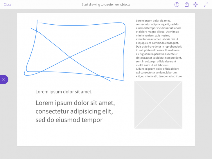
Using Comp CC is exceptionally easy, as I found when taking a pre-release version of the app for a spin. There are two modes that you can toggle: Drawing mode lets you create frames, shapes and text placeholders; while Editing mode lets you resize and reposition objects, import images, format text, and add elements to your layout. Switching back and forth between modes is easy — just tap on the left-hand tab — and once your rough sketch is finished, you can start filling it in with live elements.
Users are initially presented with a choice of 13 standard built-in comp sizes — but you can create your own custom sizes, too. The app keeps the number of controls to a minimum. You can use either your tablet stylus or finger to lay down lines and set text and graphics boxes.
Gestures obviously play a huge role in the way Comp CC works. Two- and three-finger swipes help you build, undo and redo parts of your comp, and Adobe has 16 special gestures you can use to set up your comp quickly.
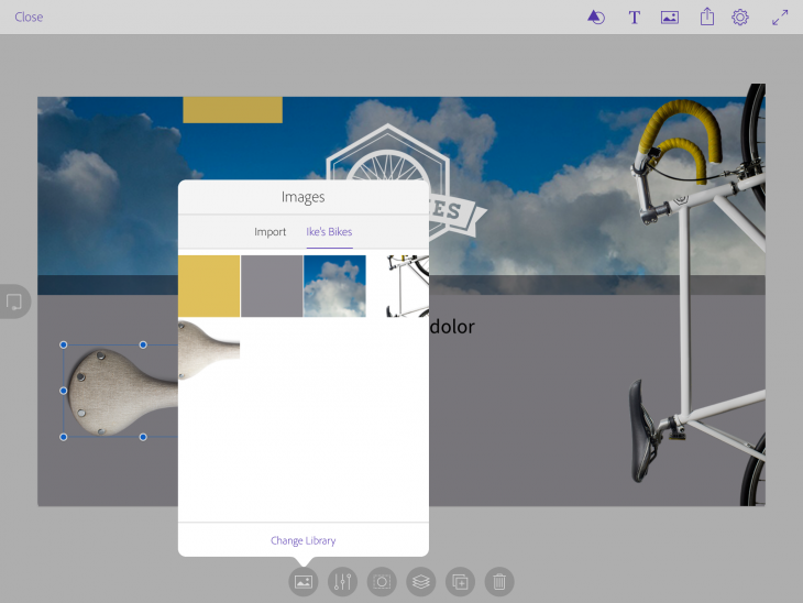
Working quickly on the iPad, you can move or resize frames precisely and use the app’s smart guides to align objects. Tap any box to select it and move it around the canvas. To add content to a frame, tap it to import images from your camera, Creative Cloud files, the Adobe Market, or Creative Cloud Libraries. Insert images directly into the layout using the Images icon at the top of the window.
There are several options for working with placed images, including setting opacity, cropping, positioning, duplicating and adjusting the stacking order. Similarly for text, formatting controls are available to work with paragraph indentation, line spacing, letter spacing and type styles. Once you’ve formatted a block of text, you can tap Copy in the Format panel, and apply the same formatting to other text blocks elsewhere in the document.

Working with vector objects is similarly intuitive. Tap the Vector Shapes icon and then drop in an included shape or one you’ve added to your Creative Cloud Libraries to resize and position in your layout.
Even if you don’t need to create comps on such a high level — with professional assets in place — it’s easy to appreciate how far Comp CC goes in giving you professional looking output and can also serve as a valuable learning tool that’s easy enough for anyone to use.
Adobe Comp CC is free for the iPad and requires iOS 7.1 or later. It is available on the App Store now.
Get the TNW newsletter
Get the most important tech news in your inbox each week.
