The Art of Analytics project visualizes complex datasets as works of art.
In her day-to-day work, Yasmeen Ahmad tackles immensely complex datasets, deploying an arsenal of approaches and methodologies that would sound intimidating to most lay people.
From predictive modelling to text analytics, time series analysis to development of attribution strategies, few people can easily wrap their heads around what such terms mean, and even fewer are capable of drawing actionable insights from them – which is why data scientists such as herself are always in such high demand.
Ahmad worked in the life sciences industry before pivoting to commercial work, where she is now Director of Think Big Analytics, the consulting branch of IT service management company Teradata.

The 💜 of EU tech
The latest rumblings from the EU tech scene, a story from our wise ol' founder Boris, and some questionable AI art. It's free, every week, in your inbox. Sign up now!
Over many years helping clients across a variety of industries to make sense of their data, however, she realised that the best way help them see meaning in those datasets was to literally paint them a picture.
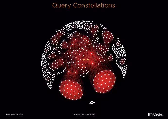
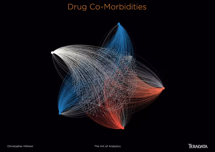
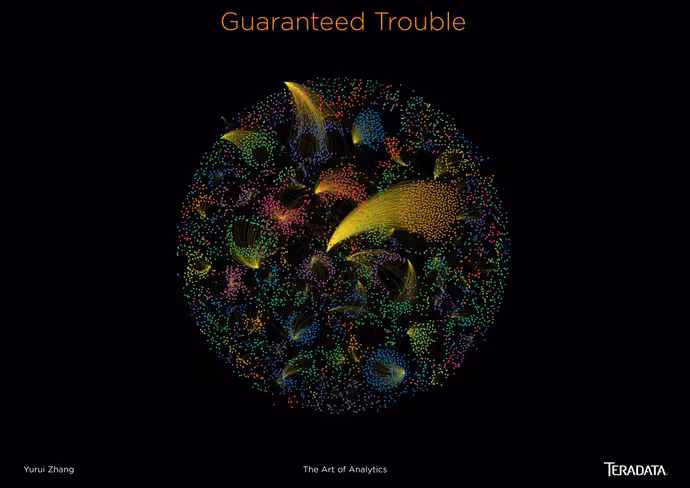
Visualisation is a core component of any data science and analytical project,” she explains. “It is almost always used at the beginning to understand the datasets you are working with, and can help to quickly identify anomalies, outliers and strong correlations in the data.
As far as data is concerned, she says, a picture really is worth a thousand words, as visualisation helps to add meaning on top of data that is much easier to assimilate for humans than descriptive words or single numbers and values alone.
Her team would therefore routinely include such visuals when they presented their key results to clients, and found that even people who might not be well versed in data science or technology could still connect with them. The visualisations supported storytelling around a project, engaging business stakeholders to understand connections, relationships and associations in the data.
As more investment goes into data platforms and analytical technologies, the artwork helps to provide a face to this investment. We had business leaders commenting on how beautiful the visualisations were. Colour, shape and layout were all dimensions that were used to convey meaning. The choice of how a visualisation was formed is actually a creative process – like creating a piece of art.
From there, she explains, it was a short leap to the idea behind the Art of Analytics project, which brings together a range of those visualisation pieces from their previous projects.
Ahmad believes one of the main strengths of the project is its ability to bring data to life for lay audiences, creating a connection between data insights and observers and bridging the technical gap.
The visualisations push the human to look beyond individual numbers and values, to thinking about data as a series of connections to be explored. They make it particularly easy to see associations, connections, pathways etc. The art is providing form to the complex fields of big data and data science – making them accessible to a wider audience.
Yet the usefulness of data visualisation is not limited to non-technical people. According to Ahmad, it is also a key component of a data scientist’s toolkit:
During my life sciences research – I was working in a field where everything was abstracted. The data I analysed often came from human cell samples that could only be seen under microscopes. Hence, collecting data about these samples, analysing it to create insight and then relating the insight back to reality was somewhat difficult. Visualisation was key to help portray not only the insights, but also how they linked to human cells and biology in general.
Art of Analytics was also an opportunity for Ahmad to bring together those creative and scientific sides. Data science, she says, is actually a highly creative discipline that combines technical know-how with lateral thinking and the ability to tease out stories from complex datasets.
I believe that art and science need to come together to help to solve the world’s most complex problems, and the best data scientists are not only great at statistics, maths and analytical subjects, but are also creative problem solvers who can translate their work into meaningful messaging that connects with their business and commercial audiences.
This is an on-going project, and there are plans to create new data representations as they work with new datasets they haven’t encountered before.
Ahmad is also keen to explore how other media such as animation, video and perhaps even VR could help add other dimensions to that work. By creating a video, she says, it would be possible to create another level of emotional connection with audiences, by representing how those relationships have evolved over time.
We have had senior executives request copies of the Art of Analytics to hang in their office. The emotional connection that people can establish with the work highlights the power of data.
Get the TNW newsletter
Get the most important tech news in your inbox each week.