Over 12,000 people are attending the annual Adobe Max creativity conference at the Venetian in Las Vegas. If you scratch beneath the surface of announcements such as the cloud-centric redesign of Lightroom washed down with appearances from actor/director Jon Favreau and Mark Ronson, there is substance as well as style.
The event is not just about new applications or adding shiny features to existing products. MAX Sneaks offers attendees an opportunity to preview future technology that may or may not make it into products. These proof of concepts provide a glimpse of the vision for the creativity cloud of the future.
I spoke with Bernard Kerr, Senior Experience Designer at Adobe before he hit the MAX Sneaks stage for a preview of how Project Lincoln is going to make it easier to bring data to life. But first, I needed to understand the problems with the current way of doing things.
Kerr advised that data can be incredibly powerful, but if no one can understand it, the reports are meaningless. In a visual digital world, a nasty looking Excel chart is no longer going to cut it. The New York Times is an excellent example of how using data visualization and infographics to not only capture readers attention but enables them to digest information instantly.
The use of data to create captivating artistic displays is rising to the top of wish lists to make information more palatable to the boardroom. However, the process can be quite cumbersome. A data analyst will collect and analyze data but in most cases will have to turn to graphic designers or data communication experts.
Starting from scratch can be a lengthy process and changing data when a brief gets lost in translation is guaranteed to make matters even more complicated. Adobe promotes themselves as a tool making company that enables people to tell stories in exciting and interesting ways, but how are they going to simplify data visualization?
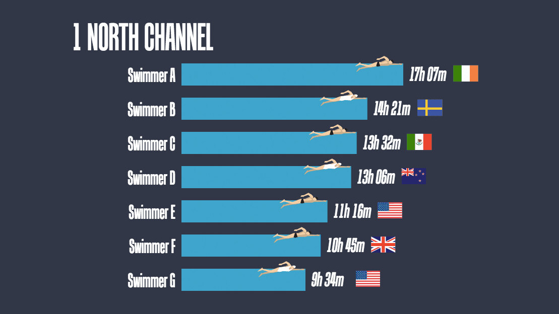
The unveiling of Project Lincoln at Adobe Max reveals a unique approach and concept straight from its design lab. An antidote to rigid templates, Kerr demonstrated how easy it was to create a 14 visually appealing charts in only four minutes using data from a spreadsheet.
Lincoln is a new approach to making visualizations that give designers the creative freedom to make beautiful charts, visualizations, and info-graphics without the need to code. This revolutionary approach empowers designers with a new set of data-driven drawing tools that can dramatically change the design velocity at which designers can make these sorts of graphics.
Early indications suggest that project Lincoln could quickly become a designer’s best friend. The ability to bind data into pallets and graphics is something that we have not seen before. But, Adobe’s mission to crush the lengthy timescales, simplify complex data and quickly present in a visually appealing format is a mouthwatering prospect.
Buzzwords such as big data, AI, and machine learning continue to dominate the digital landscape. But humans need explanatory data visualizations to both tell and understand any corporate vision.
There was clearly a buzz at the possibilities that Project Lincoln could bring to the creative cloud in the near future. The big question on everybody’s lips, was when is it coming out? However, it’s easy to get carried away with a live demo at an Adobe Conference.
The MAX Sneaks sessions are an excellent opportunity to get engineers out of the lab and onto the stage to showcase what they’ve been working on. Project Lincoln is currently a proof of concept with exciting potential, but creatives will have to wait and see what happens next.
Get the TNW newsletter
Get the most important tech news in your inbox each week.


