
Hate is a strong word, but it’s more than appropriate when it comes to these mobile UI and UX strategies.
With over 50 percent of website traffic now originating from mobile, businesses need to try harder when it comes to converting smartphone users who have a much lower conversion rate.
Remember that some of these strategies are bothersome even on a desktop browser, but can often be detrimental to mobile users.
1. Intrusive pop-ups and interstitials
Ethan Zuckerman claims to have written the code that gave rise to pop-up ads while working at Tripod.com in the 90s. He has since apologised for unleashing this nuisance on the world, but in all honesty, someone else would have written the code anyway. Pop-ups became such a scourge that modern browsers now block them by default, which is probably what drove marketers to come up with interstitials. Early interstitials existed as a web page ‘between’ two pages, so clicking on a link on one page would result in the interstitial being shown, before the linked page loaded.

The 💜 of EU tech
The latest rumblings from the EU tech scene, a story from our wise ol' founder Boris, and some questionable AI art. It's free, every week, in your inbox. Sign up now!
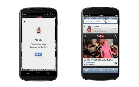
Why do users hate them? They interrupt (and intrude) on what the user was originally doing. Even Google has acknowledged how annoying interstitials and pop-ups can be, and how they impede content accessibility, so they are now penalising mobiles sites who don’t follow their guidelines.
You don’t need to get rid of interstitials and pop-ups, you just need to adjust them according to Google’s guidelines so that they are less intrusive on mobile.
2. Too many (irrelevant) push notifications
My personal view on push notifications is that they are a great marketing tool. Unfortunately, even as a marketer, I have to acknowledge that they aren’t always welcome. There is value in push notifications for both businesses and users, but the problem is that they aren’t always implemented the right way. And anything done incorrectly soon becomes annoying.
Aight news outlets let’s rethink what’s worthy of a push notification thanks pic.twitter.com/hmXsVgTESt
— justin schoolcraft (@jschool888) July 25, 2017
Like pop-ups and interstitials, push notifications interrupt users, and if those interruptions are too frequent, or not relevant to the user, they’re not welcome. The sweet spot for the number of push notifications to send in a week is 2-5, but you’ll have to do your own testing to find what works best. But much more important than this is ensuring that the notifications are personalised based on user profile and behaviour. An AppBoy study found 30 percent of users opting out because notifications weren’t relevant to them, and 25 percent because they received too many.
3. Social logins that are more than two steps
Social logins for websites and mobile apps are actually great. When they work. But there isn’t a uniform implementation of social logins on websites and apps. Gigya reminds us that:
Social Login […] minimizes barriers to site entry by reducing the need for usernames and passwords, allowing users to authenticate using their existing social media identities and pre-verified user accounts.
with a further clarification that
A social sign-in gives users the option to log on with just two clicks.
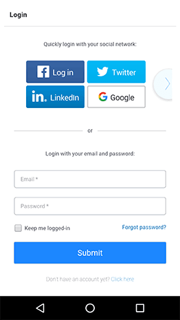
If you insist on users creating new usernames and passwords (or providing you with additional registration information), then rather drop the social login completely.
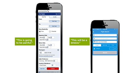
4. Long and complicated forms
Somewhat related to the previous point is the use of long or complex forms for registration or check-out. I frequently remind businesses that when it comes to asking customers to register for something, only ask for the information you need. Asking for too much information turns users off because of privacy concerns, and also because it inevitably leads to long and complex forms. And if long forms on a desktop browser are unappealing, they’re obnoxious on a mobile phone.
5. Confusing navigation menus
Mystery Meat Navigation (MMN), that delightful term introduced by Vincent Flanders all the way back in 1998, still applies today. It is less common, but it still exists.
- You use non-standard icons in a navigation bar, without any supporting text descriptions. You don’t have to use the icons provided by Apple and Google, but what you do use should look fairly similar if you want your users to recognise what action or item it represents.
- You use too many sub-menus, with important information being difficult to find. This is why a mobile-first approach to designing your website is so important these days. It allows you to perfect the layout and structure of your website, including navigation, so that it is easy to use on a mobile device. Adapting this to then also work on a desktop is much simpler than doing it the other way around.
Conclusion
UI and UX have always been important, but one reason for seeing it written about so often these days is because we are having to find new ways of making what works in desktop browsers work on mobile devices. A little more than one in three minutes spent online each day are on mobile devices, but among 16-24 year olds it is more than four in every 10 minutes, so focusing on mobile UI and UX strategies is extremely important.
We can all start by fixing our sites and apps if any of them use any of the strategies outlined here. Your effort may well be rewarded with a pleasant uptick in mobile conversion rates.
Get the TNW newsletter
Get the most important tech news in your inbox each week.