
A study by Wishpond of 62 landing pages shows that a lot of B2B SaaS business landing pages are not able to convert about 87 percent of their visitors by not fulfilling certain aspects on the landing page.
When looking at landing pages for the B2C market this metric even goes up to about 91 percent, measured on 80 landing pages.
Landing pages are the vital organs for your SaaS business. The more qualified leads you generate, the faster you can acquire new customers.
But what makes your landing page bad?
Most businesses have certain thoughts that are stopping progress on these pages:
- “It works because we gather leads, so we are not going to change it”
- “We have no idea what to change”
- “We’re afraid we might lose more potential customers if we start changing the pages”
Constant optimization of the landing page will always result in insights that will help you to better understand your potential customers. And it will also help you to get more out of the visitors you are already acquiring by running your current marketing campaigns.
Here are 12 ways SaaS businesses lose customers by fulfilling certain requirements that guarantee a lower conversion rate. This means you are losing potential customers, which in return results in lower revenue in your business.
1. Keep making people misdoubt you
You are the perfect solution to their problem. Especially when you acquire very high quality visitors. Trust is a huge part of the online transaction. A study by UX Matters shows that 70 percent of your visitors will leave an e-commerce site if they do not trust the company with their information. The same goes for SaaS businesses.
Make it obvious that people can trust you. Show testimonials of current customers that have nothing but positive things to say about you. This will result in a higher conversion, as social proof is one of the most important aspects of the buying process.
One of the neuromarketing principles, stated by NewNeuromarketing, is that people will change their buying habits when they experience social proof that change is needed. “By offering your customers a cue that the world is changing and a social example that your product suits this change, the customer is more likely to buy the product.”
Social proof will increase trust with new and returning visitors, which will result in a higher conversion rate on your most important landing pages.
2. Give them too much information
Too much information will lead customers away from your landing page. This is why you should keep it as simple as possible. By decreasing the amount of information on your landing pages, you make your proposition more clear and this will result in visitors being more aware of the product you are selling.
There’s no secret sauce to the amount of information your landing page should have. Always make sure that the information that you do show on the landing page must contain the core features of your product and the benefits of it.
Is your product difficult to explain, and do you need a ton of information on your landing pages because of it? Then it may be useful to split up the different parts of information and create several pages containing this information. This will help you understand what kind of information is essential for customers. For example, by using Google Analytics you can analyze which information pages have the most visitors. Insights like these will help improve the copy on your landing page.
You can use images on your landing page to increase the amount of information that you share with your audience. As the old proverb says: “A picture is worth a thousands words”. Don’t forget to optimize your images with mobile and tablet users, and make sure to place them strategically onto these pages.
Need more information on what kind of images you can use on your landing page? Gregg Crystal published a guide on Hubspot explaining what kind of images you have to create for your landing page. Need the right images for your landing page? This list on Buffer contains 53+ sources for free images.
3. You are making your product look difficult
One the quickest ways to scare visitors away is by using jargon that customers do not understand. Shopify is a great example of this: they don’t tell you anything about what code they used to build their solution or what other technical features the product has. Their offering is simple: “An ecommerce platform made for you”.
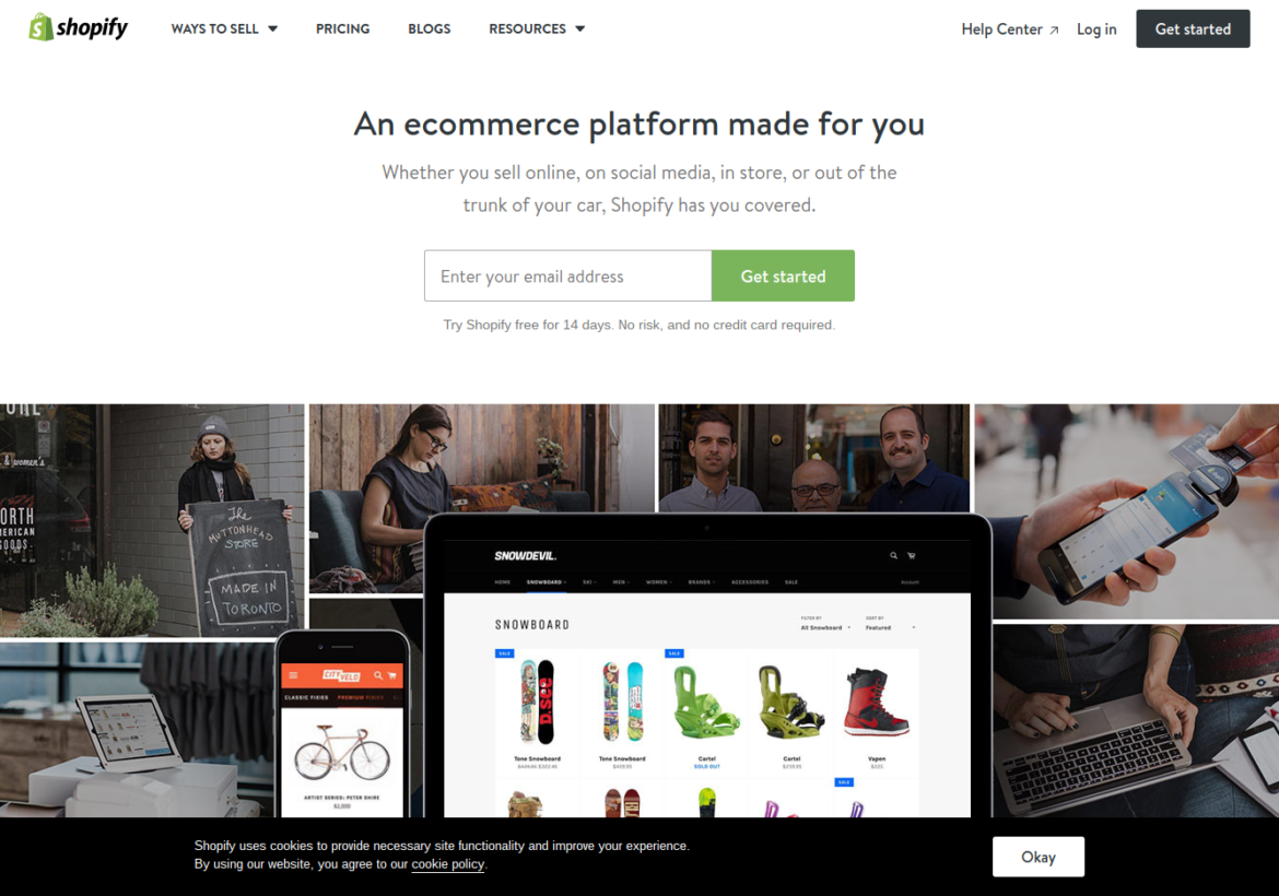
Source: Shopify
Don’t make visitors question every feature that your product offers: create a tone-of-voice that will resonate with them. This will help increase conversions, especially when you have a technical solution that can be used by non-technical people as well.
Every sentence that you use on your landing pages should help the visitor get a clearer image of what you are offering them. Always focus on the end result of the product: what is the visitor really getting out of this. Show how the product can be used. Show case studies from current clients. Make everything easy to understand, and you will quickly notice that more potential leads will convert into actual leads.
4. Confuse visitors with too many Calls-to-Action
Ever walked into a supermarket and stopped at the shelf that is completely stocked with shampoo? You quickly realize there are way too many choices. Should you go for the coconut fragrance or do you want to repair the split ends? Do you go for the shampoo with caffeine or is the shampoo for your specific hair color a better choice?
You quickly realize that there are too many options: there’s no way you can just pick one type of shampoo and put it in your basket – unless you already have a specific brand that you love and use already. The Guardian published an article on the Paradox of Choice: offering too many options will confuse customers on what they should be doing next.
Visitors don’t want to think. You should be doing the thinking for them: show them what action is required to go to the next step within their customer journey. Too many options will only lead to confusion and may potentially scare visitors away. The worst first impression to give to a potential customer is making them feel confused: this is never a positive association with your brand.
Our brains are designed to go for the clearest option. Use a clear call-to-action and stick to it. Only ask for once action on the entire page. Whether it’s a sign up button, an email opt-in button or a signup page for a webinar. Make it clear for visitors where they’re going next, and you immediately take away all the confusion on your page. Don’t use the signup button and email opt-in on the same page, because showing people that they have different choices will only make them realize that they can also not make a choice at all. And that’s when your visitors leave.
5. Hide important information
Every customer wants information as soon as possible. Don’t hide any information on your landing pages that is mentioned later in the customer journey. Are you going to require people to enter their credit card information later during the signup stage? Clearly state it beneath the call-to-action that will help them sign up.
If you hide information before people enter the actual funnel, it will only lead to a huge dropout on the pages that require that information. People may even feel scammed when they are asked for personal information that they didn’t know they had to fill in. This is scaring your visitors away and will significantly lower your conversion rate.
As stated earlier in this article, showing all the information on a landing page is usually too much. You can use extra pages that will help you explain more about specific features. Got a feature that requires some further information? Add a small paragraph on the landing page that explains this feature in a few sentences, and then add a hyperlink beneath this paragraph that leads the visitors to a page with more information.
The home page on HootSuite contains several hyperlinks that lead to other pages that provide further information about that specific feature. This will provide visitors with specific uses for that feature and will significantly reduce the amount of information that HootSuite has to provide on the landing page itself.
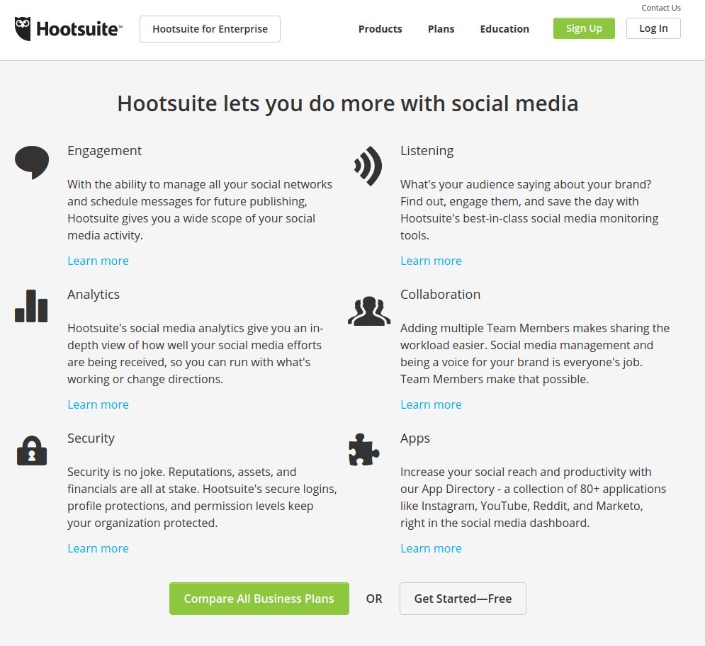
Source: Hootsuite
6. Only focus on single conversions
Conversions are great, cause they pay the bills, right? That’s only partially true. If you really think about it, you’d rather have a low amount of conversions that will be long-term customers than a high amount of conversions that will only stay for one month (or even just for the free trial that you provide). If 95 percent of your conversions leaves after the first month, you will lose a lot of money.
Instead of purely focusing on increasing the amount of conversions on your landing pages, try to see what kind of conversions you are really getting. How long will these conversions be your customer? What is the average retention rate of these sign-ups? What is the average income from these conversions?
Statistics like these will create a better overview of the conversions that you really want to get. Use data to figure out what you can change on the landing page to create a better page for long-term customers. If you keep focusing on your conversion rate, and forget about the retention rate, you will quickly realize that you’ve been paying attention to the wrong metric for too long.
Brian Balfour published an article on ConversionXL on how to increase the retention from your customers. One of the topics that Brian Balfour describes is the customer journey and how it affects retention. The way you describe your product on your landing page will have a huge influence on how long people will be your customer.
7. Make picking a package difficult
A growing trend within the SaaS world has been to create packages for every type of customer. But do not overdo it. Make it clear for your visitors which package will relate to their usage most.
This is why a lot of SaaS businesses choose to describe the usage of the package in the name of that package. Look at the pricing page on Buffer:
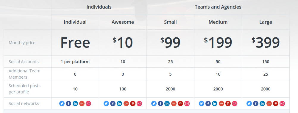
Source: Buffer
Buffer simplifies the decision by showing you the difference between packages for both individuals and teams. Then, within these categories, they show different packages and explain features that are included within that package.
Visitors will now instantly see what package fits their needs most. If Buffer would use this pricing concept on their landing pages, this is exactly the way they should be designing it. By making it easier to pick a specific package, you can easily increase your conversion rate.
8. Make the page order too difficult
When you start your GPS in your car or on your phone, the navigator isn’t going to start explaining the last 5 miles of your journey. It will also not start talking about the middle part of your journey. It will always start with the first turn that you need to make.
And this is exactly how you should be organizing your landing pages as well. Don’t make it a huge hassle for visitors to try to understand where they should be going. The page order of your landing page has a huge impact on your conversion rate and bounce rate.
Neil Patel, who is well known for his great content on conversion rate and online marketing, published an article on his company’s blog (KissMetrics) that explains how you can build up your landing page order. He summarizes what the order of your landing page should look like. Note: this is not a 100 percent perfect blueprint for any landing page. Some landing pages fulfill all these factors and get a decent conversion rate, while others only fulfill a few of them and get a higher conversion rate.
If you look at the landing page for Attach.io you can see that 11 of the 12 factors from Neil Patel’s article are fulfilled, and that the page order is perfectly assembled. It starts out with a headline to grab attention, a subheadline is added to give more information, it has a good call to action and also shows an image of the tool. This will help visitors get a clear understanding of what the product does and how they can use it.
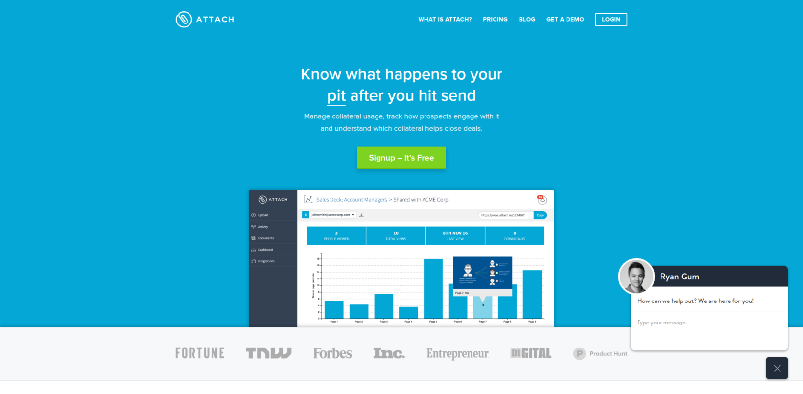
Source: Attach.io
Do you think your landing page order is too difficult or are you not sure whether the order is right? You can use tools like CrazyEgg and HotJar to see at which parts of the landing page people either convert or bounce. By further improving the order of the different page elements, you can significantly increase the amount of conversions.
9. Focus on anything else than getting proper leads
Nothing is better than getting proper leads into your funnel. Many SaaS business want to gather as many leads as possible, and this is a huge mistake. Trying to please every visitor will only result into a landing page that has no significant purpose.
If you focus on proper leads then you will definitely see your conversion rate drop. It can even drop significantly, lowering the amount of leads by 90 percent. But, if you really think about it, the 90 percent of leads that you are not generating were not going to be using your product anyway.
As I stated earlier in this article, you want sign ups that will become paying customers. And, once they’re a paying customer, you want them to be your customer for a long time. By getting as many leads as possible, you are only wasting your own time trying to convince people to become a paying customer even when they never will be your customer.
Sure, it’s great to tell your team that you have generated 200 leads this month. But once you drop those 200 leads into a drip campaign or send them to your sales reps, you will quickly realize you are giving them too much work with little pay-off.
Steli Efti, a well known Silicon Valley founder who has launched both a Sales-as-a-Service company [ElasticSales] as a SaaS business [Close.io] writes about what you need to do to qualify leads. In his article on “Selling to the wrong people will kill your startup” he covers why pleasing every visitor will only result in less qualified leads and wrong sales.
10. Make the design hard to understand
Chances are you once visited a landing page and literally had no idea what was happening. The design was just too confusing, like one of those old web pages back in the 90s. By keeping the design simple, you can increase the conversion rate on your landing page.
A simple design will immediately tell visitors what your product is, how they can use it and why they should sign up. Simple designs also load faster, which means you will not lose any potential leads due to high loading times.
Speed matters, because speed is a killer if it’s not fast enough. You’re not going to sign up for a product if the landing page is really slow. If the first impression on your landing page is a high loading time, it will lead to visitors thinking your product isn’t quick either. Sherice Jacob wrote a blog post on why speed has such a big impact on your conversion rate on KissMetrics.
In this article by Brad Smith you will find 11 ways to accelerate page load speed to ensure that visitors will not bounce because of it.
11. Use the same landing pages for every campaign
The type of visitors that end up on your landing page will either increase or decrease the conversion rate on this landing page. Make sure that the ad campaigns that you launch for your landing page are optimized for the perfect type of visitor for that product.
Getting the right type of visitors on your landing page is very easy nowadays. You can easily launch ad campaigns on Facebook and LinkedIn that are targeted at the perfect audience. AdEspresso published an article on how to create the perfect Facebook ads and landing pages, to significantly increase the conversion rate on these landing pages.
You will scare away visitors if the product does not match their expectations. And by only attracting the wrong visitors, you will end up with the wrong metrics. Your proposition and product can be absolutely perfect for your specific target audience, but if you have a lot of wrong visitors you will see a low conversion rate. This will lead to wrong assumptions, because you might think you’re improving your landing page for the amount of sign-ups, but in reality will only create a new version that will scare your actual perfect customers.
12. Show useless and distracting opt-ins in pop-ups
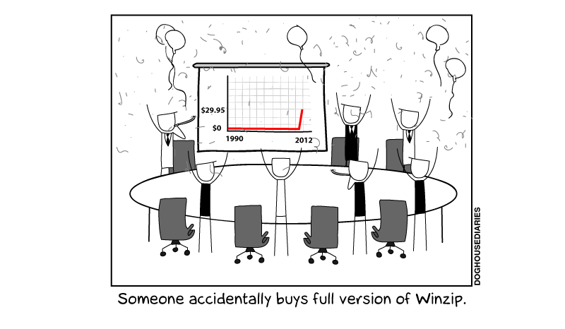
Source: DogHouseDiaries
Remember that little pop-up from WinZip that asks you to buy the full version? If we’re all honest about it, this pop-up didn’t really make you want to buy the product.
Pop-ups left the software world for quite some time, but today we see more and more opt-ins on landing pages. If there’s anything you don’t want to do, it’s leading the focus of your potential customers away from the actual action that they need to fulfill. And that’s exactly what pop-ups will do.
Sure, pop-ups are great when you use them to increase the amount of subscribers on your blog. George Mathew published a blog on CrazyEgg explaining that pop-ups significantly increase the amount of subscribers for your blog. But that doesn’t mean you should be using them on your landing pages.
Pop-ups are really distracting, and will potentially decrease your conversion rate. Visitors need to click on the pop-up to close it, and that means they’ve already committed to a negative action on your landing page.
Closing thoughts…
Get the customers you want by never scaring them, and you will immediately see a huge increase in good conversions. By using the 12 tactics above, you might decrease the conversion rate of your landing pages, but will significantly increase the amount of qualified leads that you need to grow your business.
Do you have any other ways to further improve landing pages of SaaS businesses? Let me know in the comments! I am curious to read what you have used or have done to improve your own landing pages.
Get the TNW newsletter
Get the most important tech news in your inbox each week.


