If you think the design of Facebook, Twitter, or any other popular site you use regularly is bad, hold your horses. I’m going to introduce you to a website that’ll make you spill your coffee, pull your hair, scream in agony, and punch the wall. Maybe all at the same time.
The website, aptly named User in yer face, is the epitome of bad design. It’s made by Bagaar, a Belgium based IoT product agency to point out bad design practices, and use as a marketing tool.
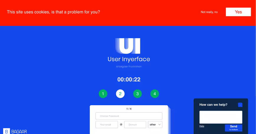
I won’t blame you if it takes you more than a couple of minutes to get past the first page. Just take a look for yourself.
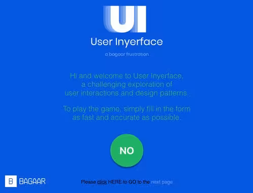
If you haven’t figured out where you have to click to go to the next page, click on HERE (literally on the word). And even if you get past that, there is no respite. There are bad boxes, forms, buttons, and pop-ups everywhere that’ll do everything in their power to stop you from progressing. I sent this site to four of my friends, and I now have four less friends.
This site is just a museum of design horrors. Check out the site here, and tweet @ us with your most hated design part.
Get the TNW newsletter
Get the most important tech news in your inbox each week.