When Spotify officially launched in India in February, I was excited for a particular reason apart from its music prowess. I wouldn’t need to use multiple podcast apps across platforms.
However, I was utterly disappointed by the podcast experience on Spotify. The section was clumsily placed as a button in the library, and it was hard to discover new podcasts. Now, the company’s finally making a design change and giving podcasts its own tab. Thank fuck.
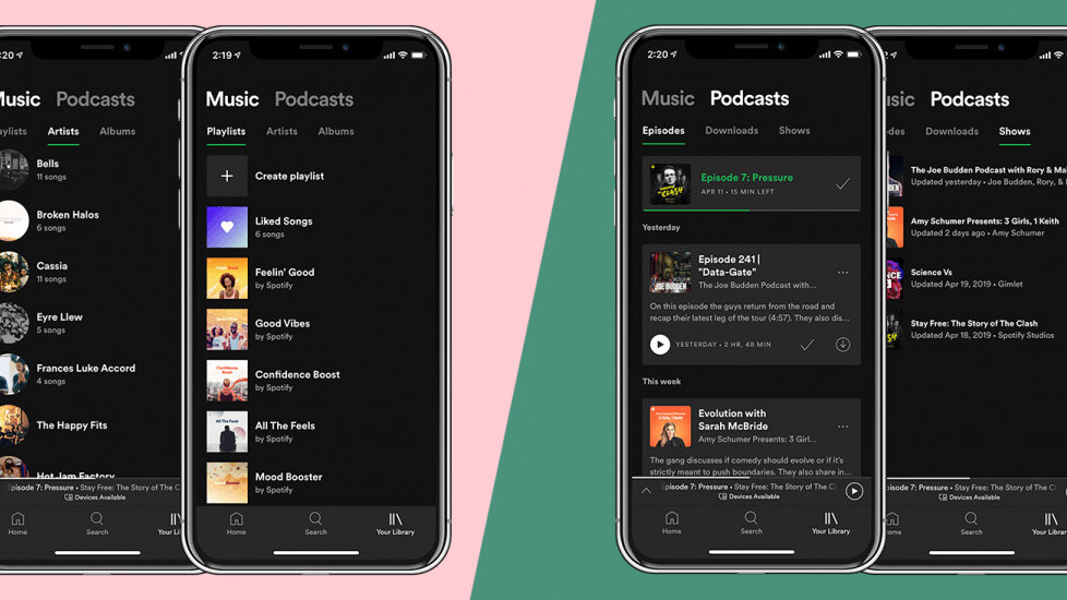
Yesterday, Spotify announced it’s revamping its library layout for premium users. The redesign brings two new tabs: Music and Podcasts. Under the Music tab, you can find Playlists, Artists, and Albums subsections. More importantly, the Podcast tab has Episodes, Downloads, and Shows categories, making it easier for you to keep a check on the shows you listen to regularly and episodes you’ve not finished yet.
The previous version of the app just had a list where the show with the most recently released episode sat on top. This meant you had to click on a show title to see the list of episodes. Pretty cumbersome, right?
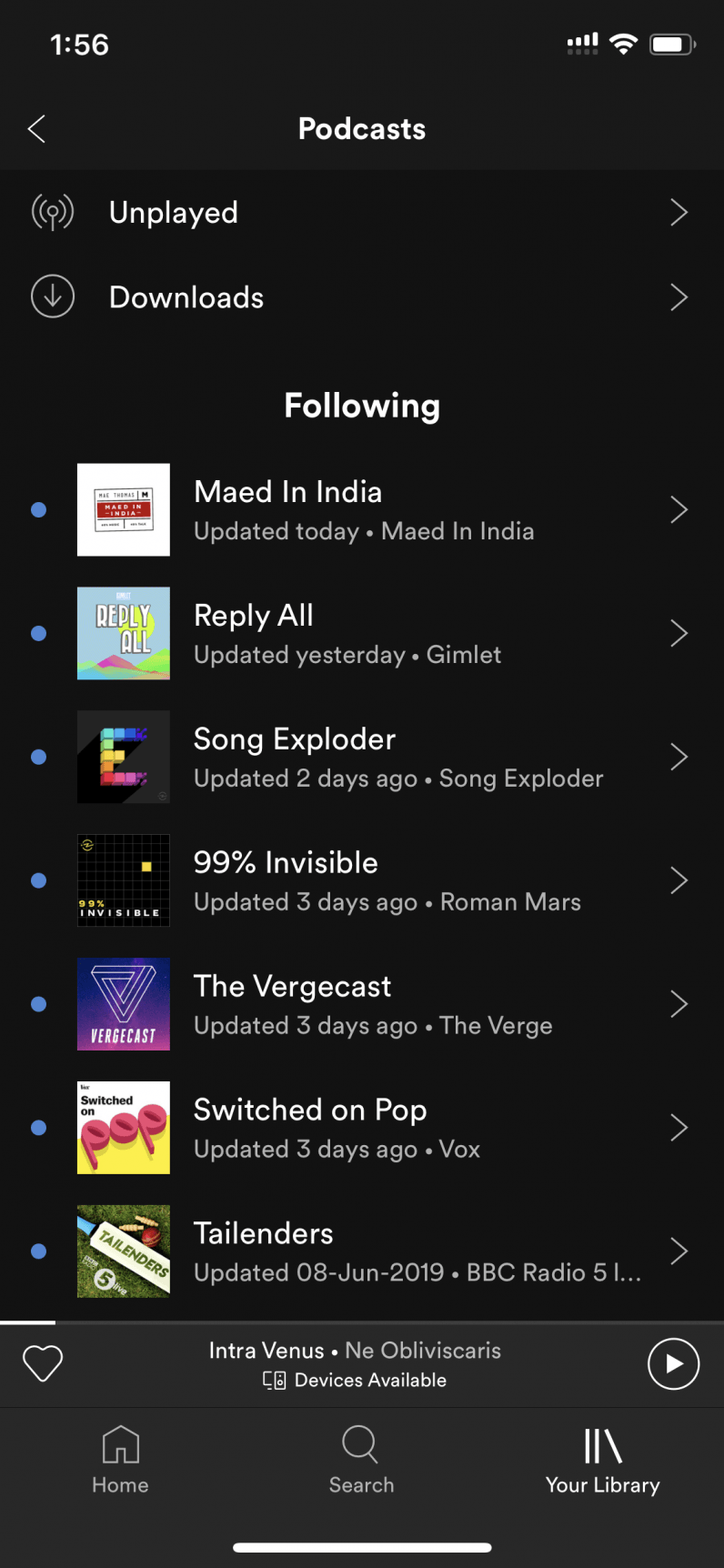
Another problem with this approach was that if you had a long list of podcasts, you might never scroll down and catch up to a show you subscribed ages ago. With the new system, you might be encouraged to check out shows you haven’t listened to in a long time.
Even though the redesign is a step in the right direction, Spotify could learn a lot from its podcast competitors. Apps like Pocket Casts and Overcast have better UI, and a range of useful features, such as the ability to set a separate speed for each show.
I think even after the redesign, Spotify can learn a lot for apps like Pocket Casts and Overcast and add features like separate speed setting for each podcast.
Spotify’s recent acquisitions show just how serious the company is taking podcasting. Expect to see more of this in the future, as it’s pretty clear Spotify wants to become your favorite podcast app.
Get the TNW newsletter
Get the most important tech news in your inbox each week.

