There comes a time in every company’s journey when it needs to find a reason to change its logo. Today, that time has come for Slack.
Look, I’m normally cool with logo changes. I think it’s fun to mix things up. I’m also not a designer, so maybe my opinion doesn’t mean anything. Point is, I’ll let you come to your own conclusions, but if you ask me, the new logo is an unequivocal downgrade.
For reference, here’s the old logo again:

And here’s the new one:

The 💜 of EU tech
The latest rumblings from the EU tech scene, a story from our wise ol' founder Boris, and some questionable AI art. It's free, every week, in your inbox. Sign up now!

It went from a unique, quirky logo to something that looks like it belongs at your local pharmacy. Or maybe a Web 2.0 law firm or bank. Perhaps a summer arts program at the local middle school?
To be fair, Slack lays out some very reasonable logic in its blog post on the change. In the company’s own words:
Our first logo was created before the company launched. It was distinctive, and playful, and the octothorpe (or pound sign, or hash, or whatever name by which you know it) resembled the same character that you see in front of channels in our product.
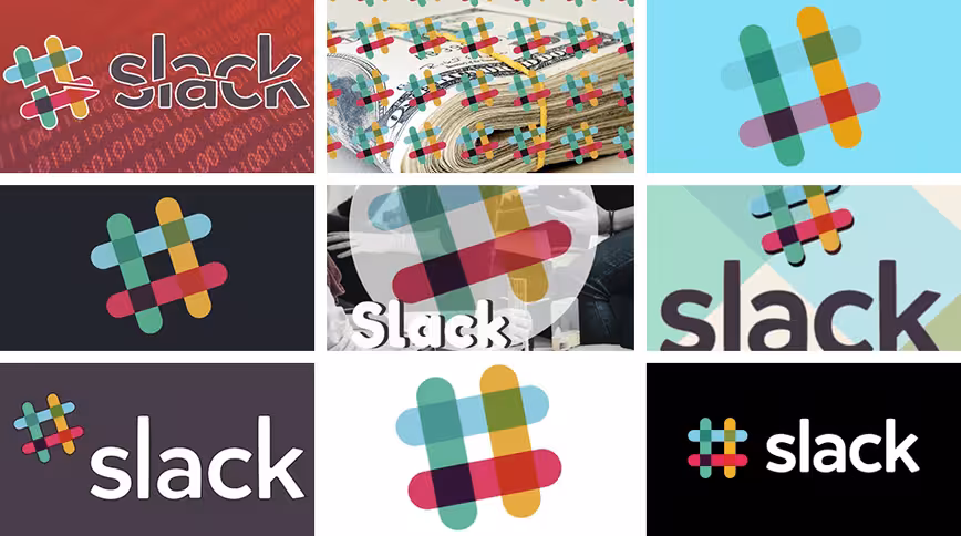
It was also extremely easy to get wrong. It was 11 different colors—and if placed on any color other than white, or at the wrong angle (instead of the precisely prescribed 18º rotation), or with the colors tweaked wrong, it looked terrible. It pained us. Just look:
Simply awful.
We developed different versions of the logo to compensate, which worked well for different purposes. But that meant that every app button looked different, and each one in turn was different from the logo.
They were all pretty good … but not at all cohesive. And the important thing about being a brand is that whenever people see you in the wild, they should recognize that it’s you.
The new logo should fix that inconsistency.
Problem is, that reasoning falls apart if your new logo doesn’t invoke your company image… or just plain looks worse. I get the reasoning behind wanting to maintain visual consistency, but there had to be some way to do that without something so, well, generic.
Also I really doubt anyone had trouble identifying the Slack brand with the old logo. Maybe it could get a bit messy when used improperly, but the logo was unique enough to make it easy to recognize.
Whether it was the hash, the angle, or the colors, each of those things promptly communicated ‘Slack.’ In fact, I think the hash, and the channels it represents, is the most iconic part of the software.
The new logo makes me think of chat bubbles. Which is weird, because Slack doesn’t use chat bubbles. Its distinct lack of uniqueness makes me think it’ll actually be easier for me to gloss over it if I happen to see it in an article or an ad.
Granted, I’m just venting because I use Slack every day, but so far the public response seems similar:
#Slack has a new logo that I'm pretty sure is actually four ducks sewn together in an uroboros human/duck centipede. You add eyes and you can't miss it. pic.twitter.com/IMDNwagkFG
— HisRepMajesty (@HisRepMajesty) January 16, 2019
https://twitter.com/HeyHeyESJ/status/1085613709286764544
Not sure how I feel about this new Slack logo 🤔 pic.twitter.com/0zuR4YzkPC
— Troy Osinoff 🕺 (@yo) January 16, 2019
New Slack logo looks like a multicolor squirt emoji 💦 skeet-skeeting out in all directions. Very cool, very legal. pic.twitter.com/rC9cHOYx9W
— Mike Rundle (@flyosity) January 16, 2019
New Slack logo looks like it's for a public swimming pool pic.twitter.com/Jtm6NxX6Po
— Rik Lomas (@riklomas) January 16, 2019
The response hasn’t been one-sided though. A fair number of people do like the logo:
https://twitter.com/ssbittle/status/1085617453042974726
https://twitter.com/_Chima__/status/1085618289848528897
it took me 6 minutes to decide i'm fine with the new slack logo
— leil 💀 (@leilalw) January 16, 2019
Unfortunately, these people do not realize they are wrong (just kidding, kinda).
What do you think? Sound off.
Get the TNW newsletter
Get the most important tech news in your inbox each week.