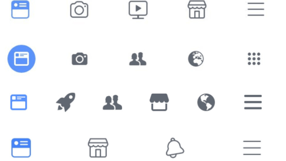
Facebook is currently testing more than 60 versions of its navigation bar, the small icons on the bottom of your mobile screen. According to designer Luke Wroblewski — who gathered the data with the help of Twitter users — the navbar has at least 66 variations:
if anyone (other than me) is still counting… now at 66 active versions of Facebook’s mobile nav: https://t.co/Rw5VqPeP2d pic.twitter.com/mNCpGCuFS6
— Luke Wroblewski (@lukew) October 17, 2017
Facebook seems to be A/B testing its app with a ton of users. I’ve already gone through a few different navbars in the last couple of months, and it seems CEO Mark Zuckerberg just can’t make up his mind.
The different navbars don’t just vary in icon placement, but some icons themselves. The notification icon, which has been a globe from the start, has been replaced with a bell for many, but not for all. There’s also some variations that have up to 6 icons on their navbar — slightly excessive considering most of us only use two or three.
Surprisingly, Facebook is still insisting on the Discover option to extend time spent on the app. Just like Instagram, Discover (the rocket icon introduced in April) shows content from Pages that match your interests. For me it was mainly memes, which completely defeated the purpose of using it — I’d be looking for a variation of content, not what I already have.
Some users even have the Marketplace icon as a shortcut, which could be useful for those who use Facebook as a modern-day eBay. The small grid on the far right gives users access to their Profile, Pages, Events and other features, which should ideally be on the navbar.
The smartest addition is probably Facebook Watch, encouraging users to try out and have easy access to its new episodic video service, the social network’s own version of YouTube.
Get the TNW newsletter
Get the most important tech news in your inbox each week.


