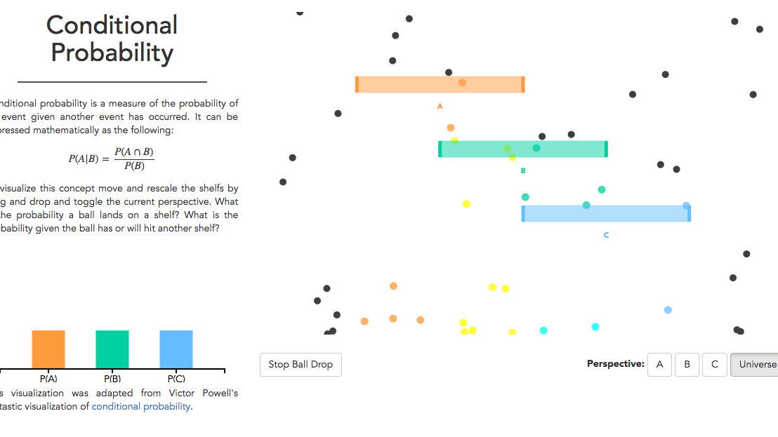
Statistics tend to be pretty boring – especially to people that know little about the field or simply lack the skills and knowledge to interpret such data. Now Brown University wants to take the hassle out of perusing charts with its new interactive website.
Created by Brown student Daniel Kunin, Seeing Theory is a gorgeous website that aims to make statistics more accessible to a wide range of people through interactive visualizations.
What is particularly nifty is that all visualizations are broken down by categories and accompanied by additional information about the method and data they demonstrate. Some modules also allow you to fine-tune and toy around with the parameters.
Here are a few examples:
Those interested to browse through the code of Seeing Theory can head to this repository on GitHub. In case you find any shortcomings or have some feedback, you can shoot an email to Kunin at daniel.kunin@gmail.com.
Step your statistics game up and head to Seeing Theory by clicking here.
Get the TNW newsletter
Get the most important tech news in your inbox each week.


