British people have a somewhat hysterical reaction to inclement weather. For example, right now the West of the country is currently being thrashed by Storm Doris. No, really, that’s what it’s called.
Doris isn’t particularly fierce. It’s just a bit of wind. But that hasn’t stopped it from being ridiculously over-hyped by the media, with tabloid The Mirror describing it as a ‘weather bomb‘.
That said, I’m still not stepping outside. It’s not The Day After Tomorrow, but no way do I want to head out into the cold and lashing rain.
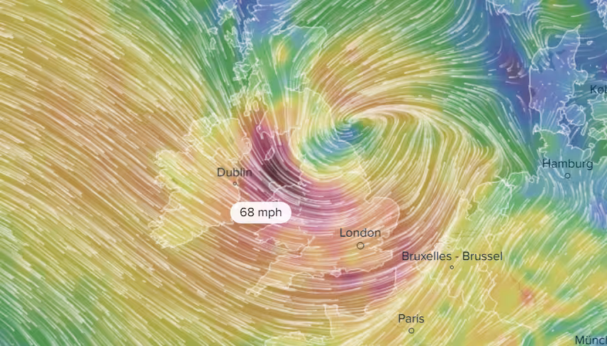
But if there’s an upside to Storm Doris, it’s that I’ve discovered how beautiful meteorology visualizations can be. Wind maps, in particular, are strikingly gorgeous to watch. Check it out.
If there's an upside to #StormDoris, it's that I've discovered how hypnotically beautiful wind maps can be. pic.twitter.com/p34v39GZ4P
— Matthew Hughes (@matthewhughes) February 23, 2017
I can totally imagine myself curling up by a log-burning fire, drinking a glass of scotch, and watching that until I eventually fall asleep.
The wind maps come from a service called Ventusky, which is able to visualize several different categories of weather data, including wind speed, thunderstorms, and waves. Although none, in my view, are as beautiful as watching the movement of the wind gusts.
Get the TNW newsletter
Get the most important tech news in your inbox each week.