Is the LinkedIn app on your smartphone right now? The recruiting and professional platform certainly has mobile traffic; according to the company, 50 percent of its traffic derives from mobile. So the company has pushed the reset button to create a modernized app that simplifies the app into something stickier and more digestible.
LinkedIn’s new flagship app, nicknamed “Voyager,” is a complete architectural and design overhaul available for iOS and Android, as well as an online mobile experience, in the coming weeks. Announced at the company’s Talent Connect 2015 in Los Angeles, Voyager boils down LinkedIn’s complexity to make the app easier to use.
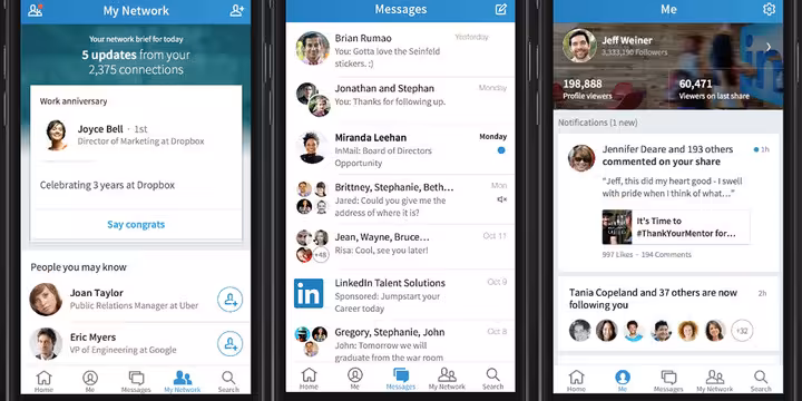
Voyager breaks down into give different use cases:
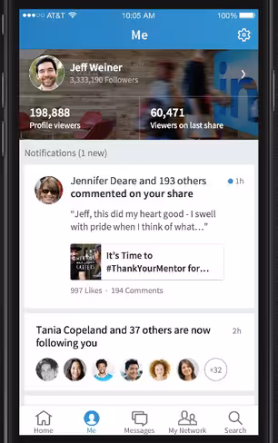
- Home, which is designed like a main news feed where news articles and suggestions surface for users; Me, where stats about profile views and mentions live.
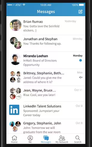
- Messages, which abandons LinkedIn’s old inbox in favor of a more informal chat interface.
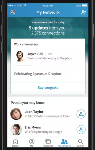
- My Network, where activities associated with your connections are monitored.
- Search, where users can look for potential connections, follow companies, and access other information available on LinkedIn.

The 💜 of EU tech
The latest rumblings from the EU tech scene, a story from our wise ol' founder Boris, and some questionable AI art. It's free, every week, in your inbox. Sign up now!
“This is more than a new design: we’ve architected it at a system level how we do relevancy,” Kiran Prasad, VP of Engineering at LinkedIn, said.
The interface is certainly cleaner, eschewing the lengthy sidebar for five simple buttons on the bottom. The separate buckets of information is also much simpler, allowing users to focus on what they’re interested in rather than wading through profile picture changes and other small notifications to get to news or jobs.
“Currently, we commingle our stay informed case with our keep-in-touch case,” Joff Redfern, VP of Product, said. “When we had those things commingle, there’s context switching that adds complication.”
In addition to creating simpler channels for information, there are also more elegant actions to lead users away from Voyager to LinkedIn’s other apps. Voyager will subtly suggest that users download the company’s other apps — like Lookup, Job Search and Pulse — and also provide a multi-app loader to kick users out to those apps easily.
“Not only is it a departure from what we have today, it’s what we call the start of an Incredibles family,” Hemendra Kumar, Director of User Experience Design, said. “The app is different in its superpower, but when you put them together, they look like a family.”
One repeated theme throughout the conversation was the concept of sterilization — how do you abandon the buttoned-up, work-focused environment of LinkedIn to create something more friendly, casual and, most importantly, sticky? Everything about Voyager — from its notifications to its pared down and visual design — feels as though LinkedIn is finally shedding its shell and communicating to its users that it’s not so serious.
It will be interesting to see whether that tone shift can be achieved — LinkedIn has, after all, made its name on being the professional’s social media outlet. Would you use it to reconnect with the old colleague you haven’t seen in five years? The company hopes you will.
Get the TNW newsletter
Get the most important tech news in your inbox each week.